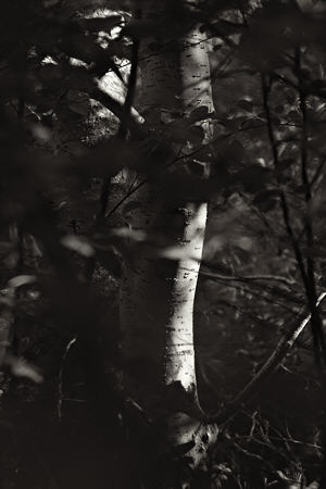
I recently noticed that I was making some images that had a reversed figure/ground relationship, in terms of lightness. That is, the main subject was light with a darker surrounding, rather than the more common dark with a lighter surrounding. For example, compare the first picture with the one below it, which I showed last week.

Although we’ve all seen those visual illusions based on ambiguous figure and ground, I realized I’d only seen this discussed in terms of geometry and shape, never lightness (or tone). So I decided to haul out a few classic examples and see what your reactions are. If you want to be unbiased, examine the pictures before reading the text following.
Is there a difference in what you see first in the images below?
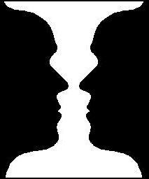
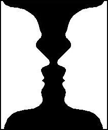
The vase/face illusion may not be the best example. At least for me, it switches fairly rapidly between the two possibilities. But does one dominate for you? Is it the same when light and dark are reversed?


The pair above is sometimes used to illustrate our different interpretations depending on brightness. Typically, the black square is perceived as something lying on or covering the gray surface, whereas the white square is seen as a window to something below or behind the gray. Tyler Green noted something related to this in a recent post about Picasso-Matisse mutual influence.
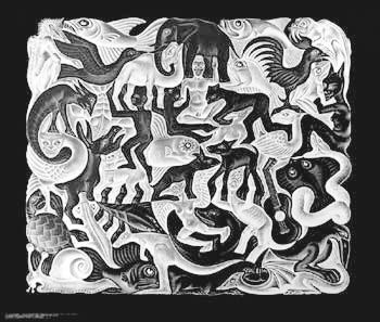
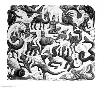
In the two Eschers below, do you notice the same animals and objects first? Can you tell which is original and which reversed?
In the art that you make or like, is there a predominance of one lightness relation of figure and ground? Do you think there’s a prevailing tendency in your daily perceptual world?
(P.S. The original Escher is second.)

Steve,
In the ‘Eschers’ I immediately focus on the buddha-like figure in the middle, just below the elephant. That figure determines what i see next – a dark figure makes me see the dark shapes, a light figure makes me see the light shapes.
Thus, there seems to be additional complexity besides light and dark.
Birgit,
Thanks for a very interesting response. Clearly, you’re attuned to possibilities for enlightenment, so I hope they happen along your path!
Steve,
Your first picture strikes me as more sensual and your one second as more intellectual.
In your first image, I can picture myself walking through the woods with my attention caught by the illumination of the tree trunks. In your second picture, I stand back and admire the correspondence between the difference in the textures of the leaves on the left and right.
Is darkness generally felt as more cozy and lightness as more awakening?
Looking at the dark and light in my own environment: I stay away from black or white color of clothing because it does not suit me. The exception was black yoga outfits until someone leading a yoga workshop that I attended requested that people do not wear black because he felt that it attracts darkness. That opinion resonated with me. I have difficulty getting satisfying shots of my daughter because she wears much black (you heard me ranting about mothers clad in black carrying their babies. And even my luggage – important to me with my family spread out over two continents – is brown which, in case I should be tempted some day to check my carry-on, would be easily singled out on a conveyor belt.
And with respect to white, decades ago, given a choice of steel case office furniture, I selected everything in stark white for small room with southern exposure and the walls painted white – you can imagine the glare. By now, I prefer the mellow hue of wood but I still subscribe to white walls. Black and white, isn’t white the funereal color in China as black is for the Western World?
Coming back to your pictures, the darker one feels softer, giving the sense of a greater spectrum of grey tones while the lighter one feels more contrasty with the dark leaves on the left looking almost black against the almost white background.
Birgit,
Your musings touch on a fascinating generalization I’ve never considered, but that seems to make sense: reactions to darkness have a tendency to be more emotional, whereas lightness brings out more of the intellectual. This would be supported by the huge base of metaphor, probably common across languages, related to bringing something into the light for examination and consideration. Perhaps we feel we can’t analyze something if we can’t see it well, and we are less likely to go beyond an immediate, emotional response.
I preffer the first picture, it makes you feel safer, like you in the darkness hidding.
The light one you feel exposed…
Angela,
That reaction makes sense to me, though it seems in conflict with the common idea that dark and nighttime are scary. In Chinese art theory, dark and light are represented by yin and yang, respectively, which also are associated with female and male and a number of other oppositions. There is always yin within the yang and vice versa.
Steve,
Your first photo is intriguing because of the directed light source which only catches the trees behind the foreground. Very Renaissance in feel to me.
I’ve been playing with shadow and paint and find I know a lot less than I ought to about the way light can strike objects. I think I have some base book learning, but it’s not the same as reality. So I’m intrigued by the way you captured that light.
this is faneastic
Hi Steve. My colleagues and I are doing some research on brightness (actually, effects of contrast on judgments of location, but brightness is a critical manipulation). The example you show with the black and white tilted squares on a gray background is very relevant to some of our findings. Do you have a scientific reference or primary source for that example? It could be very helpful to us. Many thanks…
Sorry, Tim, I don’t have a reference for you, though I most likely had something at the time this post was written. Best wishes for your research!
Hi Steve. Thanks for checking, the quick response, and the good wishes. This seems related to the object-hole effect, but we haven’t found these specific luminance effects in that literature yet. We’ll dig a little deeper into the scientific databases, and I’m sure something interesting will turn up…
I came onto your blog post because I’m looking for a language to describe a phenomena I noticed recently.
Your description of the two tilted squares says that light on dark suggests a window into something deeper or further back, and dark on light suggests an object in the foreground – protruding out toward us.
I installed a music visualization program for winamp, and while listening to music, I was looking closely at the visualization. The visualization was set to move randomly through lots of different designs and sequences, and I watched for half an hour or so.
Then I noticed that mysteriously it would appear 3-D and super smooth in quality (no noticeable pixilation) and then back again to 2-D. By 3-D I mean appearing not flat like a normal image, but protruding out toward me. This wasn’t the visualization itself changing. And I could jump out of 3-D to see what it usually looks like.
So, what I was “jumping” in and out of was a conscious, deliberate focusing of my attention on the dark areas of the moving images, as if the darker areas were the ground and not the figure – as if the dark areas were the windows into something behind and below the light areas. That’s when the image would leap out into 3-D. This is opposite of what we ‘naturally’ experience – opposite of what you depict with the two tilted boxes.
As far as you know, is this a real phenomenon – flipping back and forth between the two figure/ground configurations, and the one appearing 3-D?
Thanks for your blog post!
Danny