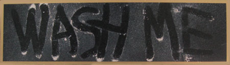
I saw a dirty rear window adorned with the commonplace admonition: “WASH ME”. The glass had a general roundedness reminiscent of an old television screen. Such a screen, if dusty, would be adorned with “WATCH ME”.
I dislike this kind of thinking because it demands action. In this case not so bad as I have discovered the joys of plastic and could imagine something in that medium.
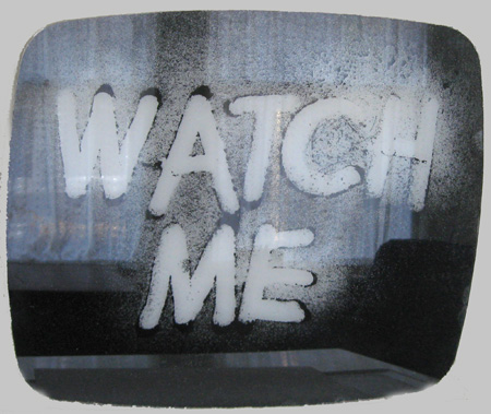
Finding an old television or crt and smearing it ala Robert Rauschenberg could maybe work, but the product would be an orphan without a context. Going Oldenburg might be better. Many of his signature works have involved a process of simplification that can catch the essential syntax of a design while allowing it to serve as a support for superimposed meanings. In this case I needed to find a way to say “TV” in an elementary way, allowing the message to be comfortably introduced.
My first impulse has been to create the outline of a tv screen in smoky lucite and to bend it into an affixed curvature, set against a background plaque, appropriately shaped and painted. Fortunately, the television screen is a deeply ingrained shape, and announces itself with no outside aid. The ‘cabinet’ might be a simple rectangle showing a little more at the bottom than the top, implying the presence of knobs and buttons. Another usable is the allowance given by the continuing depiction of older technology, like steam locomotives, in the media. Coors drives its cold refreshment choo-choo through town on steam, not diesel electric.
Granted the rest, my initial concern was for the dust and writing as all would depend upon getting that right. “Watch Me” was the correct thing to say. Writing it with a finger was also a given. But should it be applied to the outer surface of the ‘screen’ or be seen through the plastic? And what should the dust be? I tried sprinkling plaster on the surface, writing, and spraying the result with a clear enamel. It ended up clumpy and unlike genuine road crud, and the spray looked painty. One could plead the artist’s hand, but it didn’t come across.
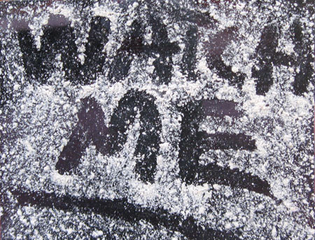
Next was to repeat the process in reverse on the side away. This created more of a picture as though generated by the crt itself. A brush was dipped in Albany slip and the dust was applied by running a finger over the bristle ends. A new screen in clear was used as smoky lucite obscured the effect.
Another decision is whether to present the ‘screen’ bowed out a little, or laid flat.
In this study I applied to the back, leaving the front reflective. The question of how and on what to mount it remains, as does the issue of the particular character of the finger work. The black and white contrast also appears a bit much.
Nobody said it would be easy. I would prefer to wait until I had a finished product to display, but A&P is about process, and this is certainly an example. Plus, we’re starving for posts.
Question: do you think that the writing should be on the side toward or away? Should it have a little bow ?

Side away + a little bow!
Jay, I love your playfulness!
Birgit:
But just a little.
Jay,
The first picture looks more like snow than dust, which is quite appropriate for a TV. Especially as the content tends to be a snow job, anyway.
Having the dust outside seems important to me. It also, theoretically at least, allows viewers to participate by drawing their own message.
If you don’t mind about archival quality, maybe you could get a nice dust layer by wiping the plastic with a bit of paper towel dipped in cooking oil, then blowing on a handful of corn starch or flour from a good distance away. I recommend stepping outside for this procedure.
Since we’ve been talking about faces, maybe you could make a diptych with a wide separation such that the two “screens” can be read as sunglass lenses. Whether you go that route or not, you could write reversed so that the message appears to be for who/whatever is on the inside.
Steve:
Insightful comments.
The snow angle (not snow angel) is what brought me to the plaster. Now I have a couple hundred pounds of mica, the likes of which are used sometimes for fake snow. Will go out and try that. Another approach to the issue might be via static electricity in that crts are notorious collectors of dust. I looked around for a way to induce a nice coat of electrons on a plastic surface without particular success as folks are more concerned with getting rid of it. That criss cross piece that I showed recently has planks covered in subtle lightning patterns that arose as an interaction between static electricity and spray paint.
Maybe those sunglasses could be added to the set of eyes that I threaten to make and attach to the front of the house. The eyes would be articulated and could be made to follow people as they walk by.
And as the eyes turn to follow a passerby, cue the sound of someone at a keyboard, as if entering data.
Jay, I agree the classic TV screen shape is iconic. Once for Halloween, I removed everything from an old TV, cut out the bottom to put it over my head, and went as a news anchor.
Steve:
I once went as a table with my head coming out of a flower pot. What an opportunity for a collaboration.
Good idea with the keyboard. I lived in a roughish neighborhood in Harrisburg back in the day. Created a painted cut out of a college chum, which filled my front window. It acted like a dog-in-the-window and I had no problems for the two years I was there. I’m afraid that the roving eyeballs would have an opposite effect in this town.
Folks:
This has nothing to do with Lucite, but I ran into a site called the Spanky Fractal Database that you might find interesting.
Jay, the fractal at that site looks reminiscent of my seaweed. But what takes you to fractals, anyway? Does it merit a post? Personally, I am a great fan of fractals.
Steve:
I tend to practice whim surfing in that I’ll Google some arbitrary word that I make up. I figured that ‘spanky’ would generate sites about a singing group maybe, or bondage or some cartoon character. Instead, I was looking at fractals.
Gumbycat was among the links and I ended up seeing stuff that seemed to have that nonrepresentational specificity that we at A&P will discuss. Time for a shout out.
Fractals spook me as they appear to represent a kind of eternity. I stare at Hubble images of minuscule red dots that are far off galaxies at the edge of time and ponder how remote seems the end of the street. Fractals are worse. I remember experiencing a spatial distortion as a small child with chicken pox in which my hand seemed miles away. It was my first encounter with a form of relativity and caused me to be wary of givens, a problem as I had been born into an Orthodox Presbyterian family. Fractals are similarly so near yet so far away.
Just to let you know that I have submitted a candidate term to the Urban Dictionary: ‘spasm’, referring to those jittery pop-up ads that sneak past my spam filters. Please include this in your prayers.