The Met has a special exhibition dedicated to Giorgio Morandi (1890 – 1964), an Italian painter who specialized in still life. Upon learning of my trip to NYC, my artist friend Nancy Plum recommended that I take a look. She added that Morandi, not terribly well-known in the US, is a ‘painter’s painter’.
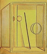
Upon entering the exhibition, my attention was captivated by two Natura Morta, both painted in 1918. This picture, copied from the web, has a reasonably faithful likeness:
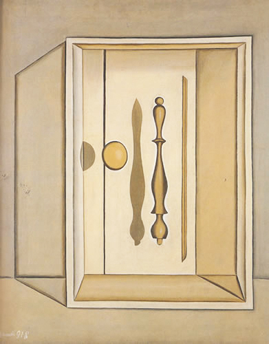
Here is the one that I liked even better because of its sense of optical illusion. Its actual coloration is the same as in the still life above. Unfortunately, the copy available on the web possesses a garish yellow that I was able to reduce somewhat, using AP. At the MET, one is not allowed to take a snapshot in a special exhibition.
The sharpness, fine shadings and elegance and some sense of optical illusion in these two paintings is fascinating.
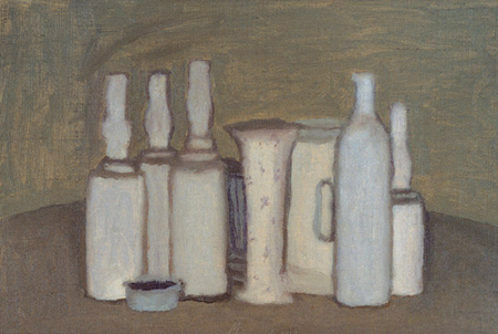
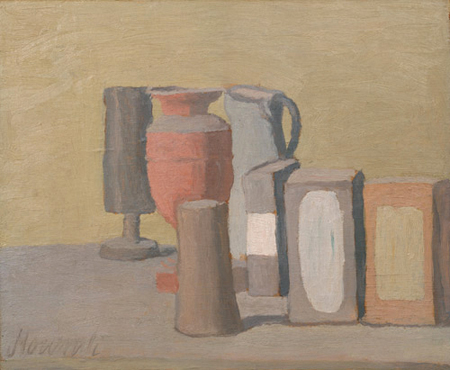
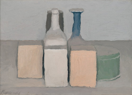
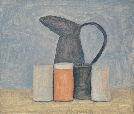
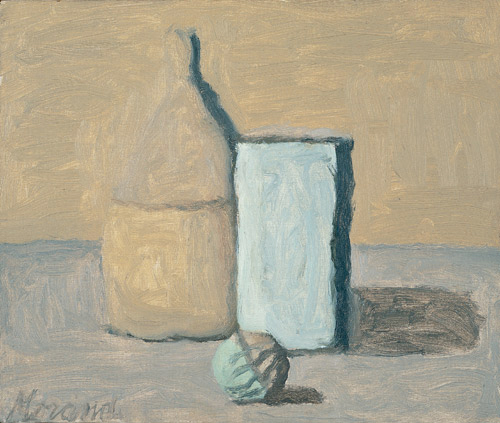
Other paintings in this exhibition are the type of still life for which Morandi is better known. Here are some of them, chronologically arranged – 1941, 1949, 1956, 1961, 1964:
Perusing these later, more popular still lifes now on the web, I am beginning to appreciate them better, largely for their interesting color schemes.
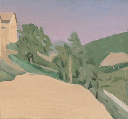
In the interval between the startling change in Morandi’s still lifes from 1918 to 1941, he painted landscapes such as the two Paesaggios from 1935 and 1942:
Any comments?


Birgit,
I’ve been reading about Morandi here and there over the last year, but especially recently with this show in New York. I liked Laurie Fendrich’s comparison of the bottle still lifes to family portraits. Interestingly, though she calls him figurative for obvious reasons, he himself said, according to Morgan Meis, “nothing is more abstract than reality.”
Morandi’s landscapes especially seem flat and abstracted, but the still lifes also seem to make little attempt at realism. He just painted what interested him, which was color, as you say, and also shape relationships. An intriguing thing I noticed is that earlier arrangements mostly involve frank overlap of objects, while later ones increasingly favor arrangements where the overlap is so slight it might almost disappear. In the next-to-last still life here, the glass on the right almost disappears entirely against the background. You might not notice it if it weren’t for its occluding a portion of the table.
I haven’t gotten to the point where I can say I like Morandi’s work, but I do sense it growing on me. I’d love to see the exhibit.
Steve,
I hope to be able to visit the exhibit a second time. At my first visit, fascinated by the clarity of the 1918 still lifes and much sleep-deprived, the later ones seemed clumsy. The 1918 still lifes, like Richard Estes cityscapes, need to be seen as actual paintings to be appreciated.
Thanks for the link to Laurie Fendrich.
I absolutely love his paintings. Not only are they best viewed in person but alone.
Birgit,
Thanks for all the images. I’ve been reading about and looking at web images of Morandi’s work, but hadn’t seen the landscapes before. And the chronology of the still lifes as attached to the images is new to me.
I really like his work. I like it that it’s just what it is — no attempts to seduce or flash, it just speaks softly and wears quiet robes (sorry about the metaphor…)
It’s totally different than anything I do, but it’s the absolute its-ness of his paintings, if you get me, that gets me. The landscapes have something of the same quality, although as web images, I’m less taken with them.
The 1918 Natura Morta have that clarity that you like so much; I can see why they would attract you. And the surreal illusions that both Natura Morta have are also something I see a bit of in some of your photographs.
I found it interesting that your friend said Morandi was somewhat unknown in the US — that was perhaps true five years ago, but he now seems to pop up everywhere. It might be that he speaks to our need to tone down our environment, to turn off some of the blinking taillights and dim some of the headlights that so blind us. Not to mention the unceasing noise that we surround ourselves with. HIs work seems quietly absorbed, paying not much attention to its viewers.
Birgit:
Had one of those episodes where an entire multi-paragraph comment disappeared from the screen not to reappear. It’s likely something I’m doing.
There was a time when Morandi popped up everywhere it seemed – like Bernard Buffet. Morandi”s work seemed to fill an ecological niche; a little more figurative than someone like Guston, but vague enough to fit into an abstractionist discussion. Guston came to mind, I think, because his later paintings of cigar chomping heads, boots etc. have, for me, a Morandish feel in their selection of shapes and spatial composition.
And this time around I find Morandi’s paintings to be rewarding to look at. It might have been a time when quietness was out of fashion, but his work came across more as a kind of stance than examples of the world filtered through a sensibility. Now I sense a mind in operation as it explores a number of intersecting themes. The more you look the more you see.
I continue to find the dissolving and coincidental boundaries especially interesting. He plays with that in the landscapes, also.
The best article on Morandi I’ve seen so far is some collected observations by artists who felt his influence: Robert Irwin, Vija Celmins, Dan McCleary, and Uta Barth.
Steve,
Dissolving boundaries!!! This insight provides the first useful explanation to me about the later still lifes and the landscapes. I am now intellectually interested but now yet in love with them.
To use another strong adjective, the ‘dissolving’ boundary of the left bottle in the last still life shown here feels really CREEPY to me. It was amusing to read in the review whose links you provided descriptions such as …CLUMSY, BUT… because ‘clumsy’ is exactly what my initial reaction to the later still lifes was.
I still have no explanation about the startling change in his painting from accentuated edges (1918) to dissolving boundaries in later still lifes. – After returning to NYC from Cambridge, where I am now, I will try to spend my last few hours visiting the Morandi exhibition again. Perhaps, the thick tome sold there provides the explanation that I am seeking.
The dissolving boundaries may be the technique that will solve my current conundrum in depicting waves where my contrast between the light tops of the waves and, below, their deeper blue is too harsh.
June,
I found it interesting that your friend said Morandi was somewhat unknown in the US — that was perhaps true five years ago,.. My friend is a ceramicist, a student of Toshiko Takaezu. Her husband was the painter who died about five years ago. The opinion that you found interesting could stem from him thereby explaining why it is outdated.
June wrote: “It’s totally different than anything I do…”
I sense a similar playfulness of alignments. Just look at the tops of the two aligned boxes on the right in the second still-life. Time passes. So simple and beautiful and why painting can be more Real.
My favorite is the third still-life: has anything more simple been more complicated.
Birgit:
What’s the atmosphere in the Morandi Exhibit? Is the lighting flat, or are the paintings spotlit? Are visitors quiet?
I keep coming back to the fourth painting with the blackish pitcher. It doesn’t appeal to me very much, but it obviously appealed to him. The pitcher itself seems made of paper mache’, as does the container at its foot. The blue background seems tentative, but more bravura and the feel would be thrown off, flatter and the same. However, there is a clash in the lights and darks and in the variety of shapes that adds drama to the sense of family portraiture that is mentioned in one of Steve’s links. Working in such a limited color and tonal range might be read as timid and a big step down from his earlier paintings, but that pitcher and cup is more a jump off the deep end. I wonder how he knew when he was done.
Jay,
I remember people exhibiting interest and excitement in a brightly lit room adjacent to the what I now remember as dark cave of the show (suggesting in retrospect that the pictures must have been spotlit). These people were animatedly thumbing through a book about Morani. I don’t remember much about people looking at his actual artwork. But, as I mentioned earlier, I was not in good shape having gotten up at 4 am that very day to finish some computer work before my flight to NYC and, I was confused about what I felt to be the fundamental change in Morani’s style from 1918 to his later work.
The picture that you referred to makes me think of Morani living with his mother and three sisters, Morani himself symbolized by the dark pitcher and cup.
Birgit:
Was his mother the redoubtable Molly Pitcher? Another possibility granted a little creative chronology….
Revisited the Toledo Museum of Art last week to find that they tend not to spotlight works so much, with the result that there can be a certain flatness of presentation. I may be all wet but a certain polite highlighting seems like the right thing for the Morandis. And the “dark cave” suggests something of the sort. Moreover, I sorta remember wanting to peer in on his paintings, much to the discomfort of the hovering guards. Might have something to do with trying to remove an expanse of wall and various distractions from my field of view.
About the waves, there’s a painting by Carlo Carra called “The Swimmers” that you might find interesting.
Jay,
I also like his ‘Ten dream’. I am busy shooting water, today at the Boston Aquarium.
Birgit:
I hope you tried not to get anybody wet.
Just adding a note for this and later Morandi posts. Joanne Mattera recently interviewed art dealer Stephen Haller, who had made a piligrimage to visit Morandi in Italy in the Sixties. Haller tells a number of stories about Morandi. The most interesting comment echoed Fendrich’s observation (see comment #1 above):
Steve,
One of my favorite painters speaks similarly of his teacups:
http://www.tedjulianarnold.com
D.,
Those are wonderful paintings! I liked the teacups series best.
I suspect this is an almost inevitable analogy that underlies our reactions to art and other things in our lives. Consciously or not, we extend our social way of understanding our world to the non-people in it also. Any child psychologists in the room?
“The painter of bottles” is Morandi’s legacy. From the micro to the macro, from vague to sharp focus, from the frivolous to the deeply meaninful, Art has explored every aspects of our lives and envirnoment. Morandi chose an introverted approach to life and art and maintained the discipline to be taken serious after awhile. Who would guess that some dusty bottles could keep an intelligent person attention? Morandi help expand our insight into our world and therefore the arts too.
Duke,
“from vague to sharp focus’ and then finally to partial loss of boundaries in his very last pictures (http://artandperception.com/2008/12/giorgio-morandi-late-work.html).
What tragedy that Morandi died before, as his friend quoted him ‘how very much he still wanted to realize his new ideas with painting’. To let a particular object/subjet sink into the mind is an appealing way to create art.
Birgit:
Could you give me your new e-mail address?
I’m extremely fond of Morandi’s work. It is direct and to the point but,
I believe that the compositions were very well planned .
His work is painterly with delightfully soft colors much like Utrillo’s
‘white period’.
Another somewhat comparitive artist might be Milton Avery. Each of
these painters had innate sensitivity, individuality and genius.
Enough already of photorealism’s tour d’ force albiet the ability to
paint like a camera. I’m fond of Morandi -yes indeed!
David T. Henry