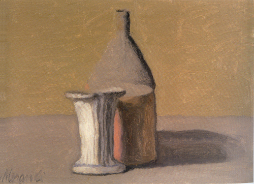
The two paintings by Giorgio Morandi shown here interest me because of what Steve called their ‘dissolving boundaries’. The first one was done in 1960:
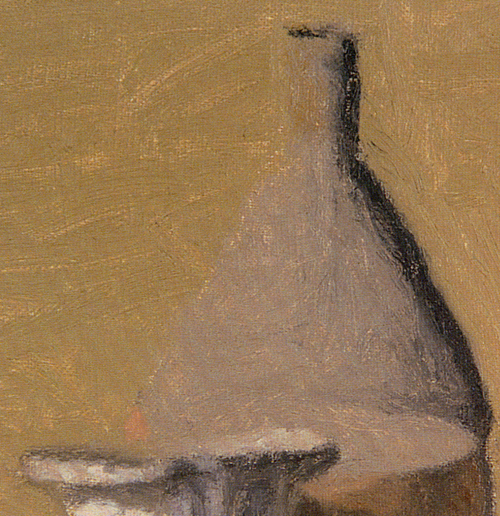
Here is an excerpt showing the boundary between the left aspect of the vessel and its background:
Looking at this excerpt here on the web shows a clear boundary between the vessel and the background. However, in the museum, standing back from this painting and viewing it from some distance made the boundary disappear. The left aspect of the vessel melted into the background. It was a fun experiment going close to the painting and then moving away while observing the boundary disappear, giving the impression that the top of the vessel was vertically cut in half.
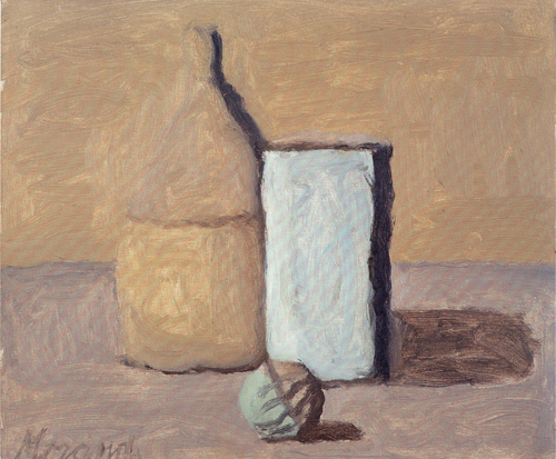
GM finished this second painting before his death in 1964:
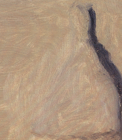
Here is its excerpt showing the left aspect of the vessel against the background:
This excerpt of the 1964 painting indicates the similarity in color between the vessel and the background. Here the boundary can be sensed from different directions of the paint strokes. A fascinating method.
A comment on the color in Morandi’s paintings: The pictures shown here were scanned from the book currently sold at the Met ‘Giorgio Morandi 1890 – 1964’. After I bought the book, I compared the colors of its reproduction with the actual colors of the paintings while standing right in front of the paintings and I took notes. Regrettably, the colors in all the reproductions are consistently warmer than the beautifully cool colors in the paintings. GM painted cool yellows, reds, greys and not in the warmer, ‘candified’ hues shown in the reproductions. What a disservice to the GM’s legacy to falsify the colors in what may be become an important resource book. I attempted to reduce some of false warmth by desaturating yellow in my scanned photos.
What do I like in the two paintings shown here besides their ‘dissolving boundaries’? In the 1960 painting, the cool red is fascinating. There is a ‘vibration’ between the white vessel in front, the oval of the top of the red vessel and the cooler greyish vessel in the back. In GM’s last 1964 painting, the cool, feeble looking yellow of the vessel contrasts with the clear turquoise (clearer than apparent on the web pic) of the round shape in front. I had not seen this turquoise hue in any of his other paintings. – At death’s door, GM expressed something like ‘how very much he still wanted to realize his new ideas with painting’ – a touching thought.
In summary, during my first visit of the Morandi exhibition, I embraced two of his 1914 Natura Morta because of their clear lines. In contrast, during my second visit, I learned to very much appreciate the two Natura Morta shown here, painted about 50 years later.


Birgit,
Thank you for these detailed images, they’re much better than the other ones on the web or in my old book. The last one is particularly interesting in the way the left edges completely disappears, while the right edge is enhanced by contrast with the shadow. I’m jealous of your chance to see them directly.
Your photos do seem to show a slight problem of faint, parallel red/blue bands crossing the images. I suspect this is a Moiré effect resulting from interaction with the dots of the printing with your scanner line resolution. You could probably do better photographing them with your camera, but that’s more bother.
Hi Steve,
Yes, in Morandi’s last piece, the lost edge on one side and the enhanced one on the other side is most interesting. Has someone else carried on from where he had to leave off?
Thanks for explaining where the red/blue comes from. I did not know about this problem with scanners, using them only rarely. I will experiment with photographing the reproductions in a few days.
That’s an intriguing perceptual effect to have an object that announces itself clearly from one side, but on the other, sneaks up on you before you realize it’s there. That sort of effect is probably not uncommon, but I can’t think offhand of another artist who deliberately plays with it, the way Morandi appears to do from his obscuring brushstrokes in your last image. The controlled setting of a still life is a good place for such experiments.
Photographing artwork or printed images is not trivial, but it should be OK if you can arrange even lighting, a somewhat diffuse source about 45 degrees to the side being standard. Depending on the light source, you may have to do some color correction on the computer. But you’re already aware of that. In principle, Moiré effects could still result from the sensor matrix, but it hasn’t been a problem in the little copy work I’ve done. For details, it’s better to use the lens to focus in, if possible, than to crop a larger image.
In Art in America I just read the article by Matvey Levenstain on ‘The Naiveté of Morandi’. He used the word ‘awkward’ which reminded me that I used the word ‘clumsy’ in my first post on Morandi.
But standing in front of Morandi’s paintings at the Met last week dispelled this notion: Every stroke of his is intentionally and masterfully executed.
Levenstain uses Naiveté like Schiller did :
“In another major theoretical essay, ÜBER NAIVE UND SENTIMENTALISCHE DICHTUNG (1794-95, On Naïve and Sentimental Poetry), Schiller explorers the contrasts between the “naive” and “sentimental” modes, enlarging his study into analysis of nature and culture, feeling and thought, the finite and the infinite. Modern poets will never regain the immediate and unconscious-the naive-relationship to nature. Poets, he argued “will either be nature, or they will seek lost nature.” Introspective by nature, Schiller considered himself “sentimental” or reflective writer, when his friend Goethe was an archetype of the “naive” genius. (Copied from http://www.kirjasto.sci.fi/schiller.htm)”
Birgit,
Thank you for the further exploration. I’m fascinated by your insights and thrilled that you had the chance to go back and look twice and make notes and then shared them with us. I keep thinking about the work I just did this week and am going to post on, so I guess I’d better get on with the posting, so I can check out my comparisons.
PS: I wonder if Schller’s “nature” could be translated to anything in one’s immediate environment. In some perverse way, I think most people have a naive/immediate relationship to, say, the urban environment — the vehicles, noise, surrounds of buildings and people. They move through it as one with it, and while that violates all the Romantic notions of the “natural”, it seems to me that the substitute exists, nevertheless.
Or maybe I’m just maundering about here, trying to fit a square into a circle with contacts at all edges.
June,
Woody Allen objected to the countryside because of its lack of noise.
Guys:
Have you ever stared at something steadily until it starts to dissolve in your vision? This happens with various optical effects. It’s as though Morandi may have experienced a kind of visual fatigue from regarding his subject, that ended up erasing some figure/ground contrast.
What we were talking about here was also described by Robert Irwin. In Seeing is forgetting… he compares Morandi with a more “modern-looking” contemporary, Pierre Soulages:
Just look at the necks of the two bottles in the images here for a clear illustration of Irwin’s points.
Steve,
I just reread that last night and something may have clicked. Thanks again for getting me back to Irwin and then for inserting this passage, which I had already thought was important to me somehow.
Joanne Mattera has posted a very nice interview with dealer Stephen Haller, who knew Morandi in Italy. Morandi comes across as a very quiet man who lived simply and without distraction.
Interesting to read this string of comments on Birgit’s post on Morandi. I regretted not getting to see that show. The Mattera interview of Haller on his memories of Morandi was very moving, and refreshing in this time of careerism.
Disappearing edges were part of Albers teaching, and there are several examples in the big “Interaction of Color” book, if you can get your hands on one of the editions with the portfolio of silk screened examples. It was published originally in the mid 60’s… by Yale, and then a facsimile was published by a German publisher around 1980.
Colors of equal value and fairly low saturation will generally produce disappearing or ‘fugitive’ boundaries; conversely colors of equal value and high hue contrast produce vibrating boundaries….which can seem like day-glo paint,
Color reproduction, particularly where precise and subtle color is hugely important, is always a problem! Color ‘rendering’ may even be a problem for galleries and museums in terms of lighting work….work painted under flourescent or tungsten light will appear quite different in daylight. It’s also always been a problem for artists who can’t afford professional photography in photographing their work. I always struggle…with the painting in front of me, to get the right value range and color balance in digital images on a monitor.
Bruce,
“Colors of equal value and fairly low saturation will generally produce disappearing or ‘fugitive’ boundaries…” This explain the effect of the dissolving boundary in the first painting shown here, upon stepping away from the painting.
I was touched by Morandi’s very last painting. I wish that he had lived longer to follow up on what he was doing there.
Steve,
Reading quickly through the interview that Joanne Mattera has posted with dealer Stephen Haller, it struck me that Morandi would not sell Haller one of his paintings arguing that they were commissioned by art dealers. Could that have been one of the enticements for becoming an art dealer?
Bruce,
Thanks for the notes on color. I had been thinking of these subdued, not to say shy, colors as reflective of the man himself, but hadn’t considered the significance of their interactions. It appears the local university library has a 1963 Interaction of Color available, I’ll have a look.
I’ve just recently tried photographing art for the first time. One thing that helps, if you haven’t tried it, is to have a neutral white or gray card in the image which can be cropped out, or in a second image. Adjusting color controls to render the card with equal red, green, and blue pixel values–or just to appear a good white/gray by eye–should help.
Birgit,
I was actually wondering if the pictures were indeed promised to dealers, or if Morandi for some reason didn’t want to part with any. Or perhaps he didn’t want to ask from a young friend as much as he would be paid by a dealer. But certainly becoming a dealer would be a way to get to know some art and artists much better.
Steve;
Thanks for the suggestion about color correction…it sounds simple and effective.
It’s great that you found an available copy of the Albers book…be prepared to spend some time. There are probably over 100 plates, in separate folders, and the booklet of accompanying text is not too clear or comprehensive. Some of the images are self explanatory…obvious examples of transparency, color interaction, etc….some are pretty puzzling. Good luck. They are all from his students work with colored papers, and his teaching was challenging as he posed problems, with no directions or recipes, for the students to solve. He had some advantage in havng students who included Alex Katz, Chuck Close, Richard Serra, Rackstraw Downes, etc. Rauschenberg also studied with him at Black Mountain, and later said he didn’t understand any of it!
Wow!! I only had a half hour with the Albers, but it was eye-opening. I’ll be back, bringing a new pair of gloves–the ones clipped to the case are pretty old. The Vibrating Boundaries were almost physically hard to look at, my eye just didn’t want to examine that edge. I was also captivated by the Transparency and Space series, which is very applicable to my black-and-white work. The charming Leaf Study series I happened on is one to examine more closely later.
Steve;
It sounds like Albers has a new student….certainly a fan. A simple and fairly amazing exercise is to try to find 3 colored paper samples that will create the illusion of transparency. Arrange them so it seems that the shapes overlap.
Yesterday, while sketching at the beach, I talked to a local artist, Roger Matson, about Giorgio Morandi. Roger told me about the Morandi museum in Italy and I told him about the Morandi exhibit in NYC last year.
Morandi’s ‘dissolving boundaries’ in his later pictures now acquired a new significance to me after just having read Jill Bolte Taylor’s book ‘My Stroke of Insight’. Trained as a brain scientist, she recounts in detail what happened to her as her left hemisphere was inactivated by bleeding. Dr. Taylor experienced what is the goal of many meditators, namely a state of bliss, and here is the important point, suddenly lacking boundaries, she felt fluid, merged with the universe. The normal experience of having boundaries, feeling solid, only came back as her left hemisphere began to slowly function again.
Here is my speculation, venturing into mysticism. Was Morandi inspired to paint ceramic vessels with dissolving boundaries because he was transitioning to a new state of experience close to his death? Was he recording the experience of losing boundaries that Dr. Taylor associates with left hemisphere function?
Watching the dissolution of boundaries is fascinating. Yesterday morning, an unusually warm day in March, the sublimating snow created a fog on top of the Sleeping Bear Dunes so that they seemingly merged with a overhanging cloud.
As I just mentioned in a post, I’m certainly interested in such boundaries in my own work. I hope I haven’t had a stroke or am approaching death! Though those could also be motivators for an interest in edges.
Jill Bolte’s TED lecture is highly recommended.
As de Chirico noted,