On Monday, I painted two plein aire oils from the uppermost level of a parking garage. On Tuesday I attended a crit session with some other painters that I meet with regularly. OF course, I showed them the paintings.
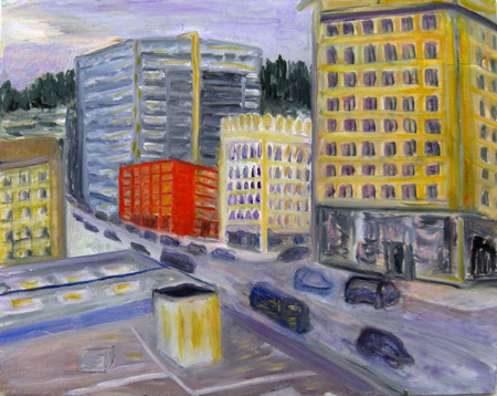
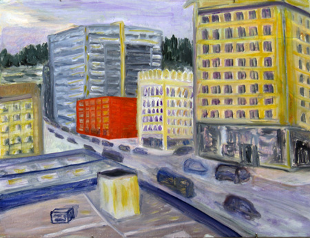
I managed to remember to photograph the first painting twice — once as it emerged from the garage session, and then again after I had been through the critique and had tweaked it in the studio. I didn’t do a lot to this painting in my second go-round, but when I finished I was concerned about the loss of some of the “naive” quality of the red building. Here are images of the two versions:
Library Parking Garage, View South (first draft) 12 x 16, oil on board
Library Parking Garage, South View (draft 2), etc.
The differences between the two are slight, but the concern expressed by one member of the crit group was about the wonky perspective on the red building. I later mucked about with that building (as well as darkening the edge of the roofline the takes up much of the bottom of the painting and which will get more work). I’m not sure the red building, as it now stands, is what I want. Another person suggested perhaps making all the buildings more wonky, which I didn’t have time for, but would still consider.
This series of decisions (as well as a rather funny comment by a fellow critiquer) is what made my ears perk up when I read the Schiller quote. Is the first wonky take more “naive” in Schiller’s sense, than the second, somewhat less wonky, version? The comment from my fellow painter (who actually defended the wonky perspective) was something like “I’d like to be behind your eyes, seeing what you see when you drive down the street.”
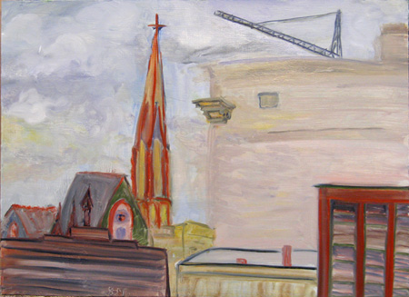
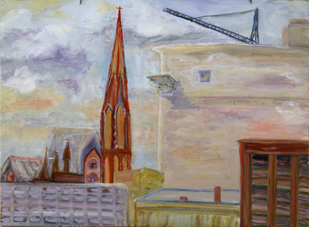
The second painting references the Morandi/edge discussion and is a continuation of my visual wandering around the constructs of edges. I don’t have a photograph of the original post-garage painting, but the photo below is of the painting after I worked it a bit prior to the critique session. My hasty working was to try to eliminate the edge that runs down the slab of building in the center of the painting. My intent was to push that building out of the way of the steeple and crane, both of which were central to what I was seeing.
The Library Parking Garage, West view (draft 1) 12 x 16, oil on board
After the critique, I modified the edge treatment of the slab, as well as pushing back, through losing the edges, the church roof and the foreground building edging. I also added shadows and changed hues a bit — the result is shown in the image below.
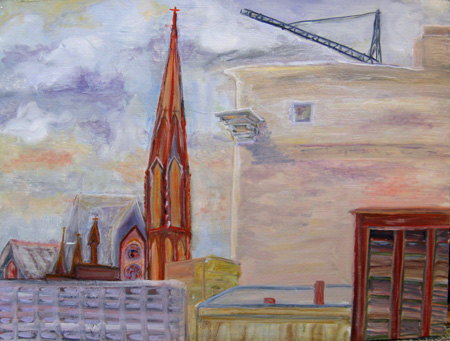
The Library Parking Garage, West view (draft 2)
This last version, below, now sits in my studio, awaiting further revelations; I have made the slab more colorful and attempted to mirror somewhat the big block of sky on the other side. I also modified some of the color in the bottom righthand building.
The Library Parking Garage, West view (draft 4)
So to recap: In the first version, which is close to what the original looked like, I tried losing the edge of the big building on the right. Then I went to the critique meeting, where the lost edges were seen as too lost but also some of the other edges as too defined; so I added the lighter strip down the side of the big frontal slab and muckled about with the edges of the other buildings. Further emendations included changing some of the color, sharpening the steeple and church elements, and attempts at making the slab wall on the right echo something of the sky on the left.
I’m still debating about reinforcing that edge and wondering what it is that losing or finding or almost finding an edge means to the painting as a whole. What I was thinking of while I was painting was the sharpness of the steeple and the crane and the losing any impact of the slab, in spite of its size on the canvas (and in my view). That’s what happens in cities — people no longer see the altered, mangled buildings that sometimes inject themselves into photographs. But why did Morandi lose his edges as he does — is it the sense of oneness of all things, the lack of object individuality that he’s concentrating on? And then he delineates a very strong contour line on the opposite side of his lost edge, so he not only finds the other edges but thrusts it at us. Somewhat like that crane thrusts itself…..
OK, I’m through meandering. Please comment willy-nilly as you will. And I’m interested in why one loses or finds or sharpens or softens edges — not as a matter of aesthetics or realism, if you will, but as a matter of intent and philosophy.

June:
Is the garage actually that red? I wonder what would happen to the overall effect if the garage were to blend in a little more. I do have a comment about the vehicles. Maybe it’s the result of stringing lights around today, but I can see your line of cars and trucks as having a bright and colorful potential.
Jay,
I think the question is not, is the garage that red, but whether, does that particular fire engine red work in the painting. I’m rather fond of it, but too close to have a very good take on whether it works. For me, it’s the wonderful contrast between the gingerbread larger building beside it and the increasingly larger and bolder buildings all around. The little red building that could, one might say. And when I cover the building, the scene becomes boring to me.
As for the cars, I was proud of myself, not mucking about with them. I don’t want to paint more cars. I’m tired of painting cars. I think the wheeled vehicle has altogether too much presence in the city and in this painting I want them to be whispers of themselves. But you are right, of course. Perhaps I could substitute cars for the little building that could. But I’m not going to…………………… I’m on an no-more-cars kick — maybe it’s living with all these green folks.
By the way, the red building is not the parking garage. I was painting inside the parking garage, looking south down 10th Avenue. I almost called the painting “Not the Library” since the building that is just off the canvas to the right is a grand A.E> Doyle neo-classical Central Library. It was too good to paint.
June,
I love seeing your work in progress. From what I can make out in the web images:
In the first series, I am amazed what difference the windows make on the right site of the red building. The windows strongly enhance the luminosity of the yellow building to its right and even a little that of the grey-yellow building behind it.
With respect to ‘wonkiness’ I like the impact that one wonky building has on the remainder of the straight buildings.
I copied the yellow thing in the foreground and desaturated its colors to be some dirty yellow/green. I like the resulting look of the foreground as a ‘whisper of itself’. But then, the correspondence to the other yellow buildings was diminished and I realized that the bright yellow has its purpose. But why does the little black outlined box in the foreground has to be that much in focus?
In the second series, I love the enhanced left edge of the large building. But in the last picture, I miss the wonkiness and the brighter colors of the brown-red building to the right. Its slight angle in the first picture of the series gives the impression that it bends away as a respectful gesture to the tower with similar color while it the last picture, it stands up straight, unaffected.
Hi, first, I’m glad to find this site through your email — second I’d like to add a comment or two here as I too am fascinated by process and the effects of color and light. my impression of the red building in its wonky version is that it holds the slightly off center space and enlivens everything on either side of it. the second version, for me, loses that excitement. in fact, when the red building is wonky the others look more in motion — while they lay more flat without it.
two other comments — I agree with Jay about the cars having more potential for light and color as that would help emphasize the movement in the painting — not more cars but just some brightening up —
and last, about the edge of the roofline — darkening has the effect of pushing that edge down into the painting and making the street appear to float — if that is what you want it is successful — my perception though is that if the street were darker than the edge of the roof (as that edge is in the first draft) then you’d see the roof as above, the street as below it where in the second version that perception is reversed. bringing more detail into the box object on the roof gives it more tangible closeness to the viewer which suggests its closeness —
all in all this exploration of perception and individual’s responses to what we see are a fun part of the process. thanks!
June,
I love how the Morandi/edge theme is woven through recent posts. It feels very productive to see and think about something over time and in different contexts. My own upcoming post (yes, I am very behind) relates to the same ideas in yet another situation.
I like these cityscapes. I thought I liked the second version of the red building better than the first, because the color is already enough to highlight the red building, and wonky perspective in addition seems to be too much. But I really liked Elaine’s comment about the other buildings sort of dancing or reacting to the red one. Perhaps they could have a bit of a weave to them, or be leaning slightly towards the red one.
More later…
Birgit,
As usual, you are right on. The black box was the result of a forgotten experiment — now lost forever except here on A and P. A mistake, in short, which I had overlooked. It’s why I have work in progress — so I ultimately have a chance to see that which I missed the last hundred views.
Oh, and the red building has returned to its original wonkiness. The more I looked at it the less I liked it as a more literal rendition. So I wonked it out.
And as you noted, I straightened the building in the second painting (the one on the right) and toned down the color a bit. I’ll have to look at it again and see what I think. I may have to wonk-up the other buildings in the first painting to talk to the red one and assure the skeptics that what I’m doing is intentional. Being faux-folk is a dangerous business — you may be mistaken for a bad painter [add that snort here]
Thanks for your comments — good eye, as usual, and very kind besides.
Hey Elaine,
Welcome. Good to have you here and good to hear your comments.
I played around with the edge of that roof today, in light of what you said, and I think your suggestions are going to work. I’m still playing — the paint is a bit wet for a good take, so it will be a few days. But making the roof lighter, while retaining the sense of a vertical edge, and darkening the street makes good sense to me. Now if I can manage it…..
I also added some faint color to the cars, but only because you and Jay ganged up on me. I have to admit to disliking the drafting of the automobile in my paintings — and that’s in spite of having to do it all the time. It’s like poking a sore spot. That said, I’m fussing with a bit of color on those vehicles. I’ll photograph what I’ve done when I’m “finished”; the photos make comparisons relatively easy and sometimes decisions too.
Thanks for checking in. I’m looking forward to future comments from you.
Steve,
As I told Elaine and Birgit, I’m thinking of making the other buildings more off-kilter. It’s interesting that that was one of the suggestions from the crit group the other night — in opposition to the suggestion that I got entirely straight with all of them.
I’m having a good time with edges, when I can remember to. I have no problem with smooshing and playing with edges in landscape, where atmospheric perspective seems to be obvious. But in city landscapes, there are more options for more reasons to play around with edges — more edges, too — so like those still lifes, I have to keep fussing.
I’m happy to hear you’ll be fussing too.