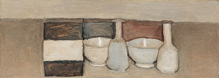
It’s been instructive to continue experimenting with photography à la Morandi: not attempting to imitate, but rather to explore some of the themes he seems to be working with, or at least what I find myself working with as I go about it. One thing I realized looking at more of his pictures, both online at the Metropolitan and the Morandi Museum, and also in a book found at the library, is that he was often interested in the modeling of masses by the light falling on him. This was contrary to my impression from the quite flat images that seem to be more common. Perhaps working in both modes was his own form of experimentation.
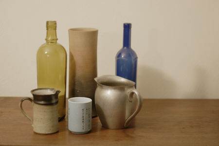
My first job was to find a plain background, and also work with lighter, more Morandi-like colors (though I personally tend to prefer dark ones) than before. In arranging a still life with bottles, etc, I was very aware that it was hard for me to get anything interesting. I certainly didn’t succeed. On the other hand, I can’t say I find Morandi’s arrangements very interesting, either. It became quite clear that playing with edge alignments, making them rhyme or overlap or extend, afforded a necessary compensating interest that occupied Morandi even more than it did me. Picture after picture from the book exhibited the same kinds of relationships. In this vein, Morandi was said by his friend Roberto Longhi to have admired Seurat for “mathematically” planned compositions and Mondrian for his strict rigor (for more, click on “The Care for the Image” at the Morandi Museum home page.
Another observation on composition: Morandi seems to have had little concern for the negative space in his still lifes, or at least they seem unremarkable that way. His objects are, in fact, almost always jammed together, leaving no negative space at all. My second composition, with one bottle well off to the side, is very un-Morandi.
In general, Morandi’s attention seems to have been mostly on the individual objects, and certain aspects of their close relationships. I noticed that one effect of vague boundaries or coincidental alignments is to draw the eye to those places, where I find a local appeal stronger than the whole.
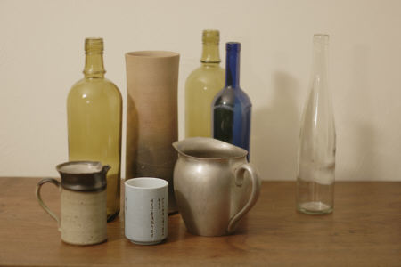
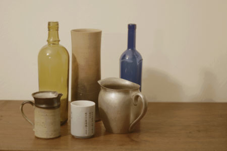
I did make one attempt to create a more “painterly” image by partially posterizing it to simulate a limited palette. Below, the top image is the result of that treatment, the bottom is the original. I’ve deliberately not overemphasized this, so you have to look a little closely to see the difference.
If nothing else, this exercise has convinced me of the usefulness of copying as a means of learning style and technique. It’s been helpful for me in getting to know Morandi. And I expect that some aspects of his approach will find their way into future photographs.
Have you ever engaged in copying as an instructional method? Was it effective for you?

I transcribed Death in Venice.
It was a profoundly interesting experiement in getting cose to a text.
Steve,
I have to think about your statement I noticed that one effect of vague boundaries or coincidental alignments is to draw the eye to those places, where I find a local appeal stronger than the whole.
Melanie,
How did you transcribe Death in Venice?
Melanie,
That’s a great parallel. Perhaps painting and photography are somewhat like different languages. One gets to know a writer’s concerns and style, but that doesn’t mean it’s easy to put into other words. Not that I know Morandi all that well yet. I did learn more German reading Mann with a dictionary than I ever did in the classroom.
Birgit,
I typed it — or, as we say and do now, keyed it. I thought seriously about transcribing it by hand — mostly for the pretension factor — then remembered who I am and decided against it. I’m surprised that I finished it. I’m forever setting grand and modest goals, then abandoning them by the end of the same breath it took to voice them. (I worked with a translation, I don’t have any German beyond being able to count to ten, while mispronouncing every syllable)
Steve,
I think of the various arts not so much as different languages, although I understand the analogy, but rather as different methods of analysis. The arts are as much about problem-solving as is any other discipline. There is value in practice, and transcription of various kinds is a good practice.
Hi all,
Sorry to have been absent for so long. I’ve been reading but too overwhelmed by other art chores to weigh in.
First, I must admit to being in awe of Melanie’s transcription of “Death in Venice”. I know lots of folks who poured over Hemingway (and then wrote like him but not so good) but I don’t know anyone who actually transcribed in order to comprehend more thoroughly. I think it would work on one’s subconscious in ways I can’t even begin to understand.
Certainly copying, or imitating, or playing with the ideas inherent in, the visual work of another artist has long been a way to stretch one’s own work. So, transcribing Mann should have the same kind of effect. And Steve, your varying takes on Morandi are also admirable.
But I see a lot of interesting negative space in the Morandi as published here on A&P, and in fact, would submit that that’s one of the reasons his work still appeals. But I haven’t read the links that you’ve found, Steve, so I guess I should do my homework before I open my mouth too big. I too have to think about your statement: “I noticed that one effect of vague boundaries or coincidental alignments is to draw the eye to those places, where I find a local appeal stronger than the whole.” I will think more before I post my blog entry (sometime very soon, honest).