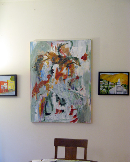
Across from my normal sitting place in our dining room (which is really our living/kitchen/common room) are some paintings –Frippery, 36 x 40″ oil on canvas, Condon Library (far left), and Heppner Courthouse, both 12 x 16 inches, oil on board.
To my right as I sip my morning coffee, are some other paintings, Numen and Heart, both 30 x 40 inches, oil on canvas:
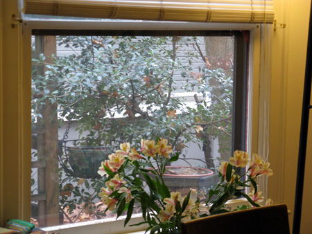
To the left is a window that often acts as a painting:
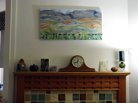
Far left, on a slight diagonal wall over the fireplace, is another painting, the Mascall Formation Overlook, 18 x 36″, oil on canvas.
What all of these have in common is that I look and live with them daily. And, for the most part, they are my own creation (out of modesty, I don’t claim to have created either the flowers nor the foliage outside the window).
Looking and living with your own creations leaves you few excuses for bad work. There they are, the paintings you did or the flowers you arranged or the foliage you planted, staring back at you, day after day. It’s a wonderful, merciless experience and grand for teaching one about one’s art.
The questions I ask myself, over time, are as follows: Why did I like this art when I first put it on the wall? What does it do to the room? What do I look at most often within it? Do I like this art a week later? A month later? Six months (if it lasts that long) later? Do I even “see” it after it hangs for a while or does it just disappear from consciousness? What will be done with it when I take it down — stored, destroyed, sold, revamped, revisited, reviled? Are there better works to be done, inspired by this one? Do I ever want to do anything like this again?
Naturally the piece immediately in front of my coffee-drinking face is the one that garners the most attention. It gets the most criticism. And sometimes gets most extensively redone. Or taken down and put into deep storage. Often I move the ones from the sides to the front, in order to better assess what they are like when they are “in my face.” But sometimes, even on as they hang to one side, I can suss out the necessary info.
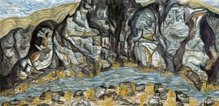
For the last six or so months, I had a 5 x 9 foot textile piece hanging on the right wall: Goose Rock, 48 x 108″, painted cotton, backed and batted with cotton, machine stitched.

By the time I took Goose Rock down, I was seriously annoyed with it. Right now it’s stored, but shortly it will either be cut into three pieces, almost equal in size, and/or given the “needle” treatment — that is, much more heavily quilted. It may even go back to the studio and get painted on more, probably after I’ve done more stitching over the top. Or maybe I will cut it into 3 unequal pieces and then cut the worst-composed one into more pieces and do something with all three thereafter to make it stop annoying me!
There’s also a kind of monotony to the piece that I’m not sure what I can do about. The effect of such a large wall covering is like that of tapestry — but tapestry tends to be multiplicitous in its imagery — or sometimes, like abstract art and color field painting, large swatches of subtle color. This representational kind of work might simply not be right for the large wall hanging. Or it might be that the wall on which it hung was not right for the work.
As you can tell, I’m still thinking about what needs doing to the piece that no longer pleases my eye and my visceral reactions (ie my gut). Next I’ll probably move one of the right side paintings to the front, so I can give it an equal share of criticism.
What art do you have hanging around that you think of changing — or keeping in exactly the same place forever? Does anyone else use their favorite sitting room as a critique gallery? Do you frame and hang your photographs and art? Do you keep bins of not-quite-discarded materials from which you may someday rescue them? How do you critique your own work and what do you do with it once you’ve come to some kind of semi-conclusion?


June:
When I think of your coffee drinking room my mind turns to that long board that dominates your floor. Now that I have dealt with that image, let me say that the painting centered in your first photo hits my buttons with its flowing composition and pleasing use of color.
Used to be that I would crowd the walls with bad art – much to the dismay of my wife. It’s now boiled down to three spots, one of which stands empty. That said, I do subscribe to the principle of the living room test, which it appears you practice at length. It is one thing to sequester your work in progress in a set-aside place thereby to contemplate it in isolation, and quite another to ask it to compete in a diverse environment. A piece in the dining room has already failed the test and awaits removal for disassembly or further development. Over time I have so cultivated a sense of dissatisfaction that hardly anything gets a clean bill anymore.
I see all kinds of creatures in the rock face of Goose Rock reminding me of seeing faces in New Mexico rock surfaces as well as this week’s visit to the dinosaurs in the Boston Science museum. The appearance of the body of water in front of the rocks seems to diminish them.
Jay,
It’s possible that you are too hard on yourself, a result of a long hard life….
I think your ladder would look splendid on one of your walls and although my memory is spotty, I distincly remember the architectural piece in foam going up your stairs.
As for “clean bills” — oh, mercy, man, what kind of creditors do you have in your head? You want perfection? — it only happens when the bones are picked clean — and even then, a bit of flame would refine them further. Pefection is perfectly entropied, methinks.
So there!
Birgit,
You are right about the water, which is one reason the piece will get redone. I might even remove the water — that’s a thought. I was wondering if I could push the piece to total abstraction and still make it of any interest. I had started by cropping it vertically, but I’ll try some other ploys as well. The nice thing about fiber is that cropping is quite simple and seamless (unless you seam things back together again….)
I once had an arrangement for temporarily putting up photographic prints to “live with” in that way, but it’s been unused for quite a while. Most of the house is poorly lit (big trees surrounding), so it’s not conducive to evaluation. I do have quite a few photos on the walls, but find I seldom look at them. What works much better for me is to go over my collected prints organized in series in boxes or portfolios. It’s easier to hold a print in your hands for close examination, to put different ones next to each other, and so on. But if I had fewer, larger works, hanging on the wall would be the better option.
About Goose Rock: I’d be interested to see this extended upward with a moderately wide strip of that sky, which struck me as flowing like the river. Then the swath with the rock face becomes like a stream itself between banks of blue–it even has waves! And conceptually, that bit of geology on display could be considered more transient than the stream and sky. This would also allow the picture to turn towards the abstract, though with a more color field feeling than your other nice abstracts.
June:
Perfection? I wish that my doctor will issue me a clean bill of health, but she is under no obligation to declare me perfect. There I was in the Toledo Museum haranguing a guard about perceived shortcomings in a Matisse: too monochrome here, needing a brighter yellow there. In a sense I’m bidden to appreciate, but my eye has developed a case of jaundice.
But how are we so different? I try and try again in an effort to get it right, as it would seem do you. Goose Rock’s neck comes closer to the chopping block with every gander. Steve restlessly explores and Birgit shoots water because there is a challenge out there. We all are aware of how small we are and how high it is. But we are all proud dues-paying members of the Sisyphus club
June,
Water? An effective, simple way to depict water is using orthogonal lines, horizontal for the water and vertical for the reflections. Used by Turner for his ‘The Grand Canal, Venice, ca. 1835’. Looking at the same picture now on the web, the orthogonal lines do not appear as clear (ship masts and water), presumably because the painting is large and its web picture is very small.
Horizontal water lines are very clear in an giant painting by an American Artist at the Met (name?). He first painted the rock reflections and then added straight horizontal water lines on top.
To learn more about painting water such as your mountain brook, I just bought ‘The complete guide to painting Water’ by Bert N. Petri. The book looks interesting but I plan to use a different painting style than he did (If I ever figure it out!!!). Petri’s and Richard Schmid’s books reveal their writer’s different temperaments, one such difference is the availability or not of an index.