June’s recent post about trying to gain a sense of personal expressiveness in one’s landscapes—which, on the face of it, are more about the place out there than the one in here—set off resonances. All the more so as I had just returned from a day in the mountains where I had gathered one of my more coherent set of photographs in a mode (style?) I feel I’ve been seeking for some time (all in one 10-minute stint, the only halt of the trip). And then her mentions of Wood and Hockney added to the echoing cacophony.
 1
1
I’ve said before that I’ve never hit a comfortable stride in photographing the larger landscape. Most of my work has been on a smaller scale, such as my last-posted winter stream study. I’ve certainly been trying, but it has seldom felt right, the results veering from a postcard look—pretty but unoriginal—to boring.
 2
2
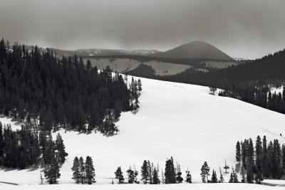
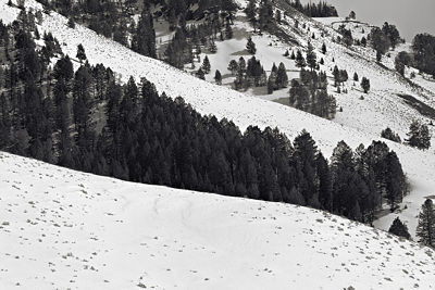
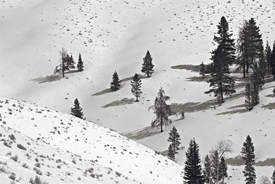
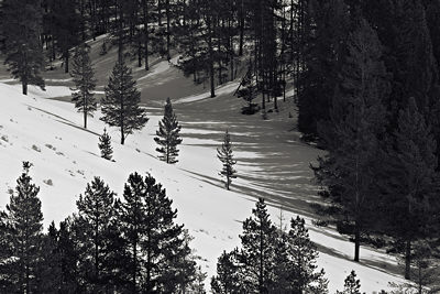
Now I’m not claiming that the hot-off-the-memory-card images shown here are especially great, or exceptionally expressive, or reliable predictors of what future work will look like. But they did feel good in a way that generally eludes me. They do capture for me, albeit imperfectly, some aspects of landscape that I haven’t managed well in previous work. One of these is a kind of musicality, by which I mean rhythmic and flowing structure. Another is the pure pleasure of shapes, especially the interplay of positive and negative definitions of them.
 3
3
If interested, you can find a few additional images in this Tepee Creek series on my web site.
 4
4
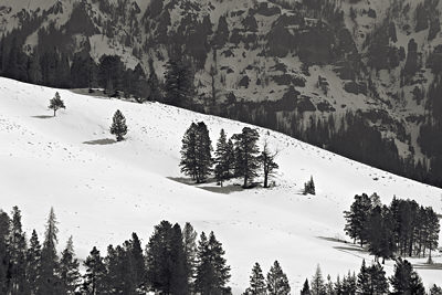 5
5
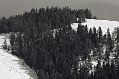 6
6
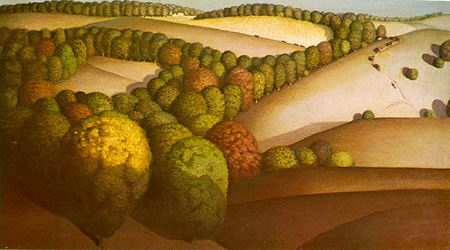
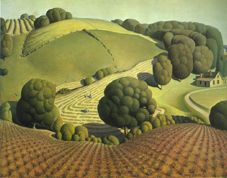
I was particularly struck by June’s examples of other artists. I’m sure I’d seen Grant Wood’s landscapes before, but had forgotten them. A number seem to suggest a fascination like my own with trees as punctuation on the rising and falling land. See, for example, these Wood landscapes from the site June linked to:
June’s other model, David Hockney, is one I’ve been reading about lately in the Weschler book, True to Life, which includes discussion of the recent East Yorkshire landscapes, like the two shown below. Though not stylized like Wood’s paintings, the subjects certainly have much in common. (To view more of these Hockney’s at Annely Juda Fine Art, select “previous exhibitions” and scroll down until you see Hockney listed. Hockney has also been working on larger multi-canvas paintings in Yorkshire; see e.g. the video at La Louver.)
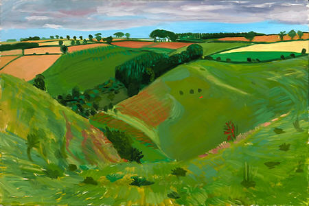

Both Wood and Hockney are more concerned with the domesticated environment than the relatively (but only relatively) wild one. I share their interest, and have also photographed in cropland areas, though I think I’ve done only a single A&P post on them. Naturally, these tend to provide more structured or rhythmic compositions than mountainscapes. In that sense, my lucky catch owes much to the genius of the place I was in.
My personal view of the landscape, to the extent it comes through, is conveyed most importantly by my selection of what’s in the frame. I think it’s not too strong to say that the structures delineated by the trees and other elements are created by the framing as much as by the varying patterns on the land. So what you see reflects my predilections as well as the facts of the place.
Is there a question in this? I’m not sure there is. Or maybe there are too many. At any rate, it’s one more installment in a neverending tale.

Steve,
Great photos. I found myself thinking that “3” was not as strong as the others. But then I read your mention of “musicality” and I took a closer look and I could see what you meant. I think my initial problem was that the picture simply merges with the white background. So I tried to frame it:
I played with the frame width. It makes a huge difference, the width, of course. Here I tried something similar to the pine tree width. Also, the form of the nearer snow-covered hill becomes more salient.
Karl,
Thanks for the suggestion, you seem to be in a framing mood these days. You’re quite right that the frame has a significant effect, and it’s especially important, given how these images (are supposed to) work.
I find your frame a little too broad. I think something thinner suffices to provide the frame, without isolating this bit of landscape quite so completely. I haven’t really played much with the balance between focus and suggestion of continuation, but what do readers think of this?
I love the gentle slopes, seen here in the mountains or in the dunes.
The two frames give very appearances to picture 3. I looked at the 2 different framings for a while, copied side by side, and I cannot decide which one I prefer. The wider frame makes the landscape look more dramatic while the thinner frame creates a wider expanse.
Isn’t the lighting on the first Wood landscape surreal?
Steve,
Elegant, not too wide, not too narrow.
One aspect of skiing or mountain biking is the intense attentiveness to the immediate surroundings. The World gets small: this is where you are. Your Unsky Landscapes nicely remind me of that experience.
intense attentiveness to the immediate surroundings
D.,
Thanks for putting this into words. I had precisely this feeling of gliding or falling into the landscape, especially in the framed image above with the rounded hill in the foreground. The little trees at the bottom are especially interesting, as if they are saying (“Yes, slope hill is BIG”).
Birgit,
I think Wood’s hills are mostly odd for their smooth shape and texture. The lighting seems exaggerated but plausible for a low sun angle, somewhat like the shaded sphere:
Hockney makes no effort to depict light, ignoring the shadows on the land that would be expected from his clouds.
D.,
Yes, that’s a familiar experience. These images taken from a vantage point are actually broader views than I’m attending to much of the time walking (on snowshoes). I can tell you that in avalanche avoidance mode one’s sphere of attention becomes very small (with occasional uphill glances).
Steve:
Thin or wide, I find that frame to be overly assertive. The image appears to be a pretext for the frame – this coming from one who has botched his share of these things. What if one of the grays in the picture were sampled and applied to the framing device?
It would appear, sir, that the landscape was happy that you had shown up. Perhaps you, like June, have formed a reputation among the various geologies and they maintain an intense focus on you in their own seismic and mineral manners.
In regard to such matters, I long for the window seat. Just flew to and back from Texas and enjoyed the attendant spectacle of land merged with sky. The trip back was clouded over, mostly, but going down was some fine viewing. Fog in the lowlands is one of my specialties. Makes me think of those times when I pour varnish on a figured ground. On this morning the Ozarks were resplendent in a raking morning light that caught the sinuous ridges as they floated in milk. Arkansas, and it might as well have been Utah.
I’m posting as a bit of an outsider to the blog, and hopefully folks won’t find this too off-topic. I was reading Steve’s post (also June’s predecessor post) and thought that some of the concerns about personal expressiveness in landscape would find an appropriate outlet (or experimentation ground) in a blog I’ve been running. If anyone’s interested you can check out blog.weatherphotos.org. The basic idea is that you share weather-related photos with a partner, as a means to communicate the effect of weather on mood and emotion. By no means are the posts exclusively landscapes, but there are a lot of those. Since the focus in less on the landscape and more on the internal response, I thought to mention the blog on this thread.
And thanks for posting the Grant Wood landscapes. Something I vaguely remember seeing at one time, and am really happy to see again!
Steve,
I’ll write more this evening, but my first thought was that #3 was wonderful — the best of all of them. Now I have to read and think about those frames, which on first glance, I wasn’t fond of.
More later, I promise.
June and Jay don’t like the frames. Well listen, you’re not supposed to like them, they are just gray outlines. The issue is whether or not Steve’s light-background image needs to be somehow offset from the background. I think it does. Perhaps there is a better solution?
Miriam,
Thank you for introducing us to that fascinating weather photo project. Is it part of the concept that pairs of participants communicate only through their photographs?
Karl:
The frame shapes can be lightened to whatever extent. They then can become a suitable offset. Most processing programs offer a way to create shadow effects. But that might not solve the adjacent whites problem.
Maybe we can communicate through descriptions of weather photographs. Jay, regarding your criticisms of my frame attempts, [mild shower, with chance of sun, nice use of gray tones, but held the camera a bit slanted].
Steve, I found the Grant Wood and David Hockney landscapes to be garish and noisy after looking at (listening to) your snowscapes. There is something both musical and poetically silent about your latest images.
David,
I agree with you. The Wood landscapes look contrived to me. The Hockney’s have more integrity, but they are a bit bright in color to fit with Steve’s. But that’s not too hard to fix:
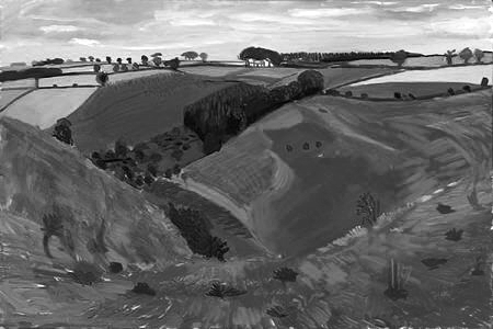
Nice texture, I think.
David,
Can I ask you to write my next press release?!? I’m not fond of the Wood landscapes, either, but included them as a point of comparison. The Hockney I like better, but not so much for how they look as for what he’s trying to do with space. Both of them give me a sense of almost pitching headlong down that foreground slope into the picture.
Karl,
I think it’s actually the other images that would benefit more from frames, which serve to bring out the shapes of the white areas that reach the boundary, allowing one to assess the picture in terms of a balance of light and dark regions.
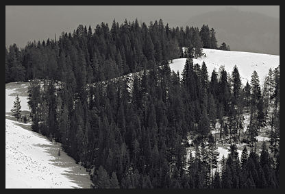
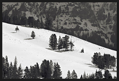
Hmmm, just noticed that pitching-into effect (see previous comment) is also quite strong in the second Wood painting. It’s interesting that in the case of my images—where I’ve said such spatial effects are less important for me than 2-D pattern—the seemingly most popular (#3) exhibits a similar drawing in and down.
Steve, I’d be happy to write your press release for you, but I can’t guarantee the results :-)
For that pitching-into effect, you can’t beat Wayne Thiebaud
Hmm, I tried to add this image but it didn’t show up. Try again?
http://artandperception.com/?attachment_id=3828
“Whatever you were looking for cannot be found” is art.
D,
You are pretty easy to satisfy today.
Being Easy means it Happens more often.
Nice, Karl, let’s change our error page!
D.,
I am usually looking for so many things–most of which I can’t recall, and if I can, they’re vague–that chances aren’t so bad of finding one of them. Though I do often find something else. And I seldom recognize any of them when I see them. These I hadn’t much regard for until I started at the computer, and I still don’t have them where I want them. But I think they’re moving in a direction I want to further develop.
Steve,
On my site I use the “404 Not Found” page to discuss a topic of general interest. After all . . . who really knows what they are looking for anyway? The only certainty is (excepting D., of course) that a 404 warning is not it.
Karl,
I love the idea of a mis-typed URL going to a hidden fortune cookie. But c’mon, a discussion of “What is art?” that starts with an equation? :-)
I prefer pithy, cryptic, profound, random aphorisms. You could learn a lot by constantly making errors.
You could learn a lot by constantly making errors
I do.
David, to answer your question, yes, communication is done entirely through the photos. If two partners want to email each other (or communicate in any other way) they can, but in terms of the blog the emphasis is on photos. The only text that’s allowed are tags related to the time of year and the location.
Landscape Dialogues
Karl,
At some point, I became a little more concerned with the mountain saying to the hiker, “I’ll bury you!.”
Can your fertile imagination speak for Wood? Is he saying, “See how nice and tidy”?