Karl recently asked if gold still has a place in art. Frank Lloyd Wright thought it did in architecture and tried to persuade the Kaufmann’s to gild Fallingwater. It would have been something to see, but a headache all around.
Out of curiosity I introduced some gold effects into a stock image of Fallingwater.
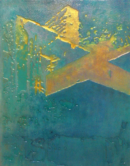
The gold is straight out of a jar. Utrecht Linens sells a water based gold luster that goes on like paint. In this case I mixed it with clear medium, allowing a bit of under painting to come through. the theme of the image dictated that forms and colors be simplified, although I can imagine something more complicated working as well.
Here are a few street images to flesh out this post. I have a nagging suspicion that I may have shown one or more of these before.
No gold here, but instead a peach colored glaze. Again, this is an example of raised foam.
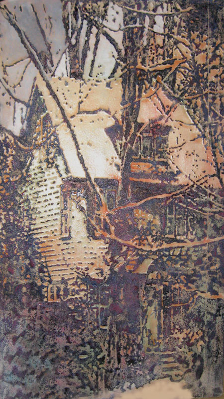
An unsuspecting neighbor lent this view of his or her front porch. The house contends with an unruly patchwork of colors with raised details holding its identity.
For awhile the gold luster had me in its spell. Fortunately, the store sold it only in pints or, brush and ladder at the ready, I might have gone after the house. Thwarted in that ambition, I still think that a straightforward clapboard two-story home entirely in gold would look just grand. There’s a certain house in Portland, Oregon that would be an ideal candidate. What say?

Jay,
I have never seen the pictures that you show here. In the first picture, I love the way that the blue shows through the diluted gold. What medium did you use to dilute the gold?
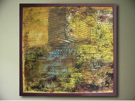
The colors in the second and third pictures are great! How did you make the peach glaze? How did you colorize the last picture?
Birgit:
Glad to hear that I may have put up something new. The gold was diluted two ways: with clear medium gel and then with a rubbed-in application. The peach glaze is just some polyurethane varnish with a little orange color thrown in. I was afraid that I had screwed up the picture with it, but it seems to contrast fairly well with the bluish gray sky. The whole thing doesn’t seem complete as yet as the pathway comes across as a little mushy.
As you may know, these pictures all started with black and white images with no intermediate tones. I traced off the black parts and liberally painted them in. While the paint was wet I sprinkled on some finely-sieved sawdust. I then went over with a paint removal gun If the surface was foam – this to cause the areas not covered in paint and sawdust to shrink down. The last painting is on plywood so, instead I ironed the surface, softening the applied materials and flattening them down a little. Then it was a matter of working in the paint and hitting the high spots with pieces of insulating foam. My first act with the last painting was to apply a few colors with little concern for composition, in order to loosen things up. Then it was time for the foam to bring up the raised portions.
Jay,
You are sculpting a painting! Could you give us a close-up of some parts of the last picture?
I like the idea of sculpting your paintings. And you are welcome to paint our house any color you like, so long as you promise the paint will last for the rest of our lives and you bring your own ladder –snort–
June:
Pop for the gold paint and we might have a deal. Methinks iIt would be cheaper to buy a ladder in Portland.
The technique might be better described as intaglio-ing. And I’ll try to get some close-ups, maybe with a raking light.
Jay,
Do you know if your paint is made of actual gold? Or whether it’s archival? Can you get the feeling of pure goldness that gold leaf provides?
Steve:
I can aver that it’s archival, given that we agree on a definition. The basic acrylic medium is so and I understand that the gleam comes from finely powdered mica, which is igneous. My only aversion to so averring would be the yellow addition that accounts for the gold effect. A silver color is made, and that’s the formula minus a coloration.
I’ve never placed an example of this paint next to some gold leaf. But I have no doubt that the real stuff is going to come out ahead.
Good, that’s what I wanted to hear–since I happen to be working with leaf! But I agree with Birgit about how lovely the way the gold paint can blend with your other colors. I am more often faced with extreme contrast of the gold to the matte surface of a black and white print.
Jay,
What is the name of the mica with the silver look?