I’m not sure that this post will be very interesting or useful to anyone here since it seems that what I do, artwise, is not something anyone else does. I have not even heard any aspirations in the direction of classical figure drawing either, but here, nevertheless, is a quick synopsis of my method.
I decided to attempt to recover some of my earlier methods in order to illustrate the story, but lacking pastels for the moment and furthermore basically despising using the computer to simulate the effects, I recovered only certain aspects of the earlier style — mainly a sense of dynamic motion and form. If you’d like to see some more, you can have a look at the non romantic exposé of my penultimate post. I lacked the time before, but this past week and a half, I’ve done nothing but make time and pick up the pace, so here’s my first recent blush at a classical theme in a long time — the fight between Heraklos and Antaeus.
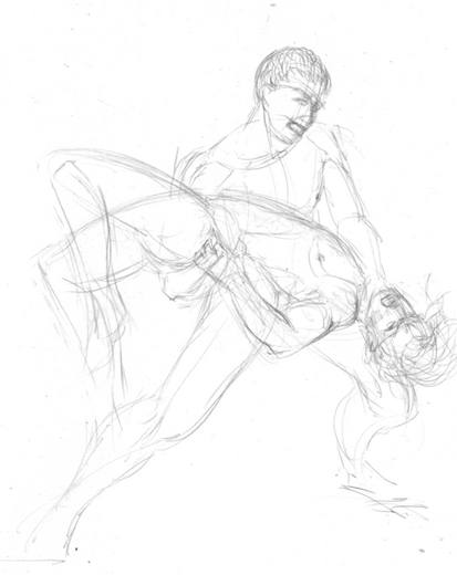
Antaeus was a Titan. In Hellenic mythology, the Titans were the makers of the universe while the Gods came later. Titans were usually portrayed as large and crude while the Gods were represented as refined and beautiful — an intentional association with the nature of their relative types of creation.
I have intentionally ignored a certain protocol for the representation of Titans and Antaeus here though. History, as they say, is written by the victors, and I decided to eschew the dehumanization of Antaeus. So he is not a wicked and frightening giant but a handsome youth, and Heraklos is an older, larger, stronger guy. That is in keeping with the story.
This first sketch took about, I don’t know, maybe fifteen minutes. There were some dozen other versions that I did over the course of several days, however. But I am an advocate of alla prima freshness, so if it’s not right the first time, I don’t rework. I start over until it is right the first time.
I have had to exaggerate the contrast of the pencils here, sorry, but the images barely show up if I don’t. The fact is, I draw so lightly one can barely see the picture. I used ultra smooth paper. My favorite: Bordon & Riley #234 Paris. That’s 108 pound stock. When I use Bristol board, it’s always the ultra white two ply kind. I just use an ordinary 0.7 mm mechanical pencil with 2B leads. My eraser is a kneaded rubber only. The Bordon & Riley paper is so polished smooth, I need no other.
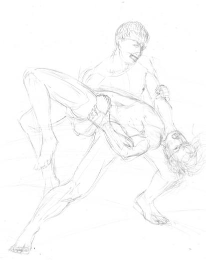
One of the things you have to accept when working without models is that your figures will lack the details of individual, idiosyncratic characteristics. Second, all the subtle and beautiful effects of light and color will have to be largely ignored. To a certain extent, drawing from imagination is drawing the “felt object” rather than the “seen object.”
However, one can achieve forms that will never appear in life because their exist no models who can do things like hang upside down in space or fly through the air and such; moreover, humans are frail, imperfect things while drawings of ideal types can transcend any reality.
“When one door closes, another opens,” the Chinese say.
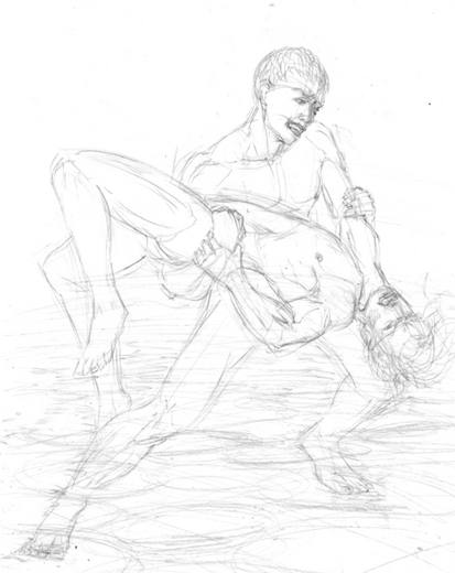
Here, I was fooling around with background. I had this idea of a dry lake bed.
But I have to stop here and explain something. Reading the above, I realized I did not talk at all about how one comes to get a good set of mental models in the mind. And that’s of course the key to the biscuit in figure drawing.
Well, the lengths and breadths I have gone to to learn the figure might not even be something you would believe; for example, by the time I was fifteen, I had drawn, traced, and labeled every bone, muscle, and organ in the human body. In my collection, I have some twenty anatomy books. When I look at people, I can see the lay of every single part of their insides. In another life, I was probably a doctor :). So I have an intellectual base which permeates my rendering of figures. One of the reasons you hear me bitch about modern art training is due to the paltry, pathetic, pretenses made towards the dedicated intensity it really takes to get good followed by bilious justifications about why the old ways are no longer valid.
But the people vote with their wallets. Talk is cheap. If you wish to master the figure, sitting around in class sketching those fat ugly models won’t do you much good. You have to have a theoretical base — what the Hellenes called “ideal form.”
I should say too, that I first got interested in mythology when I was ten. My first attempts at drawing themes like this occurred then. These taught me that I had a lot to learn about the figure, and so I began to study the figure (and classical representations of the figure) in earnest then. When you’re ten, you have little luck getting people to pose nude for you, so you gotta make do with books and pictures. It’s a start, but it’s a good way to start.
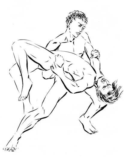
I pretty much use only a brush for inking. My current favorite brush is a Winsor & Newton #4 England. It cost about $45.00. I have a #1 too, but I haven’t used it in a year, I think. Doesn’t hold enough ink. I can do a whole drawing with one dip when I use the #4, and I can get just as fine a line as I can with the #1. It’s like the difference between a 1000cc motorcycle or a 250. The bigger bike just smokes the smaller, but it’s dangerous. There is no substitute for good brushes. You really can’t paint without them. Teachers who let their students use crap brushes should be publicly flayed because it is actually harmful to their development.
I have several Japanese horsehair brushes in my kit, however. These are the pointed kind commonly called “Sumi-e.” That’s Japanese for “Ink Painting,” but in Japan, these brushes are just called “brushes,” or “writing brushes.” I use these for covering larger areas and when I want a bit of raggedness. So I have to amend the above statement with the understanding that there are certain effects that can be achieved with cheap brushes that the nicer brushes won’t do, but you don’t get that nuance until you’ve really grokked the power of a great brushes.
By the way, I learned inking by studying nineteenth century illustrators. The art is really not taught these days (though the tradition has been kept somewhat alive among comic book illustrators).
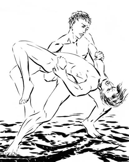
And here I’ve fixed a couple of too fat lines in Antaeus’ left leg and arm with some white gouache while suggesting a bit of background. I should probably have touched up Heraklos’ left leg too, but only the gods are perfect, and even they have their issues.
A final note: I decided to show Heraklos as almost sympathetic. He was, after all, only fighting because he was blackmailed and threatened. He has no personal beef with Antaeus, and Antaeus is not anguished; he is enraged. Rightfully so.

Rex,
Thank you for sharing information on your methods with us. Methods are important to me. I am impressed with your earnest study of anatomy. I have only one old anatomy book by Cunningham. As a little boy, Karl learned from it to draw bones with a fine black pen. I don’t know how he learned about muscles.
These last couple of years, I have been relearning my anatomy. The incentive was yoga and a brilliant physical therapist who recently helped me with an old sport’s injury. Jolynn has an amazing understanding of body motion. On her recommendation, I read all the books by Eric Franklin that he wrote for dancers (not his recent popular stuff) to illustrate functional anatomy.
Intrigued by your statement It was not until many years later that I figured out what my real motivations were and from where I drew my strength , I looked up the Antaeus myth in Wikipedia. I read The myth of Antaeus has been used as a symbol of the spiritual strength which accrues when one rests one’s faith on the immediate fact of things.
A Google entry Thoreau uses the idea of never ending strength that is derived from the earth throughout Walden seems to make a different point.
The Wikipedia entry seems more meaningful?
rex!
that is how you do it gorgeous!!
I forgot to say that your drawings are powerful.
Rex,
It is always interesting to learn about an artist’s process, so thanks for showing this. One thing I don’t understand, though, is the relationship between pencil sketch and ink drawing. Do you ink over a sketch and then erase the pencil? Or ink on tracing paper so that you can re-use the sketch if you’re not satisfied with the inking?
Your insistence on an alla prima feel and your swift, strong strokes seem very appropriate for athletic subjects. But I also like the more rounded lines of the first pencil drawing, especially the legs of Heraklos there. Do you also work with a more continuous, flowing brush line sometimes?
I don’t know if you want suggestions, but I find the background hard to interpret. Maybe a stony field or a river bank would be easier to read than the dry lake bed idea.
Your methods are absolutely fascinating. You’ve got me all wired to go out and buy every book on anatomy I can find.
Having said that, I have to wonder how the ancient Greeks arrived at such lifelike athlete figures in sculpture without such books. Perhaps because they had such outstanding examples of live, nude figures available for direct study? If they were like most sculptors, they must have had strong life drawing skills. You’re right in that attending a life drawing class is hardly the same. Thanks once again for sharing your methods.
In reverse order…
Brenda,
One thing about ancient times is that in addition to the Greeks practice of nude athletlics (the word “gym” comes from gymnos which means naked) there were usually plenty of dead bodies around to cut up and examine. The Greeks were famous for their medical skills even into the late Roman period. Most of our medical terms are of Greek origin. Also, they had plenty of books. Even now, ancient Greek texts outnumber Roman ones by about forty to one.
Steve,
I agree about the background. It was an afterthought, not part of my original conception. It does serve to plant Hercules’ feet though. And something is always lost from those first pencils. This is always frustrating. Yes, I go over the pencil with ink and erase the pencil. This is a standard tewchnique. That’s one reason I draw so lightly. I have a lot of work with elaborately detailed backgrounds. I just didn’t do it here or the past few weeks. For a picture that hangs on a wall for some time, one needs more going on, more mystery, more subtlety, but here I was just single focused.
Usually what appears to be single, flowing brush strokes are in fact strokes that have been carefully joined together. I do that with oils, but not with the ink. There’s this recent fad of drawing heavy profile lines around everything, but to me the look is overly stylized and contrived. In fact, I’m trending to more broken, looser lines. They feel like quick sword strokes when I do them, and I like that feeling.
Hanneke,
Thanks :)
Birgit,
That’s cool you picked up that quote off my blog. It is a complex question. For one thing, I became, at that time of my life, estranged from my family. There was no sane reason for that and that disconnection hurt them and me. For another, I learned that I was motivated by a desire to do great art, not fame or money. Additionally, I learned that I had to be true to my own artistic sensibilities — to ignore trends and fads and stay tuned to my own sense of truth and beauty. In trying to please others, I became insincere and ironically, my work was less well received than when I was totally honest, but I went through this backlash period of actually trying to upset people with art before I figured that out. Last, I learned that I could not deny the powerful effects of sexuality, but until I learned to sublimate that, it hindered rather than helped my art. So yes, there is strength in connecting with and embracing what IS rather than shoulds and oughts and maybes.
So the Wiki is most apropo.
Yet I’ve also at various times sought my own Walden Ponds, seeking and finding in wild places great inspiration and serenity.
Rex,
Today it is a foggy winter day here in Northern Michigan. The snow has sublimated and the outside has a soft, magic feeling. The perfect day to mull over things before starting to prepare for next year.
I didn’t get the ‘simple’ message of the legend until your rephrased it because I was looking at it from the different angle: where ‘should’ Antaeus have rested his faith so that he did not get killed? It is odd because I do feel connected to nature. It probably just speaks for my psychology, running away from a small town in post war Germany because of its intellectual, artistic poverty etc etc. perhaps, I am still running.
What a lovely image, Birgit. So few words, so much evocation.
And looking at it from the angle you saw, Anteaus should not have been challenging everyone to fights. He should have been helping mortals, not using them as toys to be broken and discarded. He denied the nature of his life giving connection to Gaea.
why is it necessary to have an ideal form in mind when creating a figure drawing? There is nothing better than drawing a real human from sight, no matter how “fat and ugly” he/she may be. Furthermore, it is impossible even to generate a basic concept of ideal form from which to work because the idea of beauty is subjective and differs from person to person. You imply that perfection is an intelligible reality that can be used when portraying figures when the opposite is true. It doesn’t exist and there is no way we can comprehend it. The whole idea of drawing forms and figures is to repesent in some way what we see here on earth, whether it be fact or fiction. I have no problem with rendering poses or forms from imagination, as long as artist has experience drawing from life, but the idea thatliving human beings should not be the basis of any representation involving the figure seems wrong to me.
Jessie,
I totally agree that notions of beauty and “ideal” are subjective, but that still allows an artist to have a clear personal idea of what they mean. That might be some cultural stereotype or it might be very idiosyncratic, but it can still be the basis for a work of art. True, that work will probably be saying something rather different from one created by drawing from life. In this post, I think Rex is not saying that all figures should be representations of some ideal, but that, for practical reasons at least, an artist should have a good enough mental model of the figure that drawing without models is feasible.
Well put Steve. i can understand Jessie’s commentsand certainly agree with most of it, Drawing from life is essential for any artist, but the last part of your post, “an artist should have a good enough mental model of the figure that drawing without models is feasible”, is extremely valid.
Hi- enjoyed your comments and explanations. However, I was not able to view any images, even in different browsers. Are they still available to view?
Thanks for posting this!
Tim
Tim,
Thanks for your comment. Apparently the images were stored in an unorthodox way that was not accounted for in a move or upgrade of the web site. They should all be visible now. Enjoy!
whan a drawing go to realism style must be perfect of “real”
interaction is ok
the drawing as drawing is ….. dynamic
and its all what is good