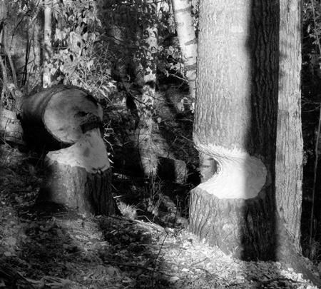
Do you see this as
Near completion?
Destruction?
This was a color photograph from northern Michigan. Inspired by the black and white photographs recently shown here, I converted it into lab color, clicked on lightness and then converted it to grey scale. Intrigued by Colin’s luscious blacks, I used the merge tool to increase the contrast a little to get a little more black. What else should I do or have done in my first attempt at processing black and white photos?
Steve,
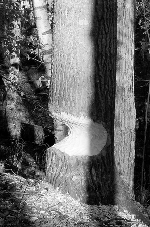
is this what you meant by cropping to the lower right? I also did some ‘unsharp mask’. Of course, this cropped picture does not do justice to the earlier accomplishments of the beavers.

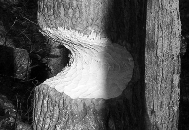
Thank you for all suggestions. Here is further cropping.


I have no idea about the technical issues, but I find this a neat picture. Fascinating to see the tree cut in two in one direction by a shadow, and in the the other direction by a beaver. There is a lovely mix of textures — the bark, the wood chips, the surface of the gnawed wood. If I didn’t know Birgit made this I would think it was a good photo ;-)
Birgit, I can’t give you any photo advice, but I am relieved that this photo shows the chewed-out tree from the side. If it was looking straight into the gap I’d be very worried.
B.
I like this photo very much.
I like how the beaver used its mouth to make a mouth in the tree. I like the slope and how some trees rise directly up, others fight it, and others, retire. I like the shadows, especially the vertical one rising up the tree on the right and how it is balanced with the light from the tree behind it, how the contrast makes the tree more sturdy, thus highlighting its doom. I like the wild tangle brush in the back and the two Peacock Eyes. I like that it is ordinary.
D.
Birgit,
Hanneke felt this photo was too “busy.” I don’t see it that way. I think the choice to go with black and white was a good one. This puts the various textures on the same level, in a sense, without segregating them by color cues. One thing I especially like is the splash of dark leaves at the center top.
One question. Is this photo in focus? I always get confused looking at digital images if I am seeing a limitation of the pixel size.
D., “Peacock Eyes,” nice observation. I didn’t think of that at all. And I didn’t see the cut-out of the tree as a mouth, but you are right, it does look like that.
Birgit,
To make a suggestion about what you “should” do, we have to have some idea what your intention is. Do you want an informative photo documenting beaver activity? Do you want to comment on the forest destruction? Are you most impressed with the size of the trees they can cut? Unfortunately, most of these different messages (if you have one, pace Colin) would require different viewpoint or timing at the scene, rather than different treatment of this image.
At this point, the most important thing you can do is perhaps cropping. For example, cropping to the lower right quadrant or so emphasizes the size of the cut and keeps the artistic verticals and strong light/dark contrast that Karl likes, while also showing better the texture of bark and teeth marks. If you thought at the time that you might want that, you could have moved closer and made a higher quality image of this area. If you’re not sure what you’ll want, take several images from different perspectives and look at them later to decide what appeals to you most. You’ll discover more and improve your satisfaction with your photography. (By the way, this is a really tough situation to photograph well, because of the great amount of detail and the high contrast from the bright sunlight.)
D. Thank you for pointing out the two Peacock Eyes. I often think about your advice before the holidays.
Hanneke, I like the contrast between the simple light ‘mouth’ bitten into the tree and the busy foliage.
I was impressed with the beavers. I am glad that they can pursue their natural inclination in the wilderness of our National Lakeshore.
I sharpened the image in raw file format because I read that one should do that with color photos. I could have done some ‘unsharp mask’ later in Adobe photoshop.
What it really boils down to is that my 4-yr old Canon Powershot cannot resolve fine details. It only does a fine job for the purpose that I bought it, namely to photograph my mother where lack of imaging fine detail is a virtue.
On this particular walk, many of the other pictures came out much worse. The camera simply cannot resolve the fine filigree of trees in the winter. Regrettably, by the time that I will be back to Otter Creek with a better lens, the beaver’s tooth marks will not be such lovely white and the sun may not be as obliging.
David, head-on, I have not yet dared to visualize myself as one of the beavers.
I find the composition on the right side (cropped or not) interesting: there are bands of light and dark that seem to break the real form of the forest and turn it into abstraction.
Steve, I have very very limited experience, but I can appreciate your suggestion that the photographer should try to make decisions when shooting the picture, rather than trying to sort it out later. Rex discussed this earlier, how making a good negative saves work at printing time. In my own experience with the digital camera, the sheer number of images I can make is overwhelming when it comes time to sort through them. By choosing the more shots carefully, I feel I get much more sensitive about choosing compositions on the scene. This seems to be a big part of getting into “photographic vision” mode. Hey that reminds me, I still need to do my photography exercises today.
Birgit, life is short. Get a camera that makes you happy!
David, head-on, I have not yet dared to visualize myself as one of the beavers.
I’m glad. Seeing that other tree is a preview of what could happen. I’d hate to think of this one falling on you :)
I enjoy looking at photographs very much, specially black and white ones.
I even have a big collection of beautiful digital images in my computer that I enjoy looking occasionally.
The photo is good but the subject makes me kind of sad, all those trees being cut down…so sad!
But an artist doesn’t have to capture only good things; dramatic scenes like this one can be as touching.
Birgit,
many of my mono pictures are mono all the way (being Ilford HP5 on the whole), but when I am shooting digitally, I too use Lab to convert to monochrome (except I do it right at the start of the workflow in my raw converter). I find the L channel to give me the result that I want most often, and with least fuss.
Once I have the greyscale image, I use a product called Lightzone from a a company called Lightcrafts for tonal editing. It can’t do anything more than Photoshop, but it is a much more visual way of working than curves or the other tools in PS. Adding contrast to the right bit of the photo, for example, is much easier.
Colin,
What do you think of the open source program “Gimp” which is meant to serve like photoshop?
Birgit,
I like your cropped version quite well. It focuses attention on the half-cut tree, and invites us to look closer to see how it was done: it doesn’t look like an ax cut, but we don’t have the clear sign of beavers that was provided by the other tree in the uncropped version. So we pay attention to the texture of teethmarks on the fresh wood, at least if we were looking at a print with better resolution than this jpg image. I also like how you chose the crop to get a dark strip on the left; that helps frame the subject.
My example crop — not necessarily a recommendation — would have included only the lower half of your latest version, possibly with a little cut off the bottom as well. That makes it more abstract and more about the shapes of the light and dark tones, which is different, not necessarily better. Your version keeps the trees very recognizable and enhances their verticality, which I also find pleasing. It makes it appear that it is really one of the biggest trees that the beavers went after.
Karl,
The Gimp has some useful functionality, but is not a serious photo manipulation tool. For one thing, I believe it only works with 8-bit images. I use and recommend Picture Window Pro (just Google that name), which is far cheaper than Photoshop, and better for what I’m interested in. You can try it free for a month.
Karl,
Never used it, although my favourite raw converter uses (in part) the same code – which suggests that the basic stuff is good.
Steve,
I tried your cropping idea. It makes a huge difference in the image, as you say. Amazing what cropping can do.
Colin,
Gimp has two big advantages: it is fully programable, and it is free. But I don’t know how it compares to the real thing, Photoshop. Reading your comments, I realize how valuable a good processing program is. Man, there is so much to learn!
Karl,
The main advantages of Photoshop are that it is “the standard” and there is a vast amount of free and paid for tuition available.
The disadvantage of it is that it needs all that tuition :-)
Advice: start simple and cheap. Only trade up when you find yourself saying “I want to achieve x, but this product won’t let me do it”.
What fun it is to see the original and the crops and to read the comments around each of them. A perfect example of good “critiques” — or mind-playin — words against visuals, ideas against other ideas, potential, possibility, and ultimately, choice. Or maybe not, because we have the privilege here of more space than we can perhaps fill.