[ Content | Sidebar ]

Archives for May, 2007

Working Spaces (with apologies to Frank Stella)

gooserockcottonlongwipw.jpg
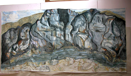
Goose Rock Panorama, 2007, Cotton and watercolor, in progress

I’ve been thinking about the planes on which we work, that is, the stretched canvas, the photograph, and the quilted textile. This is partly in response to my interest in analyzing quilted textiles vis-a-vis more traditional media, say, oil paintings. But my thinking has also been triggered by some reading I’m doing; I’ll reference the readings at the end of this post.

With stretched canvas, some questions revolve around how the picture plane is used (as a window, as a flat surface, or extended out into frontal space and rounded so there’s a back side to the image.) more… »

New Paintings

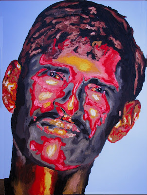
I love painting faces. I painted these over the last three weeks. This time both depict people from India. The first is that of a child pilgrim presumably attending the Kumbh Mela – originally photographed by Steve McCurry. The second one depicts a daily wage earner whose sustenance is ruled by the number of loads carried on the person’s head. They are commonly seen toiling on construction sites.   

Pilgrim“; 3ft X 4 ft; Oil on canvas

Coolie“; 3ft X 4 ft; Oil on canvas

Transformations


Spring Pavillion, 2004, Acrylic, ink, pastel, graphite, on silk-applied paper

My review of the two-woman show “Transformations”, more or less as it appears in this week’s Ithaca Times.

Local abstract artist Syau-Cheng Lai is having a good year. For a week back in early February, her mixed-media on paper installation Visualizing for Bunita Marcus spanned the walls of Cornell’s Olive Tjaden gallery. Executed on four long sheets with a bewildering array of drawing and painting media, it was pinned directly to the wall. It effectively interwove moments of sparseness with those of almost dizzying density. It was a definite highlight for local art. Lai is also a noted pianist. Accompanying the installation was her performance of modernist composer Morton Feldman’s solo piano piece For Bunita Marcus.

Currently on view at the Upstairs Gallery is a selection of smaller, framed work by Lai. Its an impressive body of work, although nothing quite matches up to her Tjaden installation. In particular, I miss the interplay between its epic length and the close-up intimacy of her mark-making. Nevertheless, their combination of exoticism, playfullness, and rigor is exemplary. Characteristically, most feature a dense layering of eclectic textures—drawn, painted and even carved. A few are more minimal. She is joined by out of town ceramicist Ann Johnston Miller. Although not as diverse or quite as compelling, Miller’s work betrays a compatible fascination with her materials.

Evocative of Visualizing—albeit on a much more compact scale—are a series of thin, scroll-like pieces. Due in part perhaps to this compactness, their quality is somewhat uneven. Hung either in an upright, vertical manner or horizontally, they are matted so as to expose the rough edges of the paper sheets. Like the Tjaden piece, looking at these pieces can be akin to reading or listening to music, with a definite if not overpowering feeling of linear sequence.

An upright Shattering Sky features a mottled background of gold and dark brown. Hanging from the upper-right corner are wavy strands suggesting knotted rope or hair. These have been forcefully carved into the paper, revealing white below. In the lower right corner sits a jumble of hard-edged shapes reminiscent of the Louise Nevelson’s wood-scrap assemblages – although not for its wide range of hues. Standing beside Sky is Before Sunset. Divided into an intricate arrangement of wavery Klee-like horizontal and vertical bands, the predominantly red, yellow and blue piece has a textile-like quality. Pieces like Upload, Ski Jump and Watermill combine paper-white backgrounds with tighter, more rigidly geometric lines and shapes. These seem overly fussy, as if the artist was trying to make too much happen.

Lai’s smaller, more conventionally proportioned pieces have a more immediate impact. They compensate for their lack of breadth with their intensive layering. Her backgrounds are predominantly white, black, gray, red, pink, or gold over-painted with dark brown (the latter are scratched into revealing the color beneath). She often uses vertical and/or horizontal bands—hard edged or soft, thick or thin, visibly layered or opaque—to break up her compositions. Recurring motifs include illegible cursive script (running up and down in columns), Cy Twombly-like scribbles and erasures, dots and dashes, and suggestions of landscape elements such as horizon lines, waves, boats and crescent moons.

Deep Spring is particularly successful. Its horizontal bands of white, greenish yellow, warm brown and red have been extensively worked over with drawn and carved scrawls and loops, small impasto dashes and a blue arrow pointing offstage to the left.

Most of Johnston Miller’s pieces combine ceramic vessels with attached nest-like enclosures of grapevine (or in the case of Goddess Eye 3, copper wire). In Transformation, a smooth shiny orb glazed light green is placed inside the opening of a larger matte black blob. The small sphere is insulated with cattail seeds. Drawing – In and Open – Out are simpler: They are light green spheres in their vine enclosures. The long ceramic piece in Natural Dilemma resembles a rounded loaf of bread, right down to its toasted-looking brown color and rough texture.

Also by Miller are two parent and child pieces: the wide, plateau-like Cantilevered Form and the smaller squarish Cantilevered Bud Vase. Similar to Dilemma in color and texture, each has a outline echoing hole in the center. Bud Vase is so named for the smooth light green vessel nested smugly inside.

Other Lai pieces in the show include: Red Matrix, White Matrix, and Nuur Resides.

Process by elimination

“A photographer is like a cod, which produces a million eggs in order that one may reach maturity.”

–George Bernard Shaw

Photographers are a profligate, wasteful bunch. Maybe not those 4×5 guys, where it takes so much effort to decide to take one picture, but I’m a 35mm guy. I don’t understand large format; it’s a different animal entirely. For me the singular unit is the roll, not the frame. I learned my craft in the era of roll-it-yourself film in reusable cassettes. I found my voice by photographing over, and over, and over again, until I figured it out, in a manner that made it affordable.

I have structured my entire creative process around this unique feature of the photographic process. I shoot in order to find out what it is that is compelling to me. The actual act of operating a camera is how I access the state of consciousness from which my photographs emerge. The more complex the environment I am working in, the more that I can depend on my unconscious mind to find the coherent, complete image.

An aside: In the digital realm, the last barriers to restraint when shooting are pretty much history. Unless you give into temptation, and watch the LCD screen. Seeing your pictures while you’re shooting them is a sure way to interrupt and defeat the process of deepening a connection with the moment. The editing brain is a different one than the shooting brain. It defeats the point to mix them up.

When I’m shooting I don’t know where in the process I’ve “got it”. But I do know when I’m done. Somewhere in there, while I was in that altered state of consciousness, I can sense that it happened. Where precisely, I don’t know. I have to figure that out later.

That “later” process doesn’t get enough attention. Somehow you have to decide which egg you’re going to allow to hatch. It requires a degree of removal from the act of conception, to witness and judge the work for the formal qualities that exist only in the image, and not in your memory of the moment. Henry Wessel, a photo hero of mine, takes it to an extreme unmanageable for most of us. He waits a year to review his work before deciding what to print.

Back in the darkroom days, I’d scan my contact sheets to see which images had some promise, and I’d make work prints. I’d post the prints in the kitchen on a big bulletin board for a few days. It’s one thing to study and consider the work—it’s another to see them in your peripheral vision without knowing you’re looking at them. I’d gradually weed out the prints that were starting to bore me, until there were one or two survivors. These were what I would work on deeper, in the darkroom, to see what potential they held.

I’m still working on the best way to bring this editing process into the digital age. For most of my output my only encounter with the image is on a computer screen. It is not a friendly environment for either a considered, or an unconscious judgement process. Sometimes I’ll go through the effort of making work prints, just like the old days, but it’s harder. It feels removed from something intrinsic to the digital process, and I haven’t found the analogous replacement for the editing mode. I’ll report again in six months and tell you what I’ve figured out.
Bones of the Earth

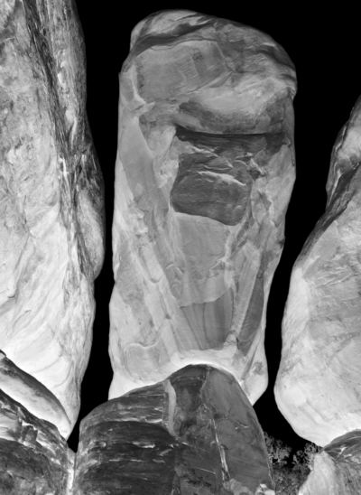
7411b-400.jpg

On my way to Anasazi country recently, I stopped at Arches National Park, where I stayed the night. Next morning before dawn, I was off to an area known as the Devil’s Garden, which I had never visited. It turned out to be one of the weirdest landscapes I’ve ever seen: a few trees and other plants sprinkled among mostly bare reddish sandstone, eroded into bizarre shapes determined partly by crack systems. Although the day before I had ignored the more famous features, I immediately got to work making pictures. Almost as quickly, the metaphor of bones came to me. These rocks were like internal structural elements somehow made visible at the surface. I knew the series would have to be titled Bones of the Earth.

more… »

Queer Art; Or Is All Art Queer?


Last week I postulated that Art Deco as an art movement speaks a distinctly queer language.  This week The New York Times asks how openly and assertively gay artists reflect the emergence of gay culture into the mainstream. It’s a fascinating article that speaks very much to the issue of how art both reflects and influences cultural change.  While words are one thing, the work itself goes a lot further in answering the questions. What is gay art?  What is it reflecting?  How is it reflecting and changing gay culture and the culture at large?  Rather than talk about the work of the artists discussed in today’s Times, I attempted to visually represent the leading edge of this supposed new school of art. As a gay man I am of course fascinated by this work and its collective messages, but I’m more curious to know what straight men and women think.  However, while I look forward to your opinions I would also postulate that even those of you who are “straight” are, as artists, absolutely queer as well, regardless of who you bed so I’m not really sure you can provide a “straight” perspective…nonetheless…

more… »

Meaning in art

OK, this is a hoary topic vulnerable to nit-picking definitions and over-intellectualizing (not that those serve no purpose). But it was brought to mind today because of a comment from an artist (Molly Stevens) on an Ed Winkleman post: “Meaning is seen as romantic, outdated, idealist, basically corny.” This reminded me of Sunil’s and my own recent remarks of looking for meaning in abstraction, in counterbalance — not opposition — to June’s reveling while meaning is “beside the point.”

So my question is: what do you feel is the role of “meaning” in your own creative work? Do you have a goal or message or effect in mind while working that could be called meaningful? If so, is it perhaps a different kind of meaning from that which might be present in a more “traditional” work of art?

css.php