Sunil’s recent post was most provocative. It’s not often that someone seeks comment about his or her self portrait. Turns out that Sunil may have opened a rich vein.
I appreciate the opportunity to witness a participant, not just through the trajectories of post and comment, but as the individual presents his or herself in an image.
In that spirit I would like to throw my mug in the ring.
Traditionally I have been the one behind the camera and only in the last number of years have I begun to consider myself as a subject in any meaningful sense. Sure, I’ve squinted and frowned in the bathroom mirror and did some charcoal sketches of myself eons ago, but no compelling reason existed to do more.
Then (drum roll) I got a digital camera and discovered the joys of distortion. Since friends and family members were likely to shy away from my shenanigans, I turned the camera on myself. For a while I found the editing capacities fascinating and created a rogue’s gallery of Jays. But the bumptious good times soon palled and I needed to get more serious. The stuff was poor caricature, but could pushing pixels around lead to something with more enduring character?
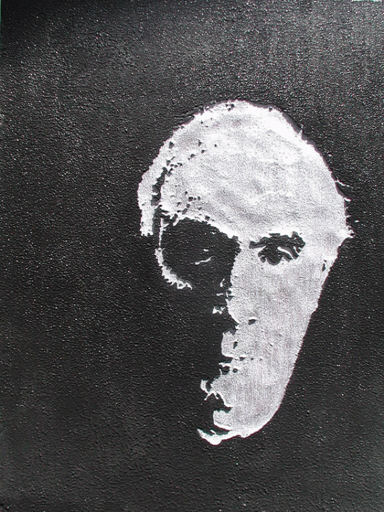
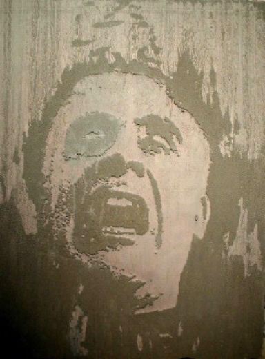
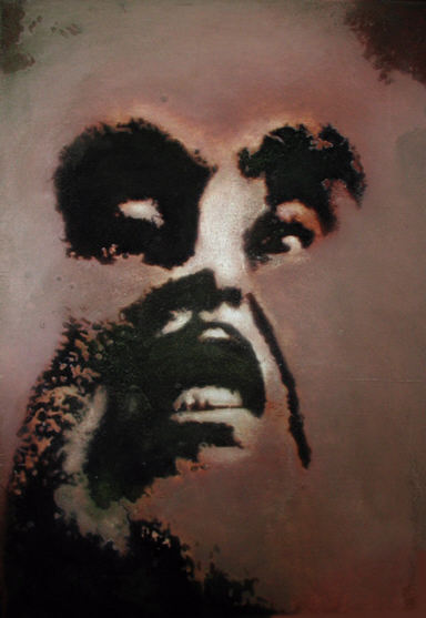
These choices were made: I would use the camera, the images would be entirely in black and white, I would put the images through one or more distorting processes and I would project and trace these images onto board or foam. I would then raise either the black or white portions to create a shallowly figured surface. Beyond that it was time to paint with no further reference to photos.

In this case I indented the facial portion and used simple silvers and blacks. Went to the Baltimore Museum of Art and ran into Andy Warhol looking like this.

In this case I discovered the power of small differences. A slight coloration around an eye socket and a modicum of dribble lent some credence to the facial expression.

Here the face was put through a squeeze function that compressed the features. More effort was made to control the painterly aspects.

Used a lot of colored varnishes in this piece.
You can do outlandish things sometimes and have a modest return for the effort. I’m wondering if this isn’t such a case. Your comments?

Jay,
You’re very inventive and experimental in your approach. Though I’m sure they are not neatly separable, I’m wondering if you would say this work is more about your chosen technique and its possibilities, about the nature of making and viewing portraits, or about the subject — yourself. Was there a shift of your concern as the series progressed? Do you sense there is something you want to convey for which you find the medium is working especially well?
I find myself, perhaps predictably, most drawn to the simple black and white portrait. I also find the triptych intriguing; I try to read the variation in size, color, and expression as different aspects of personality. Too bad your flash intruded on this image, maybe you can bounce or diffuse it to get more even illumination.
Steve:
You’re too kind.
Actually, there is no series as such in progress here. It began with my to-do list which lists this way and that, but which had had a permanent entry under:”do something about the guy in the mirror”.
The technical aspects came together and I could find no reason not to do a self-portrait or two. I doubt if you will have any more success than I in tracing a personal profile from these exercises. I learned a great deal from the experience in terms of the application of colors and textures. Referring to Rothsteins’s position as quoted by Sunil, I took stock of my efforts and said “Go away now.” I docked the paintings in a bin only to wash them off for record shots – and for this post.
The inconvenient glaring quality of the varnish in the last piece is maybe a keeper – I don’t know. I should go back and train a number of muted sources on it to gauge the effect. The idea that the painting might be hard to look at could have a psychological dimension. Certainly stands in some opposition to the somewhat preening character of the first piece.
Jay,
Face-off is an interesting title.
Picture 1. Calm, serene yet strict – you almost want to convey a feeling of superiority here. Aloofness
Picture 2: Falling freely through space open to all influences unsure of where you will land yet terrified during the plunge – a very interesting portrait – liked this one the most.
Picture 3: A twisted Jay rising over Mt. Rushmore. Almost feels like you are rising out of the snows with the prominent features developing first
Picture 4: Shadows of former selves that inhabit the individual – sometimes present: sometimes absent. The lack of eyes disturbed me here. Liked this least. Was not sure of what you were telling us through that.
More than the elements of a proper rendering of a self portrait, these pictures gives a deeper perception of the psychology behind the person (if you really want to assign meaning behind a picture) – and for me I try and assign meaning to every picture except for a recent artwork offered by Karl.
But Sunil, these are my examples of non-conceptual, ultra-minimalism.
#1 Now that you mention…need to get that Boggs fellow to draw a bank note around it.
#2 Your interpretation is much better than mine. I was thinking of titling the piece “Ouch!”.
#3 Late every October, crowds of thrill seekers gather before Mt. Rushmore, and they are never disappointed. Twisted Jay sometimes appears, rising above the ridge, dressed as a ginormous Wicked Witch of the West, and throwing lollipops the size of school buses.
#4 You force me to make something up. A sheet of foamula fell on me while I was dozing and I somehow didn’t feel like myself when when I awoke. However, I could still see.
You bring up a good point. And that is that portraits -self or otherwise – excite an urge to interpret.
The first picture is fascinating. Looking at it, I find myself obsessively flipping between the obvious eye, starring directly at me, and the hidden eye. The face pretend to be so reasonable while at the same time, it is missing an entire lower half.
The face is more absurd than that of any character in Star Trek. Congratulations!
Birgit:
Ah, the hidden eye.
Don’t I need some wires or something if I am to be Borg? Allow me to emphatically state an Ernest “Borg-nein” to the whole matter.
Nicht noetig!
While cyborgs are commonly thought of as mammals, they can be any kind of organism.
Who says that you are a mammal?
Birgit:
I replied using the “N” word that contains “ipple” and the comment did not post. Bet there’s a censor at work.
I really like the black and white but I feel something essential is lost to technique in the third example although I’m sure the process of making them was a valuable one.
Tree:
Could you elaborate? The third painting is out of my mainstream in that I did a lot of finicky things with it.
Birgit:
On a recent appointment, my doctor informed me that the test results indicated that I am a mammal.
Not sure exactly how to explain it other than when I look at the third example, I see only the materials and techniques used and not much else comes forward for me as far as subject or emotion, etc.
I think it’s like this poem I’ve been working on every day for over a week now in that you can put too much energy into the craft of creating and then you’re just spinning your wheels and you lose something, spontenaeity maybe, and you just need to step back for a while.
Tree:
I started with the application of a squish function in Harvard Graphics. It then became an exercise in what to do with such a distortion. The blatant deformation seemed to call for a degree of chiaroscuro to balance things out. And I can see how it might read like an illustration.
In regard to any constancy the four examples I put up are all over the place. Of these, the approach I’ll most likely follow is in number four.
Tree:
Forgot to say: yes, turning to something else for awhile can often be the best way to regain traction.
Jay,
Yes, there is an automated censor, but an admin (Rex, Karl, or myself) can override it and activate your comment. Sometimes the system fails and it also censors innocuous comments. In either case, let us know by email and we’ll fix it.
Sorry, I don’t like the bright flash on the last one. I’d rather see your painting clearly. White is a very powerful distractor in a color work.
Steve:
In this case I think your automated censor made an aesthetic decision.
Will re-shoot the offending image as soon as I can get my hands on it and e-mail the new shot to you.