From a purely selfish perspective — which of course is where I spend 99% of my time — the great thing about A&P is the way it helps me to see. This is often through discussion of someone else’s art, but last week’s post on my own Sourdough Trail image brought several comments that especially struck home, among them David’s
The thing I love about the top image is the ambiguity of the space, and the resulting ethereal, floating quality. Most of the image sits right on the picture plane, but there’s a secondary sense of spatial depth. The two readings create a tension, which I find very satisfying.
and Jay’s
Reminds me of pantheistic forest cultures where every rock, stream, branch and leaf has a spiritual identity and where the forest dweller is in a constant conversation with his and her environment, and every part of that environment communicates.
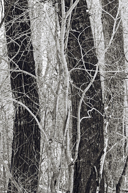
The image above, from the winter phase of the same Sourdough Trail project, seems to me very much in the spirit of both of these comments. Although it has depth, as evidenced by occlusion, atmospheric perspective and loss of focus, it presents itself, to my eyes anyway, as a woven screen like tapestry. Even in its winter bareness, everything is entangled as in Jay’s vision.
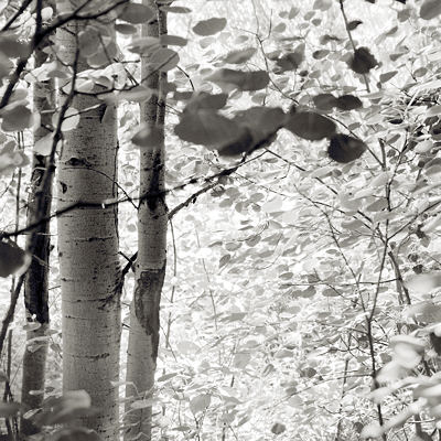
Just to illustrate the contrast, the image below, again from Sourdough Trail, also features a screen of foliage, but it’s very distinctly behind the trunks that frame it, so the sense of space is quite different here.

But the top image can exhibit an additional effect that Karl called the oscillation of a two-state illusion. It’s not terribly strong, but you might want to look again to see if you notice it before I describe it.
I didn’t catch it myself at first, either at the scene or viewing the first print. But when I showed it to a Japanese friend, she did a double-take. She explained that she had first seen the dark trunks as spaces between light-barked trees, then the negative and positive spaces had switched for her to the “correct” interpretation. Once I saw it, I can reproduce it at will. It seems to enhance the entangledness in an unusual way.
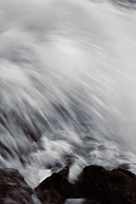
What I didn’t realize until writing this post is: the same transformation from the world’s three dimensions to a screen-like sense in two is something I’ve also pursued in some of my recent waterfall work. I’ve realized that this is different from the identity of a photograph as an arrangement of flat shapes on paper (or monitor), something I have been more consciously aware of. The image below may not be the best example, but it’s one where I was imagining the water like a sheet of cloth. Most of the rocks are hidden by the surrounding water; a few anchor it at the bottom, somewhat breaking the illusion in the same way Jay noted with the dark leaves at the top in last week’s picture.

So I’ve been thinking about these ideas of real and picture space and how they work. I’m especially curious about other people’s perceptions. Does the tapestry-like flattening-with-a-thickness happen for you in the lead-in image? Did you see the negative/positive alternation? Do you even notice “space” at all when looking at pictures? I don’t think I was consciously aware of it until long after I started making photographs myself. That’s not to say it doesn’t matter, but what’s primary is the effect on the viewer.

I think these tricks of the eye are great as long as they challenge the viewers’ perceptions and don’t turn into a “Where’s Waldo” scenario. Your photos are not the latter but I know for myself, it might be easy to play around with these ideas to the point that it’s just a game.
…she had first seen the dark trunks as spaces between light-barked trees, then the negative and positive spaces had switched for her to the “correct” interpretation
Yes, I experienced the same thing. You’re really onto something here, my friend.
As far as the second image, you might try playing around w/ cropping. I’ll send you a jpeg.
Above is David’s suggested crop. I think it’s very interesting in terms of the present discussion. By trimming the left side, the aspen trunks become less of a substantial physical presence and more of a reminder at the edge of the frame, analogous to the dark leaves at the top of last week’s image, or the rocks at the bottom of the waterfall. There isn’t quite the same thing in this week’s main image (unless it’s the small diagonal branches in the lower corners), but there are elements like the slender light trunks in the center that remind you there’s a nearer ground that is close to the viewer.
I like the cropped photo a lot. It feels like free falling and the darker elements add a perfect framing element.
Tree,
I like it, too. I usually don’t like breaking a tree trunk at the edge like that, but I don’t think there’s any issue here because of the second trunk.
I agree with you that game-playing is detrimental to the impression I’d like to create with my photographs. I don’t expect people to see the positive/negative oscillation, and I certainly wouldn’t hint they should do so with a title or caption. Whether it could have subliminal effect I don’t know, but if one does happen to see it, I think it would be intriguing and prolong one’s engagement with the image.
Steve:
The oscillation in the first image, which I take to be like the vase/faces duality, is not your ordinary bear. We talked lately about foreground/background relationships and here they present themselves in a wholly different way.
In your moment with the subject, were you aware of the foreground branches playing with the oscillation? They weave their own patterns, but at key intersections they align themselves with the boundaries in ways that reinforce the illusion and make comment upon it. They also follow the left void as thought it were a braided stream channel.
I’m an absolute cropper,so David’s suggestion intrigues. But this exercise brings up an issue. There’s a lot of airiness in the first image, which is for me a virtue. In the cropped version, while the elements are tighter, so too is the airiness like a stuffy room. I wonder if a little more transparency in the b/w relationships might help.
Jay,
No, that kind of oscillation seems really unusual in the real world, except perhaps for simplified extracts of small parts of it. I didn’t see it and wasn’t looking for it, but sometimes I do now. Not that I expect to find it regularly, but being aware of it helps me pay more attention to negative space in general.
I’m also quite willing to crop, and especially to consider crops that help me understand what a picture is about, even if I prefer the original. Here I do like the crop for the illumination it gives to the topic of the moment. It makes me aware of how close that middle picture is to the others in terms of spatial organization. But overall, I think I do prefer the airiness, as you nicely put it, of the original. The bright veil becomes a place beyond that you go to (with your eye, or physically in imagination, if you choose), not a place you’re almost at. By the way, I’m not sure what you mean by “transparency in the b/w relationships.”
Though after the fact, this sort of discussion makes it more likely that I’ll be able to convey what I want in future. I find the screen or tapestry impression very attractive, but it’s not always what I want in a given scene. In the several dozen photos in the Sourdough Trail project, no others are especially like these.
I do like the crop for the illumination it gives to the topic of the moment…But overall, I think I do prefer the airiness, as you nicely put it, of the original.
I like them both, but they end up being very different kinds of images. You could create an even more spatially ambiguous image by completely cropping out the vertical tree trucks. Then everything’s floating. Lots of options!
Steve:
I said “transparency” and I really meant it! But I don’t anymore. I meant to say “contrast” in that the present contrast seems a little brut for the airiness we are enjoying.
Jay, I guess you mean something like this:
Just a quick job. I think I prefer the lighter trunks, but not so much the large leaves near the top. It could be done more subtly.
Steve:
Ah yes. The leaves are a little more subtle but the detail work on the trees remains nicely etched.
Steve,
The first picture plays with my mind. Not too sure which one is the bark of the tree (is it black or white?). I think you have managed to play with the negative spaces very well…
The first picture also plays with my mind. I also really like the third version of the second photo. The Brown/white is great for trees while black/white suits rocks.
I finally saw the negative space in the first one. Your working of the photos is subtle but beautiful. The anchor of the rocks against which the surreal fall of water in the 3rd photo plays with my mind.
Thank you for the recent comments. I’m beginning to sense that the images are playing with your minds. Is that good or bad? Engaging or cutesy?