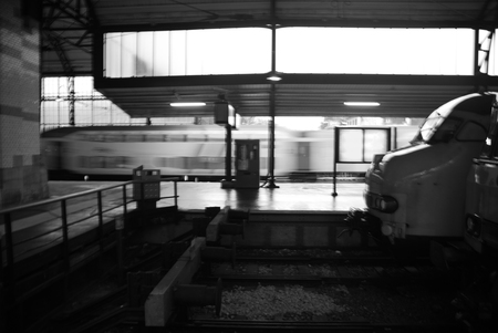
This photo of the train station in Haarlem has always caught my attention. In trying to figure out why, I noticed that the images contains blur in three flavors: blur because of movement, in the case of the passing train; blur in the case of an area out of focus, as with the distant cityscape; blur because of a translucent surface, as with the station windows.
Each of these elements of blur contributes to the impact of the image. The passing train is captured but transformed to something beyond our reach in the still reference frame. The sense of being inside the station is heightened by both the way the windows diffuse the light, and by the blur of the exterior space. The combination intensifies the feeling of being in a particular place at a particular moment, separated from the rest of the world by distance, glass, and velocity.
All of these elements of blur were unintentional. Their joint effect I only realized months after making the image, but the insight of the power of blur is something I can compose with in the future.
Do you have an example of blur in a photo which contributes to the impact of the image?

What immediately comes to mind is Steve’s fish picture. I am looking at an actual framed print which reveals different degrees of blurring and motion.
This is how I interpret the picture:
(1) The stationary back of the fish is only slightly blurred by a thin layer water.
(2) The head and tail are more blurred because they are deeper in the water
(3) The fins are highly blurred because they are being moved to keep the fish stationary in the rapidly streaming water.
(4)The water is blurred because of its rapid motion.
These different degrees of blurring and motion create a swirl. I thought that the mat (dark bluish green) and frame (light-colored wood) would calm the picture. No way, the green and the wood color swirl together with similar colors in the stream.
Karl,
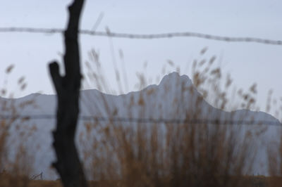
Nice picture and discussion. I think blur is a very important tool. Just yesterday I made this pair where the focus is on either the grass or the mountains, which changes the story a bit. Sorry for the hasty work, these images aren’t very well done. Just a convenient illustration.

I would like to know more about the use of blur or its equivalent in painting. Before photography, I don’t think there was a clear understanding that different parts of a scene are not all seen sharply simultaneously; we normally feel that we see everything sharp. Nonetheless, I would guess that even realistic painters would spend more time on the detail in some regions of special interest within the picture, and our attention tends to be attracted to that. Does anyone know to what degree that was done consciously or systematically?
Check out some of Gehard Richters’ work, especially portraits, to see blur.
A couple of painters come to mind that used focused vs. defocused areas in their work. One is Velasquez, who was way pre-photography. The other is Sargent, who was concurrent with early photography, though his work doesn’t look like it.
In digital effects for movies, we use motion blur a lot. It doesn’t occur naturally in a CG image, but has to be calculated and applied.
By the way, I haven’t seen Sunil’s comments for a while. I am going to assume he is still at the NeoIntegrity show, possibly up to the “M’s” by now.
Tree,
A while ago, browsing through Gerhard Richter’s paintings, I came across his ‘Seascape with Bird . It was auctioned twice without selling. The picture and the fact that it has not been sold reminded me of David’s statement a while back
.
I suppose, Gerhard Richter appeals to a different market than David had in mind.
Ha! Birgit, I think I’m going to hire you to manage my archives :)
I like Richter very much, including his Seascape with Bird. But I think the price estimate of $800,000 – 1,200,000 might be scaring off a bunch of potential buyers. If you’re going to charge that much for a painting, you have to put in at least 2 or 3 birds. And maybe even a cow.
A flying cow!
Your seagull statement imprinted itself indelibly in mind. I now only dare showing a seagull as a joke.
Okay, you’ve convinced me. I’ve got to do some seagull paintings.
Maybe zombie vampire seagulls :)
Birgit, I really like Richter’s work but I immediately think of a Kleenex box when I see that seascape. A Kleenex box would be cheaper, though.
David, how about a zombie vampire cow?
David, how about a zombie vampire cow?
Hmm, I’ll have think about that one. I wouldn’t want to do anything too sentimental.
David:
And the zombie vampire cow could be jumping over the moon.
The ubiquity of certain artists – I was getting all squirmy about throwing G. Richter into this conversation – that is, before reading the comments.
So, instead, I’ll mention Van Gogh and that particular stroke of his. As sharp as most of his compositions are, it feels to me that the reference points -that is where the strokes might begin or end – are part of a defining movement. The strokes describe a kind of tight and disciplined blur, the bundled sum of which can evoke a wind or the solidity of a pool table.
Steve,
In painting, the concept that the view is an instantaneous one is only superficially maintained. Painting a landscape can take days, the artist looks at this part of the scene and then that. The idea that one part or another should be out of focus would be quite awkward for the painter unless he or she were intentionally adapting ideas from photography. The painter Ingres was said to use subtle blur in contours of faces, though.
In or out of focus is different from more or less developed detail, which is how I would interpret the effects that David refers to in Velasquez — but then again, I’d like to take a better look at the paintings.
Steve,
Interesting that even in your quick illustration you capture the essential Durbin reference to abstraction.
The out of focus mountains are almost like clouds — they would be easy to overlook. The in focus mountains — if I were painting this scene, I’d have these combined with the in focus grass/fence, but then reduce the contrast to send them back in depth.
Karl,
I’m sure you’re right about the focus/blur distinction, at least in older painting. An early scientific model of the eye, the camera obscura, shows everything in relatively good focus.
An artist whose work I just saw, Michael Haykin, uses camera-like out-of-focus effects, very similar to some of my Sourdough Trail series. A good example is obtained by clicking on the lower left image in this gallery. Haykin works from photographs, so this effect comes “naturally” in some sense.
Steve,
The blur issue gets to the question, how long is “now”?
Blur is something that we tend to ignore perceptually. When we want to see something clearly, we focus on it, if we can.
If we think of an image as representing, not a photographic instant of a fraction of a second, but a psychological moment, “now”, long enough to make a few eye movements to take in the scene, then the lack of out of focus in painting would not be unnatural.
how long is “now”?
Depending on who you ask, it could be around 10,000 years.
Seriously David,
I think “now” is between a few seconds and a minute. This defines a compact psychological moment.
Related to photos and the blur question, the issue I have with blur, as in Steve’s photos, is that it prevents me from seeing things clearly that I might want to look at. In painting we can reduce the salience of a region — background, say — while still making it clear. With the examples that Steve provided, I find that I want to see everything, not just the in focus region. That is, if I look at the images for more than a moment, but still in the “now”
To add to the inventory of blurs, I would like to introduce Ohashi by Hiroshige. In this print the rain – a familiar subject in a wet land – consists of streaks running from top to bottom in a gentle diagonal. Hiroshige made this image about the same time that Daguerre was mouthing his first “Aha!” I don’t know of anybody in the Western tradition who treated rain likewise.