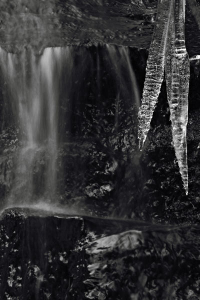
Sometimes, when you get hammered with something from all sides, it begins to sink in. Last week Susan Galassi (Curator at the Frick and Picasso scholar) discussed, among other things, Picasso’s concern with time, which was a new one for me. A few days later, while chatting with artist Glenn Bodish about his work, he told me that a major theme throughout his career has been time and the way it structures our experience through change and the opening and closing of possibilities (at least that’s how I read it; there was a lot of interesting stuff in there about quantum mechanics and chaos and four dimensions and Eastern philosophy). Then, the next time I had a camera in my hands, I was at a small waterfall seeing nothing of particular note — until I had the thought that a photograph there could be about time.

At the risk of belaboring the obvious, I recognize several scales or layers of time implicated in the photograph above. There is the time that the camera shutter is open (less than a second), which results in the blurring of the falling water. There is the slower time (day or days) of the icicle formation. The coexistence of water and ice implies the yearly passage from a warm to a cold season, and the broken rock suggests the century-scale breaking down through the action of water and ice. The rock itself, of course, was formed over far longer ages.
I imagine there are perceptive souls who might launch on such a train of thought while contemplating this photograph. Probably most would not, at least not at first. The initial, and really the main, appeal to me is in the contrasts — dark and light, solid and fluid, still and moving — and the way they play out in the shapes and tones. That may not be so different from previous work in my waterfall project (more recent posts here and here), but the idea of involving time definitely had me thinking differently. Although I made a previous series of pictures of a waterfall in ice and snow, I didn’t find, looking back, any such stark presentation of the fast and the slow against the immobile. Those rates of change seem to be the very essence of the notion of time: what is time if there is no change?
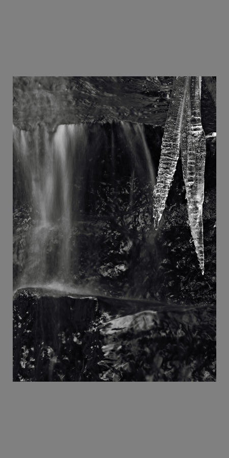
Brief aside: While we’re here, I do have one question relating to perception: do you prefer to view the image against a white background as above, or against a gray one as below?

And for you: has time itself been a subject in any of your art? Is the time it takes you to create a work an important aspect of your medium? Can you tell that it took some time to make this picture at Lost Creek Falls?

Steve,
The white frame focuses my eyes on the white in the picture – the icicle, the waterfall. The grey frame focuses my eyes on the dark rock in between the two. The white frame makes the picture look 2-D, the grey frame makes it look 3-D.
Looking at the two for just a split second, makes the one framed in white stand out as more striking. The one framed in grey invites contemplation.
What comes to mind is a phrase attributed to Proust that I read in some book yesterday N’allez pas trop vite and that has been reverberating in mind foreshortened as Ne pas trop vite.
For internet viewing, with 84.5% of the visitors only looking for a maximum of 30 sec, the white frame may be better. For a picture hanging on our wall, I would choose the grey frame, particularly as our walls are mostly white.
Clicking on the Glenn Bodish link, I felt overwhelmed by the intensity of visual input. Brrr…
Birgit,
That’s a great admonition from Proust, one I too seldom follow. It reminds me of another one I remember from photographer William Corey (a great photographer of Japanese gardens): “Don’t understand me too quickly.”
Thanks for the comments about the background. That’s interesting about the 2D- vs. 3D-ness.
I prefer white but are these your only options? Do you dislike using color mattes? I think a dark red matte would be interesting.
I suppose time is always a theme in my photos although it doesn’t have to be at the forefront of my thoughts.
Tree:
For me, the red mat enhances the 3-d view even more than the grey mat.
It makes me think of Clyfford Still. I feel violently thrown into the picture.
After seeing the red mat, the grey mat looks weak.
On my own, I would not have chosen a red mat because there is no red in the picture that the mat could relate too.
I very much like this lesson in visual perception. How else could the image be framed? As I would not have thought of a red mat, I also would not have thought of introducing a pattern into the mat or would it work?
Birgit, Tree,
Perhaps you are more visually sensitive than you realized. The darkest tones in the image are slightly bluish, which tends to make them recede even more strongly when there is a red surrounding.
I don’t think a pattern would work well, at least not on screen.
Thanks for showing that, Steve. I think dark green would be interesting but don’t feel you have to show that, too.
The red really makes the icicles jump out!
Is it the red background that makes the image look snappier, or the fact that it’s darker than the gray background? I copied the image with the red background, converted to grayscale via gradient map, and it looked even better, especially when compared to the light gray background.
As for color backgrounds in general, I find them of little use in b/w photos as they distract from the tonal relationships that are so important to b/w images.
Please show us the darker grey mat
I have some of my b&w photos framed and I didn’t even bother with mattes, the simpler the better, I think. I’m just curious to see how many times we can make Steve change the color.
I like the white background best… clean cut, no fuss, no distractions…
The ice reminds me of popsicles, I like that detail on the picture itself.
Steve, time is a great framework within which to view the world. The image above is very strong and stands on its own, but as with your waterfall photos I find myself wanting to see a sequence simultaneously. Muybridge melting.
I prefer the image against white.
Steve:
I just love that photo. We’ve been going around about waterfalls with, at least in my case, little definitive to show. Yours is a complex statement that pulls together phenomena in a sensitive and considered manner. Congrats.
Chuck,
You’re right, the darkness of the gray is very important. Here’s one roughly the same darkness as the red I showed earlier. I think it’s my favorite.
David,
You’re too much with the movies! But it’s certainly more natural to address time with a sequence or video. I actually did take a sequence of a very nearby spot where dark blobs of water were running down under a bright layer of ice. The sequence is not very meaningful, though, as the blobs are completely different from frame to frame. It does show, though, that the slightly blurred, dark tadpole shapes are moving and not just a defect.
S.,
No matte (and white wall).
D. and others,
Thanks for the opinions on the background. Looks like no clear preference, but that’s also good to know. In practice, I think it depends on local lighting, etc.
On the question of time as a subject, I’ve had some interesting correspondence on that topic with a writer, Erin Pringle. She wrote:
I was especially intrigued by her linking time and perception with death and memory. I don’t recall thinking about this much before, but it reminded me of June’s observation that my Ghost Light series and dead rabbit photograph shared “a sense of mortality and loss.” Food for thought…
I like the dark mat – most 3-D quality.
The question now is how wide the dark grey mat has to be?