For this last year I have been a Project Learn volunteer, helping Leon brush up on his reading skills. I have doodled during lulls in the sessions. Recently, my idle scratchings revisited an old compulsive tic. Some twenty years ago I stumbled across one of those holes in the fabric of existence that I have often felt a need to patch. I discovered that Pele, the Hawaiian goddess of volcanism, was visually underrepresented in traditional Hawaiian art. Since then I have gone so far as to attempt carved wood and plaster visualizations, along with paintings, all of which I have thrown out.
I began to wonder, while scanning these doodles into the computer, how they might be worked up in Photoshop. Here are some results. But before showing these, I would like to review a few Pele things.

This painting is typical of how Pele is visualized these days: a volcanically-adorned woman, or a tableau depicting an episode taken from her narrative. I have tried to treat Pele in a more symbolic way, pulling together “woman, island, lava and symbolic depiction” as more or less geometric constructs. A parade of discards testifies to my great success.
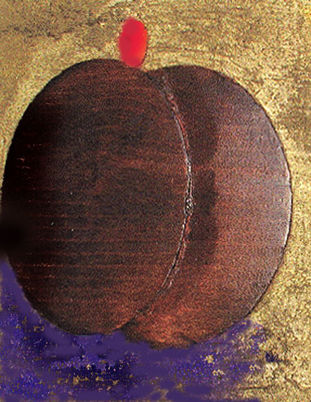
Some years ago I carved this portly example.

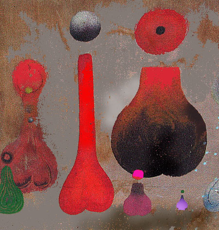
Later I tried my hand at some Pele perfume bottles using sand as a medium. They look too phallic for the part.

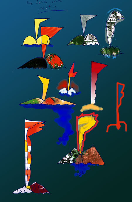
Below is a sketch as recently doodled while with Leon.

My doodling was a bit of a mishmash, but it sat on the sheet in a promising way. I brought it home and exported it from my scanner to Photoshop. There I was surprised to find it ending up like this.

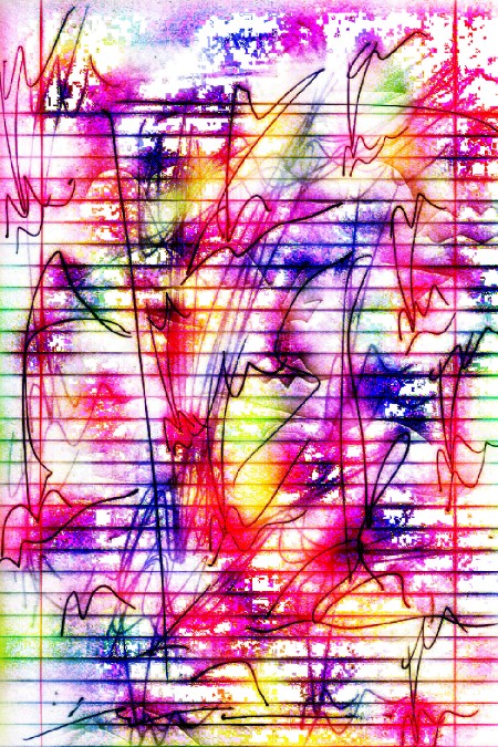
I had gone for a calligraphic look in another set of doodled Peles. This translated into a sort of fireworks seen through a Venetian blind. You may have guessed already that the straight lines came with the notepaper. But instead of being a negative, they create for me an interesting counterpoint to the flowing lines. I’m reminded of our recent conversations about art and music – the music here having come from Leon’s improvements in reading.

And finally, this, taken from another page in the notebook. I return to an old theme of Pele as some kind of a pineapple and Hawaii as a striped tent. Some writing from the other side of the sheet bleeds through.

One can begin to get carried away by an illusion of painterliness that appears on the screen. As a result of my happy discoveries with processing, I have been going back to older objects and images with an eye toward improvement. This means another lengthening to-do list of work to be reconsidered for a renovation. It’s as though the proper subject of my future work could be my past.
Hooray! if this turns out as I hope it will. However, I fear a missing image or two, as WordPress has been balky on my computer. I’m also trying to create this as a joint venture between two computers.

My pardons one and all. Certain JPG images are refusing to stick and I took the chance that they might appear in the published version.
Fascinating. I hadn’t seen this side of your creative self before, Jay. You’ve mentioned Pele a number of times, but now you are visiting it “in tranquility” or at least in Cleveland.
The last one I can see, with the straight lines from the notebook, has great markings which,as you say, contrast to the rhythms of the notebook lines — as well as to the mooshy fantasy colors.
I worry about myself and photoshop, though. I can make my work glow on the computer — and that makes it look less rosy in real life. Something about light coming through as opposed to light bouncing off.
Of course, one could just become a media artist — time-based is particularly hot at the moment.
Hi June:
I tried to produce this post on both the desk and the lap-top. The program requires me to have separate entry codes for each. It now seems undecided about which version – the desk or laptop – to put up at any one time. Just now the post came up with a nice page break, only to revert to an unbroken format. Also, I overdid the Addendum because the program didn’t put everything up on the first go-around. Henceforth it will be one computer, tops.
Oh those mooshy fantasy colors. Somebody stop me! They certainly do not translate over to paper. One can certainly become addicted to the glow, the sheer vivacity. When you can take a mundane scribble and translate it into a fever dream – when you can take the drab “is” and, using the magic of “anything possible”, as things appear on the screen, and concoct a neon world of it, then the sheer magnetism can suck the rust right off your belt.
I have mentioned a trip to Ithaca recently. The wedding was on the Cornell campus and I spent a while before the vows at the Johnson(?) Museum. It has a nice collection, but what got me was the commitment to video. There may be as many as ten rooms devoted to the medium. Clever. Low maintenance, no guards, always something new with the insertion of a disk, very trendy and eminently suitable to serving the needs of the art department. And everybody gets his or her dose of cello-fame.
We have festival in Portland called Time-Based Art — which is anything that has to be viewed over time — happenings, performances, choral renditions, and video displays.
But you know, I dislike video, even when it’s well done. it’s like listening to books on tape — I can read, and see, much faster than the artist will sometimes allow. And while I know theoretically that slowing down is often the point, it seems that that’s like writing a very boring book to make the point that life is boring (those books also slow down time:-)
But the fever dream of the monitor — ah, yes. Makes me want to do light art (like James Turrell). Only I don’t know anything about electricity or LCD’s or the phases of the sun.
June:
You know more than you know.
Most of the videos at the museum in question were almost all of them small topic. Do a stop-motion of Jer doing swimming motions down the street, Jan as a werewolf gently day-shifting, yourself in one of those presidential bank robber’s masks, raising your hand at a retail complex and reciting “Mr. Gorbochev, tear down this Mall!” All you really need is a video camera. Try it, you might like it.
Jay,
(1) Herb Kawanui Kane’s Pele looks masculine rather than feminine.
(2) My doodles never have straight lines. I doodle in smooth curves.
(3) The glorious colors of your last image remind me of the original Marimekko cottons, In the late sixties, every room in our house had different curtains from these boldly colored material, good colors for small children.
Birgit:
I was remiss in not mentioning Mr. Kane’s name. Hard to look feminine with Pahoehoe hair.
With a name like Marimekko, it’s got to be Finnish.
Well, let’s see some of your doodles.