Posted by Leslie Holt on January 25th, 2007

Hello Goya, oil on canvas, 4×6 inches
Ok, here is some of my art about art, or, art that refers to art, at least.
Tonight when I was thinking of what to write about these images, I thought about the word “juxtaposition.” Merriam Webster defines it as: “the act or an instance of placing two or more things side by side.” I remember learning this word in high school English class and being delighted by the concept. Four from this series of paintings are currently in a juried show called “Dislocations,” which is defined as a “disruption of an established order.” This is perhaps a “hipper” way to express a similar idea.

Hello Matisse, oil on canvas 4×6 inches
So if I leave you with those two words and these two images – what do you make of it? I ask because I wonder what viewers who go to see this show somewhere in the state of Maryland will get from these images. Do you need to know Hello Kitty, Goya, or Matisse to appreciate these images? The idea of leaving out someone who may not know a reference seems antithetical to my main purpose. And is this art disrespectful towards Goya and Matisse? To Hello Kitty? Is this a conundrum? :)
Posted by Hanneke van Oosterhout on January 25th, 2007
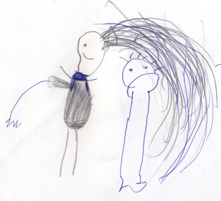
drawing by Françesca at age 3
I wanted to do a post about the drawings that my children made. I have an incredible amount of them (drawings, that is, plus five kids). The first thing was to choose and scan and crop and choose and scan and crop. more… »
Posted by Karl Zipser on January 24th, 2007
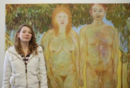
Carina Fernhout painted this larger-than-life meta self-portrait as Eve; to the right is Adam, to the left, her daughter.
more… »
Posted by Karl Zipser on January 23rd, 2007
[update: Here I use Art & Perception’s Theme files, but with the basic Sans-Serif font. You can compare the two sites to see which is easier to read. On many systems, both should be easily readable.]
[update 2:. . . more… »
Posted by Dion on January 23rd, 2007
I have always had an obsession with collecting quotes from books, particulary books about or by artists. I have notebooks filled with them and even started a site dedicated to art quotes.
Here are a few favorites… more… »
Posted by Steve Durbin on January 23rd, 2007
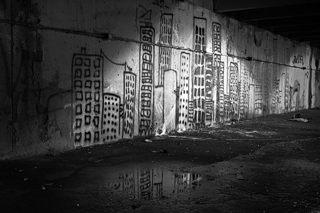
Despite recent posts here on the subject of art about art, by Leslie and by Karl, I hadn’t thought of the question in application to myself. Then I remembered that I did indeed have some photographs of art, at least if the gentle reader allows graffiti to be considered art. In any case, I was definitely interested in the personal expression represented by the graffiti. I was also interested in the setting, a half-underground concrete parking structure, and especially in the lighting, a mixture of glaring incandescent light and early morning daylight.
I made these images nearly a year ago, but still haven’t arrived at a presentation I’m happy with. I’m curious what you think of the following pairs of images. The first pair pits color against black and white. The color version shows the different tints of the two light sources, but the blacks feel richer to me in the monochrome image. Do you have a preference? For what reason?
more… »
Posted by Karl Zipser on January 22nd, 2007
Inspired by our previous discussion, I prepared an art studio/blog layout.
more… »