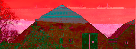
Recently, I spent my leisure time documenting where I lived as a child. As part of my day job, during that time, I used adobe photoshop to pseudocolor grey tone RBG images by cutting color channels in the ‘difference layer’ mode. Trying that trick on two of the Frisia pictures, I came up with the image above.
This, by comparison to the originals, garish image strikes a cord with me. I feel that it epitomizes my memory or feelings about North German Frisia and the coast line – brick farm houses with a hip roof line and oil tankers on a pier in the North Sea.
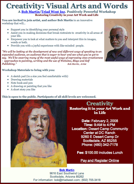
A while back, I asked Bob Martin to let me know if he ever taught a workhop because I would like to learn to paint. This came in my email.

It seems that what I did over my winter holidays, quoting Bob ..look at what matters to you and interpret this in images..

Birgit, I love what you did with this image. It’s the opposite of what we talked about your friend doing awhile back with the default filters. With this you’re taking apart an image and putting it back together, making visual decisions. I hope to see more! Don’t just stop at one or two; this is a great direction to explore. When you are doing this, you are painting.
Birgit, I echo David in applauding this. The garish colors and the layering tell the viewer immediately that this is not reality, but some mental image from imagination or memory. And then one tries to pick out different component elements from the haziness, and see what is associated with what. The combination of barns and warehouses(?) makes perfect sense, makes me think of Buddenbrooks.
David and Steve,
Thank you for encouragement. I will continue.
Thomas Mann did paint the Germans well.
Birgit:
Terrific! Turns out that those two photos make a good match. The red tonality that you have given the tanker image pulls it forward optically while the subtle line of the boats places it in a background context. And the roof lines have a wavelike quality that goes with the red sea.
Good that you have chosen to join the A&P photo manipulation party. The more the merrier. In my opinion most of the territory that Photoshop has opened is now settled, but the visual language that it provides appears to be an excellent way for us to communicate our ideas to each other. And David is right when he says that it’s like painting without the turpentine.
As an aside, I downloaded Gimp, which is offered free of charge. Like Photoshop, Gimp serves as a photo manipulation program with many of Photoshop’s dynamics and features. It’s a way to get your feet wet without paying the big bux. In fairness, I will be sending a donation to the Gimp folks if I keep it.
Jay,
It was fortuitous that my first try gave such an intriguing combination.I like your analysis of it. I now have other combinations up my sleeve.
I feel very spoiled with the capabilities of photoshop with its recent updates. But maybe I should give Gimp a try on my Linux box.
Well, I like your stuff! Brilliant, estrange, of exquisite facture… I’m from South America, my work is some dark and funny (it´s rare mixing) if you have time, please visit my gallery on…
http://www.iggiart.blogspot.com
Ignacio,
Very interesting work, please tell us more about it. What leads you to create such worlds? Is it digital or intricate drawings?
Ignacio,
Please do tell us about your work. The second to last picture seems very different from most of the others. Fascinating!
Ignacio:
Are you from Chile? Your work, which is exquisite by the way, reminds me so much of Roberto Matta. I am also reminded of Lee Bontecou in much of the linear structure and the use of ovals. And, while I’m at it, your use of enclosed forms has a feeling of Tlingit art of the Pacific Northwest.
Again, thanks for bringing your work to our attention. It’s very good and I look forward to seeing more.
Birgit,
I can’t add anything to what was said above, except Brava! Your seemingly methodical approach has made the image truly intriguing.