Among the first images I captured after purchasing my digital camera were made on a trip to the Yucatan peninsula of Mexico. I was drawn mainly by the Mayan ruins there, having had a particular interest in things Maya since a college anthropology class. Though terrific in some ways, photographically the trip was not a success. Although I wrote last week of re-visiting and revising old images, there’s no point if the original lacks merit. I did not know my new equipment well, I didn’t understand picture-making very well, and though I knew I wanted to work in black and white, I hadn’t yet developed an eye for it.

I did, at least, realize quickly that I was interested not in the usual tourist shots, but in the interaction of the monuments with their natural environment. Left to themselves, even major structures would be overrun by vegetation in a mere century or so. It requires extensive restoration for the monuments to stand free and clear in the way we are used to seeing them in pictures.
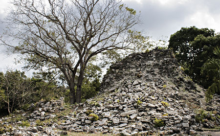
Unfortunately, I was not at all effective in expressing this concept. Probably my most interesting shot is the one above of the Castillo at Chichen-Itza. I love that the tree and the pyramid are inversions of each other. However, I can’t quite decide whether or not I like the fact that they are tonally and texturally too similar to separate clearly. In the end, I think I enjoy the way they partially merge, but become distinct in their different realms.

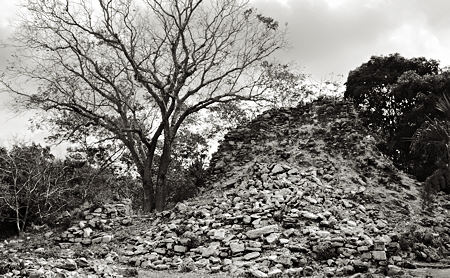
Given my theme, plus my inclination to avoid crowds, I was most interested in smaller, less restored sites. Yet despite some good material, my results were poor. The second image, of a ruined pyramid at Muyil, suffers when converted to monochrome. As seen below, it becomes hard to distinguish the green foliage from the rocks, to the detriment of my purpose. While not an exciting shot in color either, this makes it clear I was not yet in the habit of thinking and seeing in black and white, which is definitely a learned skill.

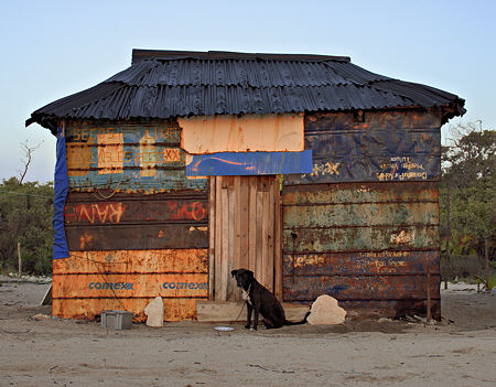
In fact, most people’s favorite image from that trip owes its success almost entirely to its color. The cobbled-together shack at the edge of the beach at Tulum is built almost entirely of re-used scraps. As the plate in front of the dog suggests, it had a regular occupant.

My photos from that trip were within the first few percent of those I’ve made since taking up photography again. It’s too bad I started with by far the hardest location to return to. If I get the chance, I hope to return with some images having only the kind of separation issues I talked about last week.

The geometry in the first shot is breath-taking.
Isn’t green the most difficult color to shown in color photography.
Outlandish hut with normal dog.
Re last week, I hope that you will capture the snake in its entirety. The thumb prints on the wall are growing on me.
P.S. Different sorts of separation issues from pictures one and two to # three?
Steve:
Beyond the issue of color, I find pictures two and three a little troubling for a lack of specificity. Not so much is the pile of rubble the remains of a sacred site as it is a pile of rubble. I see in your subsequent work a laudable tendency to construct a telling image with a minimum of means, and these appear to be an early example. Possibly, being new to your chosen game….
WordPress ate my comment (or I forgot to click “Post.”
But what I said was that the clouds in the first photo are so alive and move out of the photo so wondrously and so contrarily to the solidity of the ruin and semi-solidity of the tree (the branches move the eye into the clouds) that the whole scene is deliriously unstable — like entropy.
And there’s a nice counter to the ancient Mayan material in its sober coloration and the colorful shack in the final photo. They go together.
I think you expressed that interaction very effectively, especially in the first two (three) images. I noticed it before reading your piece. Bravo.
Jay,
Your comment is apropos, as my idea was that an old pyramid might indeed look pretty much like a pile of rubble. But I agree this should be more clear, perhaps by a ploy such as making remnant structure more evident. In a full print you could see better that there is actually some layering to the upper parts of the apparent pile. Also, I think I would be content to let context work in a group of images, rather than hit the point too hard with each individually.
June,
Yes, I was lucky with the clouds; a “perfect” day would have made me miserable. Also yes about the combination being effective. I did in fact have both in my very first, small exhibit.
Charles,
Thank you, I’m glad that comes across to you. I just morn for the paltry take from such a rich and fascinating place.
Steve, I agree that the first and last images are the best of the group. The first one has a strength that is both conceptual and compositional, which I think everyone is responding to here. I personally like the fact that the tone and texture of the two elements merge. It allows the viewer to discover the relationships without hitting you over the head with them.
As far as the last image, yes the color is a big element, but it’s not just that the colors are attractive, it’s what the colors are doing. The thing that strikes me about it is the way the landscape seems to run through the shack, while the shack struggles to separate itself from the background. It’s what Hans Hoffman would have called “push-pull” in describing the phenomenon in painting. It is a result of the way you lined things up in your composition. Another photo of the same shack from a slightly different angle would have just been a pretty picture.
David,
Thanks for the comment, I’ve just been reading about Hoffman and push-pull, but hadn’t thought about it here. I had noticed, when I viewed the shack picture, that it does somewhat mesh in with the landscape, especially on the right. Hmmm, this is a whole new angle on color I have to ponder…
It meshes with it on the right, but also lines up with it on the left. Look at the way the tree/sky line meets the color break on the shack. It does so on the right as well, but with a very different color relationship, and therefore a different perception of depth. These things create pictorial tension with contradictory visual cues. Good painting! Um, photo…
I am intrigued by the two stones that flank the door of the shack picture. They seem to be the only self-conscious/non-practical items placed by the inhabitant(s), but echo the symmetry of the structure and the symmetry (and material) of the Mayan structure. Or perhaps they were signs, or for sale, and therefore practical??? Just curious.
Martha,
Good observation, I was noticing those stones today myself. I don’t think they had any function, but I’m not sure. I didn’t approach any closer than you see from the picture, in fact I cropped out a bit of foreground, so Iwas farther than it looks.