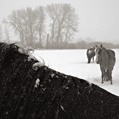
About five months ago I described my indecision regarding goals or approaches in my horse project. I can now happily report that I’m still unresolved. It appears that simply making lots of photographs doesn’t necessarily result in refinement. I’ve decided to consider this a good thing, since that’s how it is, anyway. Perhaps one lesson can be drawn: to every style there is a season. Lately in Montana the season has been winter, and a look noted earlier has remained prominent, namely one featuring the texture of snow, especially falling snow, sometimes combined with motion-related texture.
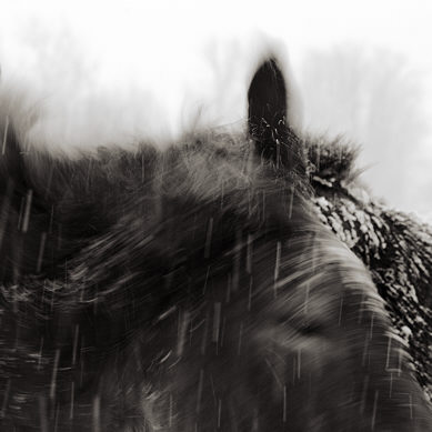
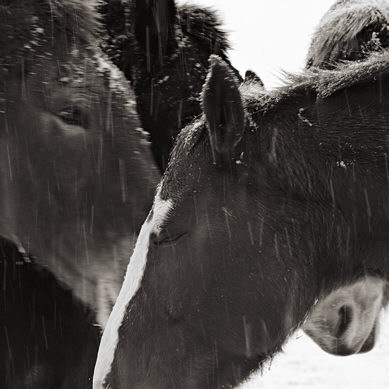

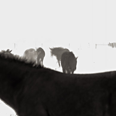

Complicating the mix are photographs that seem to have a narrative element, typically a humorous one (this may be missing for viewers who can’t imagine fun and cold weather going together).
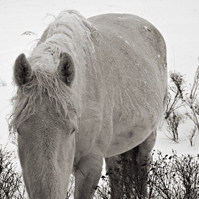

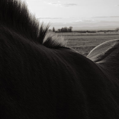
From last fall come the more sculptural studies in strong sunlight:
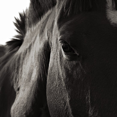


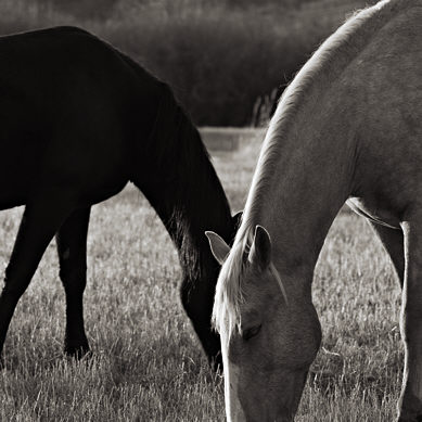
Another category is the close-up portrait, which also comes in both sunlit and snowy varieties:
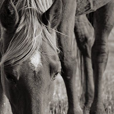

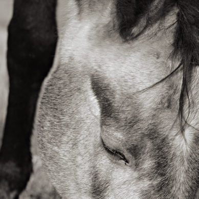
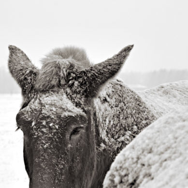
Enough already! It’s beginning to feel like a stampede… However, just reviewing the large number of accumulated images has helped me clarify a couple of things. The first is that the framing is becoming a more important part of it for me. I’ve always liked the square format for its own sake, but the especially nice thing in this context is that it allows me a second go at framing as I crop from the original rectangle (I only cut from the long direction). I’m not by any means always sure what I’m doing with the cropping, but it feels like the thing to do. Even though I like the original version as well, many images seem to be strengthened, and I also like the consistency of it.
The last point is closely tied to the second thread, namely my ongoing play with abstraction. I’m learning to work with the frame, alongside texture and tone, to define larger shapes I find appealing. I think it’s also affecting me more as I capture images, though it’s a bit hard to say. Photographing happens in some sort of fog I can’t recall clearly afterward, and never remember to notice during.
If I haven’t led you to any overwhelming question, at least I can’t be accused of insidious intent. For me, a simple visit with the horses is a sure way to brighten my day–all the more if there’s a blizzard. With a few inches of fresh snow on the ground this morning, I have to get going…
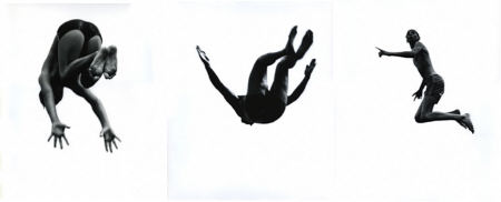
Update 1: I completely forgot, in my hurry to get out, that one thing prompting me to musings on this topic was that I had just seen a filmed interview with Aaron Siskind, in which he mentioned the importance for him of the framing in his series of photographs of young men diving into Lake Michigan. Called Pleasures and Terrors of Levitation (see more at George Eastman House and Hasted Hunt Gallery), the interest is in the abstract shapes made by the divers’ bodies. That’s the major commonality with my horses; differences include the absence of cropping into the bodies themselves, the reduction of detail to near silhouettes, and the elimination of environmental information such as clouds.
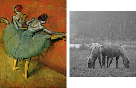
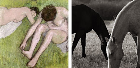
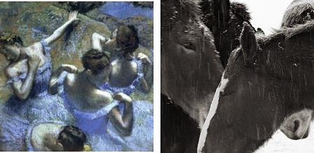
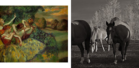
Update 2: Melanie’s comment #7 seemed very insightful to me, so I put together a few quick comparisons with Degas paintings. Some of these would be closer with my original (uncropped) images, but I think some common concerns are evident, especially regarding merging, cropping, and composition of shapes.
Pairs that partially merge in the bodies:
Similar to above, overlapping of limbs or other extensions; simplified environment:
Configurations and interactions of larger groups, environment essentially cropped out:
Inclusion of a bit of environmental context:

Steve, it’s great seeing this collection as it develops. One of the things I love about these photos is that they convey both horse and weather so convincingly. I don’t feel like I’m just looking at a picture of a horse in snow, but that I’m there with them, experiencing the cold and the wet, or the late fall afternoon as the sun is dropping. Reminds me a bit of Monet’s studies of haystacks, cathedrals, etc. in different lighting conditions.
These would make a wonderful book. Horse Seasons?
All these legs, heads and manes! They are adorable.
Does cropping the different parts of the horses feel different from cropping rocks?
I can’t enough of these.
There’s something so elemental about horses, and seeing them so entwined with ‘the elements’ is just wonderful. I find the images and the increased intimacy of the cropping provoke feelings rather than narrative, but the ones that stir humor do recall to me a horse we had who seemed to know what a practical joke is — and to revel in them.
Thanks.
Steve:
Great shots as usual. They and Birgit’s comment make me think of that old song “Mule Train”. You might remember the refrain that goes “clippity cropping through the wind and rain”.
David,
Believe it or not, I hadn’t been thinking of the weather as one of the subjects, rather as something like a different brush to use in picturing the horses. But I agree, in the process it comes across so prominently it becomes a major aspect of the photographs. I guess I was beginning to recognize that implicitly with the groupings I made, but I really like the idea of it as subject. That will help me think about future photographs.
Birgit,
There is some difference between cropping horses and rocks. In both cases there’s visual balance and interest as major criteria, but the horses also have movement and personality that I have to account for. One reason for the preponderance of parts, rather than whole horses, is that I am trying to avoid at all costs any association with the traditions and connotations of Western (meaning western U.S.) art.
melanie,
Your deft play on “elements,” nicely connecting the previous two comments, seems to get to the heart of something here. Seeing how different people express this is very helpful to me as I enter this stage of thinking about the project more, after having mostly been just doing it.
Jay,
Some of these actually are mules rather than horses, and I know they’re used at least for hunting trips, though I’ve never seen any in harness. As for the cropping, wind and rain are eschewed for the comfort of home.
Steve:
My vision of you may have been in error, in that I thought any eschewing on your part would be the very comfort of home. I could imagine you, clad in a skin, stalking your prey low to the ground, frostbitten finger pressed resolutely upon the button. I keep this picture in a locket hung about the corners of my mind.
If I may… I’m surprised to hear you say that you’re taking pains to avoid connoting “westernism” in your images. These pictures are so intimate, so full of character (without slopping over into anthropomorphism) that I imagine only those viewers who immediately and exclusively go to “horse = yee-haw!” would make that association.
They put me mind of another Impressionist — I thought of Degas’s dancers, of how the compassion and elegance of his vision laid open the full humanity, the toil and the devotion, that underscores their art. There’s something, for me, there’s something in the way you see the horses in the environment, something about the casual oneness of it,that reveals and to some extent exalts the horses in the same way that Degas’s rehearsal studio and backstage images simultaneously exalt the dancers and makes them more exquisitely human.
I hope this makes sense. I feel like I’m babbling…
Jay,
Well I guess the “cropping” comes in two parts, first (and most importantly) in the very pose you imagine, then the squaring up at the home computer.
melanie,
I probably said it too strongly: I’m not really concerned with being classed with more conventional western artists, which here are legion. And I should also add that there are also excellent artists who treat horses in a more modernist mode. But once I open up to a full landscape that includes, say, grazing horses with mountains in the distance, it becomes very easy to fall into conventional styles.
Wow, your mention of Degas struck like a thunderclap! Reviewing some books and web images, it looks like there are some strong formal similarities that will be very helpful for me to study. I’m putting a response together for a comment that I may not complete until tomorrow. Thanks for this insight!
Please do bring the pictures out as a book. It is impossible for me to decide which one I like the best. They are all marvelous in their unique way.
Steve:
Image number ten leads me to ask whether you are consciously exploring the horse as a landscape within the landscape. The horse’s mane angles down towards and intersects a tree line of not dissimilar nature. This is handled so naturally that one might doubt its intentionality – yet there it is as a central part of the composition.
Jay,
You’re absolutely right, seeing the horses bodies as landscape elements (see also earlier post) is definitely one player in my multiple personality approach, though it doesn’t necessarily come to the fore in every photograph. Those personalities may seem rather incoherent, but I’m just letting them coexist and we’ll see what comes of it in the end. Hopefully, as they get to know each other, they can work together nicely.
Steve, the Aaron Siskind photos remind me a bit of Robert Longo’s Men in the Cities series.
Regarding your pairings of horse photos w/ Degas paintings, I know you were just trying to illustrate a point, but take a look at what you’ve done here! Each of those pairings would make a great diptych! You’ve become a conceptual artist right before our eyes…
David,
Thanks for the Longo reference, that was indeed similar. He experiments more with cropping, coming very close or even cutting into the subject.
For my conceptual project, I intend to expand beyond Degas and, following Leslie’s example, insert horses into a variety of famous paintings, substituting for similar figures. In fact, for extra irony, I might just appropriate her Hello Masterpieces and insert them alongside Kitty.
Steve, the possibilities are endless :-)
As long as they’re not playing poker… ;-)
yikes! who knew what late-night babbling might provoke? To be fair, June had a recent post somewhere (here? RCC?) with her thoughts on an exhibition that included Degas, so that may also have influenced him coming so quickly to mind.
Thanks for the link to the Hello Kitty works. Somewhere I read something about how the relative blandness (e.g., uniformity of features) of the anime/manga characters allowed the viewer to project her/himself into them more easily. I wonder if that is part of Kitty’s disturbing yet weirdly compelling helium-head allure.
The proprietor of another blog I read ( http://vivienb.blogspot.com/ ) has embarked on a book project through a print-on-demand site: http://www.blurb.com/
It seems to be going fairly well. I don’t recall if any of you mentioned it, so I thought I’d send along the url.
(hint, hint)
Steve:
A juxtapositional artist.
Went looking to see if Degas had been knighted by the French government. If so, he would have enjoyed the title of chevalier, which would fit in nicely with the horse theme. Doesn’t appear he was.
I often return to Leslie’s site for a refresher on her thoughts. Her interjection of Hello Kitty into the grand art context does serve as an open door. In this series she combines cultural products, taken from across the spectrum. Different as they are, they possess a common identity as products of the human hand and mind.
Your comparison of Degas’ dancers and the horses seems to place the point of comparison in the hands of the artist. Degas’ dancers are bundles of energy – potential and otherwise – and have an almost anxious focus, while the horses come across as pastoral. The dancers are about attainment and the horses, behavior. I tend to compare the formal elements in the images without getting much of a buzz over their juxtaposed identities. A silly memory keeps cropping up, of the circus and of little poodles in tutus, riding on ponies and jumping through hoops. I guess I’m building a conceptual bridge thereby. Then we’re back to June’s post about the Portland Museum exhibit where a painting of circus animals might have been placed off to one side as a further commentary on performers -as-commodities. By no means, Steve, do I recommend your hieing off to a three-ring somewhere in search of material.
Jay,
Have no fear about my running off to the circus! Right now the Spring college rodeo is taking place a few blocks away, but I’ve not been much tempted to photograph there. Partly it is in an arena rather than in natural light, but more importantly it would not be the same intimate, flank-rubbing experience directly with the horses. Despite intellectualizing about formal aspects of the images, and jesting about conceptual approaches, it’s that seemingly basic and definitely pleasurable connection that keeps me working on my project.
I agree the horses are more pastoral/placid in the images here, and even in others that have more motion, there’s an innocence to it rather than an intention or order as in a dance. Degas is certainly about more than the compositional similarities I pointed out. One aspect that is also similar to my thinking is an interest in interaction of the dancers or horses. The relations can be provocative, playful, affectionate, casually familiar, or accidental. I don’t think the juxtapositions per se illuminate this much, but contemplating the Degas in this light does give me some post facto insight when I turn to the horse images.
At first glance, the juxtaposition of horses and dancers seems jarring. But perhaps, are we romanticizing the horses? What seems pastoral to us may feel different to the horses.