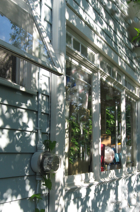
Steve’s recent post: “Light, Dark, Figure, Ground” presents a fine example of dappling as the tree in question seems to dissolve in patterns of light and shade.
The name “Forest City”, applies well to large areas of Greater Cleveland. Our property in Cleveland Heights is rather woodsy and can produce an array of shadow effects. This dappling is a constant source of fascination and subject matter. This morning it was the side of the house.

I like to work outside and the shifting patterns that move across my work can be both a problem and a blessing. One the one hand a certain prettifying is apt to occur which can interfere with sober judgment, but on the other hand the complexity of lighting is often the source of inspiration. In this image the setting sun through the foliage creates a very stagy effect.

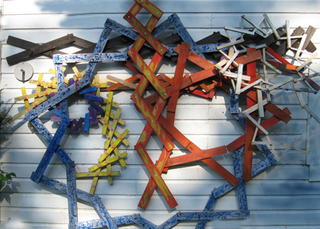
Elements of my ongoing scissor jack project are piling up and I have taken to hanging them like so many coats on pegs. Here is a dappled collection of units awaiting further sorting out. These objects seem to like the influence of of light and shadow and it makes me wonder if I am beginning to think like a forest dweller.


Jay,
I love your dappled lighting, but that sort of thing does wreak havoc with photographs on display. In a black and white photograph, in particular, it’s important to have strong, even light for detail in the dark areas to be visible. At the same time, glare from the paper or glass is hard to avoid unless light sources are well-placed–not the norm outside of commercial galleries. Sometimes the venue determines presentation: I gave up on glass and used matte paper for a site that would have had huge glare problems.
Looks like some experimentation going on with your curved geometries. Can you make a star/circle that breathes in and out?
Steve:
I can think of a few ways to make that happen. A number of these circles intertwined and breathing would be a thing to see.
Something called German glass, as a cover, is often used to cut down on reflections. It used to be very expensive.
Galleries with windows can be a nightmare for what you’re describing. At the very least, illumination shapes the meaning of your exhibited work. Back when, I posted something about ladders and included an installation shot. The idea was to put up a ladder doing what ladders do. However, shadows falling on the back wall tended to create a Robert Irwin effect, which was nice, but beside the point.
Jay,
Picture 3 inspires me to want to come and play.
Birgit:
I don’t want to misinterpret your statement.
There is nothing to interpret. The montage looks cheerful