We’ve often discussed the effect of perceptual structures and habits on ones experiencing of art. Recently, via my favorite general blog 3quarksdaily, I came across a nice formulation of a common theme: that we are blind to the usual. In an essay on Kafka, P. D. Smith quotes the Russian Victor Shklovsky (in “Art as Technique”, 1917) on the concept translated as defamiliarization:
… art exists that one may recover the sensation of life; it exists to make one feel things, to make the stone stony. The purpose of art is to impart the sensation of things as they are perceived and not as they are known. The technique of art is to make objects ‘unfamiliar’, to make forms difficult, to increase the difficulty and length of perception because the process of perception is an aesthetic end in itself and must be prolonged.
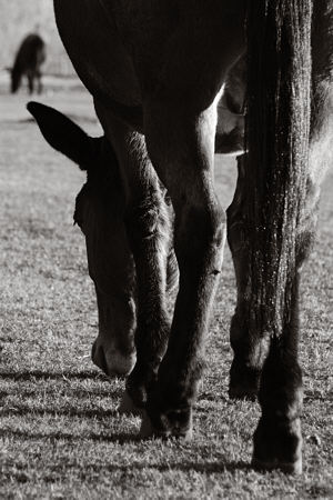
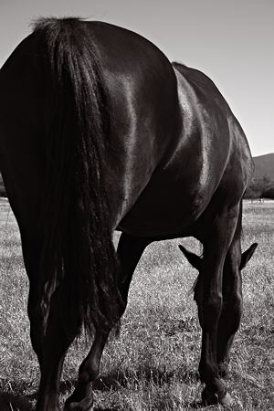
Though I don’t subscribe to blanket statements on “the purpose of art” or “the technique of art,” this passage spole to me very strongly of my own work, particularly my horse project (last post here). Without using those same terms, I have more or less consciously tried to make images that are somewhat odd or awkward, momentarily disorienting to the viewer.
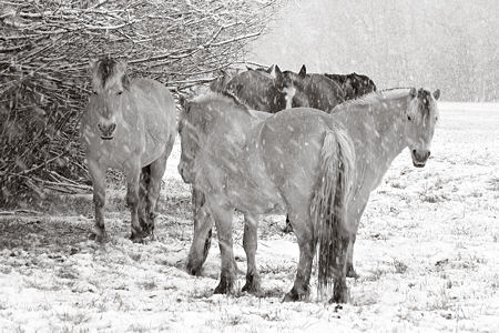
Partly for that reason, I have been especially interested in groups of horses, often for the purpose of introducing some ambiguity or difficulty due to blending of the individuals.
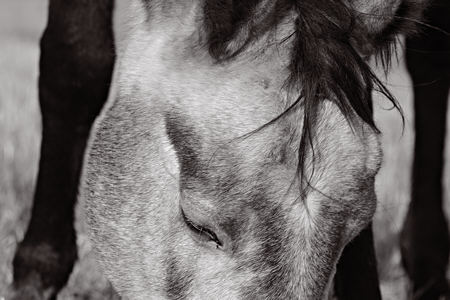
Or I may use an extreme close-up, removing most of the obvious horse indicators.

One thing I like about the idea of defamiliarization or estranging is its applicability to many, if not all, art forms. For example, it seems to me to be at the heart of metaphor, which jolts us into some insight through an unexpected, peculiar juxtaposition. The tactic leads to the high school complaint that metaphor is a difficult and indirect way to say something, so why use it? Poets and others know that it provides the most direct, if not the only, way to say the precise thing they want to say. And though the comfort of the familiar has its value, I’d rather learn of the new and unfamiliar.
The idea of making strange seems best adapted to modern Western art, fitting movements such as Cubism or Surrealism fairly well. A lovely statement from Kafka on Picasso says it all (see Smith’s essay for the reference):
Of course, Kafka didn’t need lessons from Shklovsky or anyone on how to make the world strange. In a wonderful comment, he once disagreed with a friend who accused Picasso of distorting reality. “I do not think so,” said Kafka. “He only registers the deformities which have not yet penetrated our consciousness. Art is a mirror, which goes ‘fast,’ like a watch—sometimes.” [8]
Do you see a role for “making strange” in the art you create or appreciate?

Excellent commentary and actually quite thought provoking. Although he based his work on a different aesthetic, you could say Minor White practiced defamiliarization in much of his work as well. Of interest to me is that the process of defamiliarization can often lead to a clearer understanding of the subject matter absent our preconceptions.
I think I find living so chaotic and baffling that what I seek in art is clarity rooted in compassion. And just as a minor example of things that confuse me — when you describe metaphor as “peculiar juxtaposition” what meaning of “peculiar” do you intend? Because when a metaphor is “peculiar” in the sense of “unusual, strange, or unconventional” it is often so mishandled that it says more about the writer’s disdain for the reader or about his/her own confusion of intention and understanding than it does about the technique itself, or about the thing being described,or about the capacity of the recipient to grasp the nuance. But “peculiar” in the sense of “unique, belonging exclusively to or identified distinctly with somebody or something” is the quintessence of metaphor — a comparison that illuminates by its precision, that “impart[s] the sensation of things as they are perceived and not as they are known.”
(The writing teacher in me leaps up at this. Metaphor is not a game for the jejune.)
Mike,
I definitely agree about Minor White. He often moved farther into abstraction than I tend to go, but that’s a line I’m always playing with. Although I guess the point is that there isn’t a line. Is it fair to say that with greater abstraction, the potential realizations are harder to identify but more significant?
melanie,
I agree that for a metaphor to be “unusual, strange, or unconventional” is certainly not enough for it to illuminate (to borrow your metaphor). It first of all has to work. But if it is usual, familiar, and conventional, then I think it has less chance of illuminating anything unseen before. Your “clarity rooted in compassion” helps make my point: it suggests an analogy between compassion and soil. That seems at first rather bizarre, but then one thinks about it and discovers the enlightening implications.
Bacon said that some “strangeness in the proportion” was necessary for beauty, but he never said it was sufficient, and I didn’t mean to imply otherwise.
Hi Steve,
I’m glad you found the piece for 3QD interesting – I was fascinated that you saw a connection to your own photography. You might be interested to know that I first came across this concept of making strange while researching a piece on Paul Nash’s photography. He’s better known as a painter, but his photos have have a strange intensity. I think Victor Burgin (Thinking Photography) has written on this too.
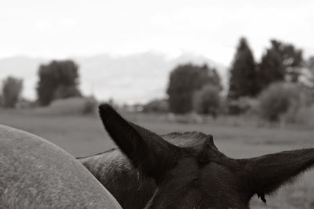
Great photos, by the way. I love the one of the horses’ backs.
Peter
I love the ambiguity as to their body parts for the two tan horses in the foreground in photo #3. It reminds me of Escher
Making strange may be the theme of the week.
Steve,
Great quotes — they come close to the idea (possibly the ideal also) I have while making art. And your distinction within Melanie’s phrase “Clarity rooted in compassion” seems apt.
One problem that art, whether visual or verbal, continually faces is that moment when a line of words or paint has become too familiar. I think my disdain for what I call “postcard art” is exactly that — that the photographer has taken the most obvious lovely scene and presented it as iconic. I prefer my icons to require a bit of work — otherwise, I simply pass them by with the expected judgment “nice photo” or “beautiful scene” or “I’ve been there”.
As a viewer of art, I think that it’s viewing over time that presents the greatest rewards, rather than newness, however.
Newness, or defamiliarization, starts the process, but in your photos, the rhythms set up by the horse’s legs and head (photo 2), the circling of the creatures in the snow (photo 3), the bouncing across the curved backs (photo 4) and the witty ears (photo 5) all keep me going back to look again. Tomorrow I think I’ll see something different again.
I think I would like to ask if you (any ‘you’ who might want to jump in) can articulate what it is you believe abstraction adds to the experience of perception. There are repeating chords here about protracted looking and about images that yield more upon revisiting, but are those results due to the abstraction? What does the abstraction itself add to the experience of executing or receiving the work?
Tom Stoppard talks about his plays as a flow of information and that his job is to manage that flow in a way that engages the audience. Does abstraction in visual communication serve a function similar to that of suspense in word-based communications? is the goal to create a flow of hint-reveal, hint-reveal to keep the viewer engaged in the work? And is it the abstraction that does that?
PD,
Thanks for visiting and for the lead. I located the Nash/Making Strange article; it was actually Simon Watney writing in the book Burgin edited. He treats the notion mainly in its social/cultural aspects, where the non-conventional was deemed necessary for revolution, both Romantic and political. Though certainly related, I was thinking largely in terms of the cognitive science of perception.
melanie,
That’s the bone I’ve been worrying a long time: not only the role of abstraction in visual art, but the corresponding thing in literature and elsewhere. Your connecting it with suspense seems very valid to me. Withholding information to retain ambiguity can be done in any domain. Visually, I think viewers become more likely to supply the lack from their own experience, and see things that might never have been considered by the artist. I like it best when more than one resolution makes sense. For example, a really good photograph along the lines I was attempting last week would work as both a star field and a stream.
I don’t claim abstraction is the only route to such engagement, only one I’m particularly interested in. The opposite tactic can also work: flooding the viewer with so much information that they can’t take it all in, like a painting or photograph with so much detail that one keeps coming back to explore and finding different things.
The management of information in suspense literature of various kinds (including comic suspense) is not really the result of ambiguity (unless I mistake what you mean by ambiguity) or strictly because of withholding information. Rather, it results from a planned discrepancy of awareness — the parceling out of critical information to some portion of the participants (including the reader or audience) and withholding it from others — and from plotting how the information comes together within the boundaries of the particular form.
The linear nature of reading and theatrical presentations makes it difficult to flood the reader/audience with information in the same way that photography, cinema, and painting come at you all at once — which we’ve discussed elsewhere — but it also raises the Goldilocksian principle of reader/audience/viewer tolerance for strangeness of proportion (too hard, too soft, just right) and the ongoing question of how much to consider the reader/audience/viewer at all.
I think I tend toward the opposite pole from June. I see the problem more as one of where the line of words or of paint becomes too unfamiliar. I was much more concerned with this when I was writing — say what you mean, mean what you say — than I am now that I’m arting, but the question of where along the continuum one’s threshhold lies is interesting.
melanie,
The idea of managing the information flow seems very productive, and it’s fascinating how it plays out quite differently in different media. A painting is, in some sense, all available at once, but our locus of attention is small, so we scan it in ways that artists consciously and unconsciously try to influence. While in arts that unfold in time, various techniques rely on our memory to connect back to previous points via a sound, a word, a movement.
A Victor Burgin preface (In/Different Spaces) offers this apology for the structure of collected, independent essays:
Far from ironed, our discourse here is more like the tablecloth dropped in the laundry hamper.
Steve:
Seems to me that you’re walking a thin line with your horses and keeping your balance in the bargain. I could show up with a camera and produce images with no horsyness about them, whereas you operate well in the area of equine abstraction. In the images that most appeal to me you include just enough that is signature horse. The first image in this post, which I find the best, you give us a hint of head set in a correlating pattern of leggy shapes.
I’ve been circling your post, looking for a place to land. In regards to abstraction, which Melanie brings up, I would posit that it, as a term, describes an element, albeit a vital one, and present in every form of representation. One can take a photograph and run it through a pixel function set on max. The resulting single entity may be seen as an abstract blend of all of the picture’s colors and values. Terms like “great” are abstractions. There is an infinity of examples which would all point to one form or another of summation.
But there’s an entire movement seeking to avoid the whole idea of abstraction through thing-ness. There was a fellow grad student who tried to persuade us that his corduroy pants counted as art under the thing banner. Some of us shrugged a whatever while the teacher essentially said “Not in my class.” And some might argue that the aforementioned pixel is as matter-of-fact as the entire picture had been.
Lurking behind it all is intention. Ink a hand and press it down and you have, if inked and pressed in moderation on a flat surface, a record that is evidentiary. Do it in a police station and the print can be seen as a summation of the complex of actions and circumstances that brought it there.
Jay,
I also tend to like the less horse-like ones better. As usual, these are in progress, and might well be cropped. The last, for example, which was only a few hours old, I think I like better as:
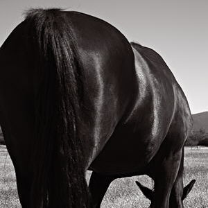
Still horsey, but less conventional; more concerned with 2D design and less with representation.
although a somewhat aggressive statement (rather than a metaphor), once it comes into focus… ;-)
melanie,
An interesting case where the existence of an idiomatic expression may color our reaction to an image. Though I wonder how many it occurred to (not me this time, though it’s happened in the past).
it was my grandmother’s favorite expression of “nitwit” and she’s been on my mind recently, so there’s the thought thread laid bare.
I do like the peaks-and-valleys play of light from shoulder to hip.
Steve:
Won’t be the first time a horse has been cropped.
melanie,
The play of light was what I was mainly interested in that day, though I made relatively few photos and haven’t worked on most. I’ll be experimenting with de-emphasizing everything but the highlights a la stardrops.
Jay,
…resisting…
“Of interest to me is that the process of defamiliarization can often lead to a clearer understanding of the subject matter absent our preconceptions.”
It’s amazing how educationally limited people attempt to hide behind theoretical artifice.
Angie,
We don’t all speak the same language. I don’t know Mike, but I don’t think he was trying to be obscure. His comment helps reinforce with a good example (Minor White) the idea that an apparent departure from reality (whatever that is for each of us) may help us better see reality.
Hi. I just discovered your interesting conversation at 2:20 AM as I often think while I’m sleeping. I Googled “making strange” because I came across the phrase years ago but it was en francais — faire etrange — and the idea has stuck with me that Art is just that: moving something from the normal to raise awareness and invite contemplation.
I might suggest that in many artist’s works, this process is done unconsciously. I myself have taken photos without realizing why or what attracted my attention in the first place. It’s as though the mind notices something, wants to define it more closely, snaps the shutter or paints the image, then derives pleasure from contemplation.
Whether the effect can be put into words is questionable. Yet, to be effective at all, of course, there has to be a corresponding sensation in the minds of viewers as well, and this may bring us back to artistic conventions or the escape therefrom. In other words, we need some experience to “see” or hear or experience this making strange.
Went to the top of the post to find an assortment of images from Steve Durbin in which the subjects were photographed from unusual angles. Without refreshing myself with a perusal of the intermediate commentary I would like to respond to soros1by not addressing his points exactly, but rather bouncing off of them.
But to be exact, making strange is a powerful thing. There can be an otherworldly feeling that results. I’ve had the experience of coming upon an intersection in town from a little-used angle and seeing it as if for the first time, with an associated impression that I have entered some kind of parallel universe. Night time for me is similarly evocative as the world becomes lit from within and without.
That’s largely outside-in. Inside – out is another matter as the ever-busy mind shuffles things around. For me it’s almost as though my conscious nature treats my subconsciousness as a source of amusement. It popped up recently that I should organize an image of a tic-tac-toe game where Muslim and Christian symbols should replace the customary exes and ohs. A prickly idea that creates a mild shift in contexts. Is my subconsciousness feeding me its joke of the day or is it a memory of something read? Either way I’m being pushed off the path of familiarity somewhat.
Reading through the comments above, I agree with Melanie “I find living so chaotic and baffling that what I seek in art is clarity rooted in compassion.”
Clarity rooted in Compassion, I like that.
Breaking that “familiarity” is something that happens naturally, thats responds to an inner necesity, or is looked for, pursued? The eye, and its focus not always goes where one wants, and there we face with something that appears in front of us, and there we live an outstanding experience, as an illumination.
Hope my english is understandable.