Last weekend I accompanied family members on a picnic along the waterfront and a trip to an apple orchard.
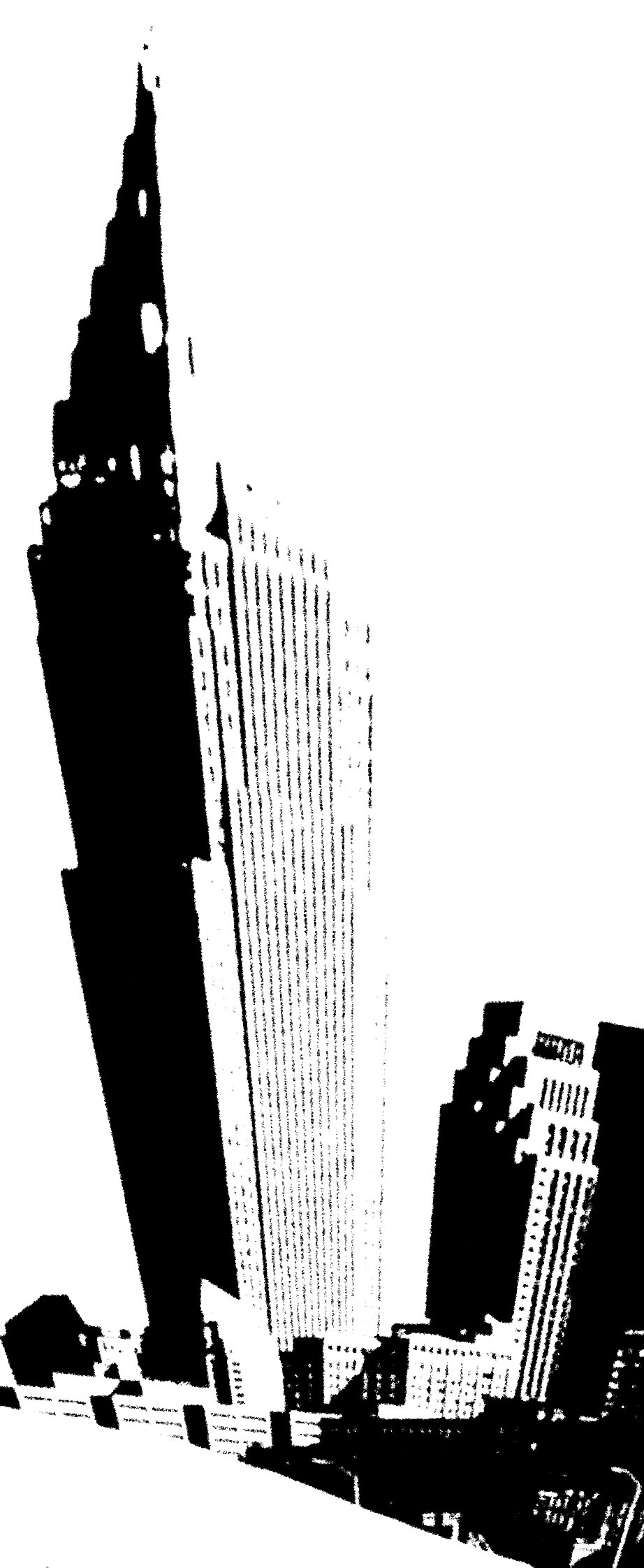
The skyline is plainly visible from the west bank of the river and I took a stock photograph of it. I then Photo Shopped this treatment. Makes me think of a mineral specimen. I’m feeling the itch to do another foam painting and this, or something similar, may serve as the source image.
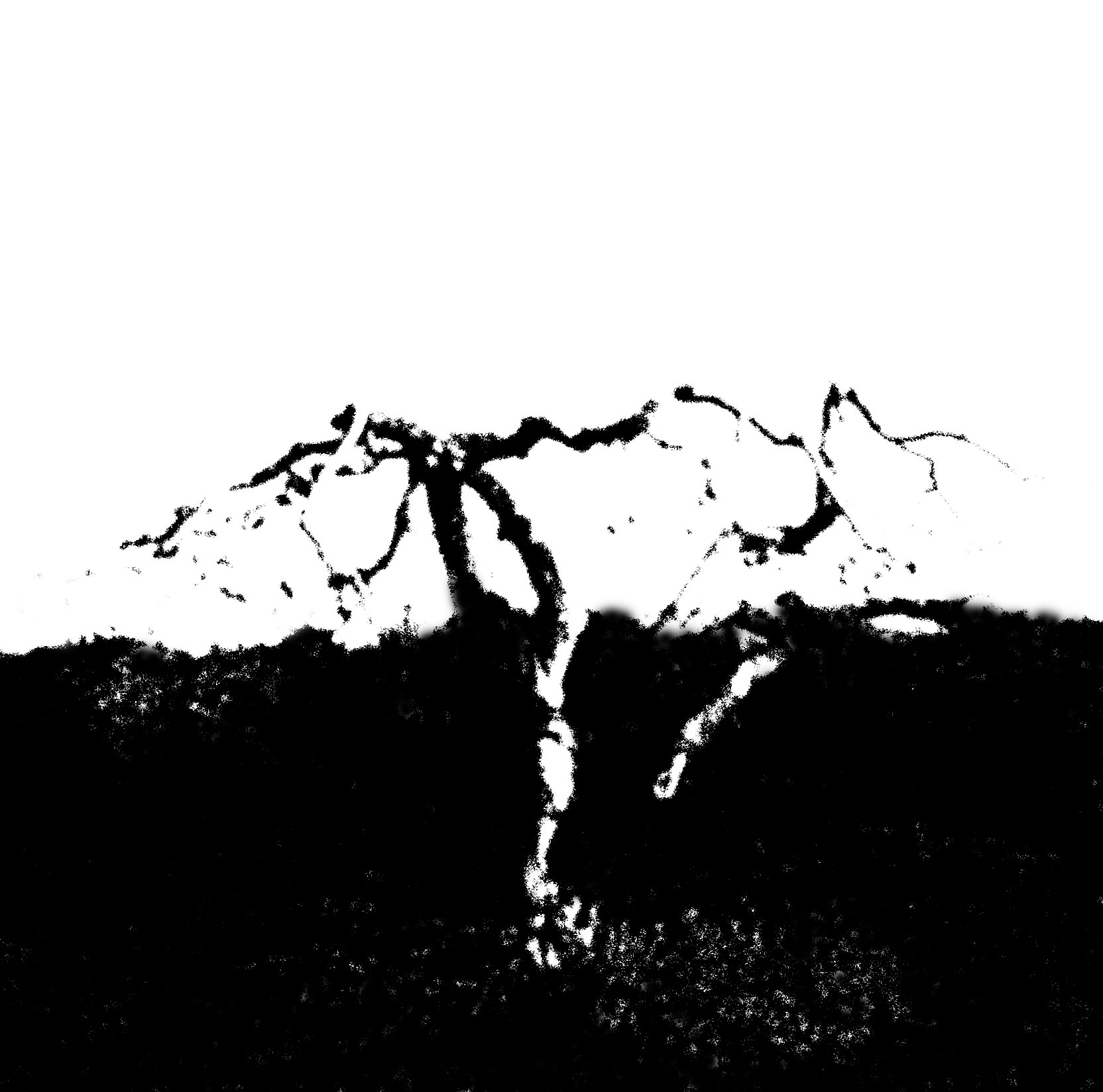
There is a section of elderly apple trees out at Burnham’s orchard. One died this season while in the process of setting out fruit. Again It was a matter of trying for a simple visualization using the computer.
No particular questions come to mind. I’ll try to do better next time.


Jay,
Your Shopped photos exemplify wonky edges — or maybe it’s the joy of “interesting” lines and marking. You see, I am updating my knowledge of art speak. Now, if someone would tell me what “lively paint” means, I might be even more improved.
June:
It is generally understood that ‘interesting’, used as a reaction, essentially means “I don’t get it”. You meant otherwise…
Lively paint simply jumps off the brush. Usually costs a little more.
Jay,
You can have the cityscape, but I want your dead apple trees! Terrific shapes.
I often go to greatly exaggerated contrast when evaluating whether or how to proceed with processing a photograph. It’s revealing to see it so differently.
I guess you have no Macbethian sins in your past, or you would have feared an encounter with Burnham/Birnam wood.
Steve:
What? You don’t like distorted skylines? For certain, our cartoonish Key Bank building will never make it to foam.
This rendering to an utter b/w contrast is, for me, useful as an initial act of destruction before bringing the image back as a foam painting. It does simplify, and allows for a better evaluation of the composition. One of my worst habits over the years has been to make a bad beginning compositionally and then hope to salvage the work later. I have found that areas that are vaguely blank, like the sky in the skyline, or the overall blackness surrounding the tree, can mock me further along. It has been a hard lesson.
I have no sins whatsoever in my background, except, perhaps, an occasional falsehood.
Jay, I do like both images, the ‘gender-specific’ wonky sky-line and the tree.
It does help to ‘destruct’ the image to understand its lines. I did that once in http://artandperception.com/2007/09/beach-texture.html with the first and last image. Maybe, I should try it more often.
Looking at my old images on my now better monitor, I am somewhat appalled by the garish colors, generated earlier by working with a laptop only. Or, perhaps, my color sense shifted into a ‘different palette’.