I’ve been photographing horses for well over a year now, and I’m feeling it’s time to put together a show, or at least a portfolio. I would be happy just continuing to make photographs indefinitely, but I’d be happier grappling with the work in another way as well, reviewing it and thinking about it and looking for themes or ideas. A few thoughts have been mentioned in previous posts, but none has risen to the level of forming the backbone of a potential statement. Perhaps the most striking thing to emerge from my photographs is a lack of interest in anything resembling a classic, noble, iconic western horse. In fact, I notice that none of the images selected for this post even depicts an entire animal (though I have some that do).
One thing I realized in the course of the recent Morandi discussions is that the edges of the bodies are often blurred, or more generally obscured, either through intervening snow or grass…
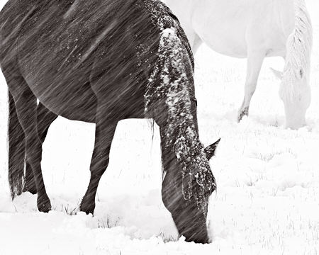
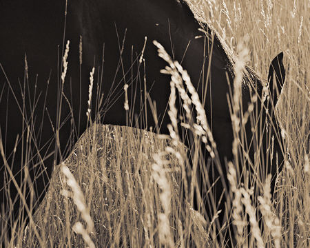
or motion blur…
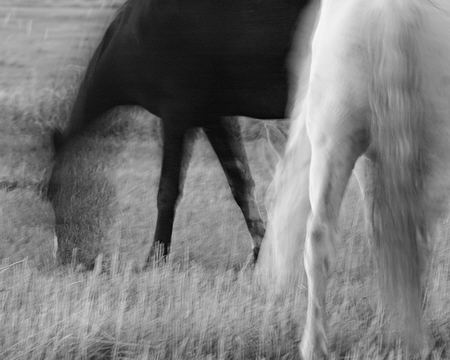
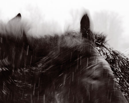
If it’s not that, then a conventional sense of wholeness tends to be defeated by awkward angles…
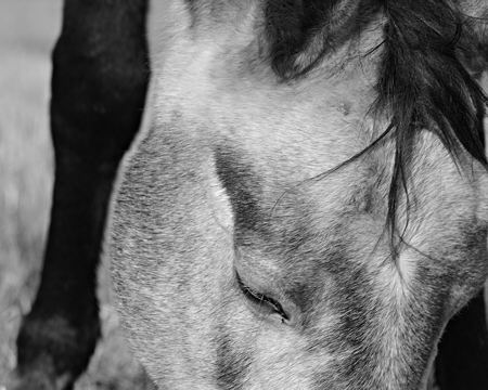
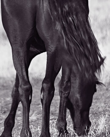
or isolated details…

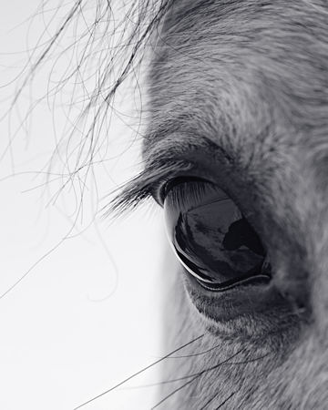
Strangely enough, I somehow feel that through these various obscurations I’m actually trying to understand basic horse form. Perhaps it’s that it seems too easy when handed to you in an immediately graspable way. I need to synthesize a horse from the disparate parts and peculiar views to appreciate it. It sort of makes sense to me when I put it like that, though I have my doubts as to whether other viewers would see it the same way. And it doesn’t seem to be a statement yet.
In thinking about this project, I may be aiming for something too neat and too intellectual. What I need fundamentally is a basis for editing decisions. I have so many images, I could easily mount a show limited to Eye of the Horse. When you are editing for an exhibit or portfolio submission, is simply liking an image enough to justify inclusion?

Amazing!
Motion blur is a Morandi in its dissolving boundaries. The one before seems like one of those images where one cannot decide whether it is a vase or a face. My eyes flip back and forth between grasses against black sky and seeing a horse.
‘All legs’ makes clear the most important part of the horse, its legs. The next one is an out-of-doors still life. The final one, all about hair, is enchanting with eyelashes reflecting back from the eye.
My own favorite? ‘All legs’.
Steve,
In a quick run-through of your images, what strikes me is the vibrating back-and-forthness of positive/negative space. In a couple of the photos, even though I knew I was looking at something horsey, the negative space made it all abstract. Your compositions here seem generally to be dealing with shapes, even when, as in the one just above “motion blur” (obscured by grass), one would imagine that “line” would trump shape.
It’s partly that these are mostly monochrome, of course, which tends to emphasize negative/positive. But there’s also something about your eye and compositional strategies that captures a whole composed only of partial parts.
This is somewhat conventional wisdom (or insights or whatever) I’m spouting, but I’ve never seen it done with a subject like horses before — it’s the combination of readable representation with the extraordinary bang of the viewer’s eyes “flipping back and forth” through the shapes.
This isn’t the only thing going on, of course, and I will return to the images for a longer closer look later. But I wanted to give you an immediate response.
Steve:
I guess that I’m an eye man.
Another person whose independent judgment you trust can be very handy in cases like this.
You have shown entirely good horse images. Every one has been well composed and adjusted. That said, I’m at a bit of a loss as I don’t know much about horse photography – just a little about composition and adjustment. Is there a definitive equine image that you might seek to emulate? Is there something like getting in touch with one’s inner horse? If you are rope walking without the safety net of established practice, then what you like might be the best criterion.
One of those notions: since horses move around a lot, could one maybe keep shooting that eye with the aim of creating a sequence of stills? What would a sequence of exposures of the same animals, taken from the same vantage point, and then layered together, be like? I guess I’m thinking of the vigor of the horse.
I agree with Jay, that starting with what you like is always a good place to start. You will probably find criteria emerging as you begin ( and continue ) sorting. I can’t resist asking — what if you stopped thinking of the images as “of horses”? Would that suggest anything useful?
And not incidentally, Happy New Year and all that, everyone. I hope to be more present in the upcoming time than I have been in the recent past.
June,
Yes, the shapes as abstract shapes, and the positive/negative space relationships are very important to me. That’s most of what I mean when I say I’ve taken an abstract approach to the subject. I want to see them as not just horses, as Melanie also suggests.
Jay,
I don’t know anything about horse photography, either, except that the bulk of what one sees tends to look like what you see when you google “horse” (which, by the way, is done more often per capita in Montana than in any other state). I don’t want a horse you might see on a postcard here.
I do have a number of sequences that might be interesting to layer. I’ve had that idea in the back of my mind, but have a preference for avoiding that level of alteration, mainly because there’s so much yet to do even within normal photographic constraints.
I think the advice to go with what I like is basically sound, but the problem is that I like way too much. I’m looking for further editing criteria to limit size. More importantly, I’m trying to figure out, if I can, why I like what I like.
Mr. Durbin,
I’d have to say that my understanding of horses is based almost entirely on movies and, unfortunately, one frightening summer-camp incident.
When I get a chance to see a real horse, I’m always impressed that these giant animals tolerate the presence of hominids and don’t appear overly anxious to step on us, though they seem quite capable. I try to imagine what Aztecs thought and felt when they saw Spanish cavalry – probably a sword.
Anyway, after reading your post, I get the feeling that you already have a way more developed understanding of what you’re doing than I do, but I guess I appreciate how your posts almost always ask a question and trigger thinking.
The first association that occurred to me was sparked by the following lines from your post:
“…I somehow feel that through these various obscurations I’m actually trying to understand basic horse form.”
“I need to synthesize a horse from the disparate parts and peculiar views to appreciate it.”
It made me remember a drawing class. The instructor believed that I wasn’t drawing what I was seeing, but instead was relying on a catalog of remembered images – perhaps templates would be a better word. He suggested that when I came to difficult parts on a model –say the hands- I would substitute a learned template of a hand instead of actually drawing the hand my eyes were seeing. He said it was obvious when it happened, like someone stuck a three fingered mickey mouse cartoon hand into an otherwise observed drawing.
Photography isn’t drawing, but maybe there’s a parallel in that people have iconic western horses in their memories, and what your photos do is force viewers to break beyond the iconic memories of horses and to see actual horses as they really appeared in an instant of time.
So what I guess I’m saying is that I agree with you that looking at these ‘disparate parts’ actually can make it possible to synthesize/re-create a horse.
I find your categorizations interesting: obscured edges, motion blur, awkward angles and isolated details. These all have much to do with your acknowledged efforts at ‘various obscurations’.
I suppose these are ‘abstract’ concerns, but maybe they needn’t be. Two other possible categories occurr to me.
4 of the presented images make me think of a category that I might call anatomy/architecture. The black horse in the snow – its heavy neck and head hanging from the shoulders, affixed to a strong triangle of legs – like a construction crane – again the hanging head in the grass, the mechanics of motion in the first motion blur image and the detailed counter ballast mechanism in the horse’s ass photo. All of these contribute to my understanding of the size and weight and physical funtionality of a horse
I don’t expect you’ll like the second category I’ve come up with. It has to do with the detailed images of the heads and particularly the eyes. There is something about the eyes that probably short circuits the real observation that I prized above in favor of archtypal templates, not necesarrily visual – Eyes, the windows of the soul. I can’t help but be drawn into the psychology of the horse. What is it thinking? What would it be like to be a horse? What does a horse see? The horse eye is just different enough to be significantly alien, and just similar enough to allow familiarity.
I appreciate your photos because they show me things about horses that I hadn’t seen or known before.
Thanks
scott
Melanie:
I look forward. For awhile this site was a tea party around a stump. Now the forces are again gathering.
June:
Would seem that the positive/negative contrast comes two ways: through the telephoto lense that I assume Steve is using, which can cast out any distant backgrounds, and the tendency of the horses to pasture in open spaces where the grass grows tall and predators can be more easily detected. I’m sure that you were looking forward to one of my patented earnest explanations.
Steve:
I admit that what I was suggesting is a far remove from what you are doing. but, frankly, the idea of the horse as a creature set up to traverse space and cast about expressively, grips me. Not that I’m looking for a proxy here, as I could just as easily head for the Chagrin Valley with its horse-an-acres and its modest browsing creatures. But I’m sure that any attempts to stir things up with loud noises or projectiles would attract a mob which might cast me about expressively.
I’ve had the experience of disliking some product of mine that people like, and the opposite. As Melanie pointed out, going with your own taste is a starting point.
Scott,
Yes, the horses are physically very prepossessing, and I’m in frequent body contact. They like to nudge or nibble, and sometimes deliberately shield another horse, but I’ve never been ill-treated. This is a good point to bring up, because I realize that something I want to convey is a strong physical presence. Being so close as to see only parts may help with that; in action, they’re often looming against or above me.
Your two categories I like very much. Anatomy/architecture reminds me of Deborah Butterfield, whom I once mentioned here. And the eyes, as Jay also mentioned, are certainly arresting. As I mentioned, I have plenty to do a show on that alone, including eyes closed, eyes looking at each other, etc. I think you’re exactly right that as soon as we see eyes, we see another being (not just an object), and start to commune with it in some way.
Thanks for commenting, you’ve helped me think about some of these questions.
Jay,
Most of the photos are with a longer than “normal” lens, though not all. Being close and having a narrow range of focus also helps simplify negative spaces, as do the plain backgrounds you mention. I do have many photographs with more prominent background elements, but it’s interesting I left them out in the tentative and fairly narrow group presented here. Placing the horse(s) in an environment, they tend to be about somewhat different things.
Steve:
I think about your horses and cottonwoods together in some manner.
Steve:
I want to recognize your punning title, if such it is. Some of the parts equal the sum of the parts.
Jay,
Close, but that should be equal(?), in case you were wondering.
Steve,
They are terrific.
Scott’s comments got me thinking about scale. A friend had a recent exhibition featuring documents for and photographs of Chinese immigrants during the Exclusion era and she made the very compelling decision to run the images h-u-g-e. As in 8 feet by 10 feet huge. When she described it, I thought the massive scale would be dehumanizing — would make the subjects inappropriately mythic, and slam the Issue of Immigration smack-hard in the viewer’s face. Curiously, when I saw it, exactly the opposite happened — the scale made the whole experience intimate. It might be something to think about, especially if “physical presence” is one aspect of the images’ appeal for you.
Thanks, Jay. I have been reading and keeping up. I just haven’t had much to say.
D.,
Thank you.
Melanie,
Your observation is most astute. The idea of doing these large is very appealing, but also somewhat expensive. Unfortunately, the largest size I can do with my own printer is 12″x15″ for these images. But depending on where (and, of course, if) I get an opportunity for a show, it might be nice to have at least one done large.
[…] last century are Steve’s precedent, and he builds on their legacy in interesting ways. His portfolio of horses is pure lens-based abstraction, and he gives us strong and beautiful images. Steve has been very […]