In my last post I described an experiment in which I performed a scan of my living room employing a laser range finder. A radial pattern emerged as the range finder, mounted on a swivel, performed a circular sweep of the space.
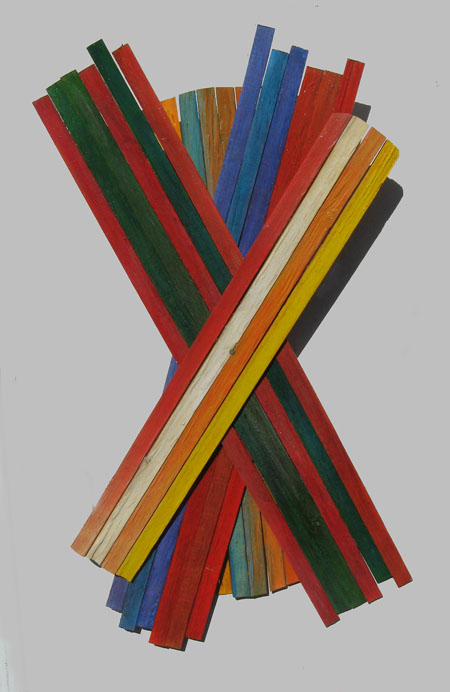
It would appear that I have become infatuated with radiant things. Last year I was making fan shapes with mason’s lath. That little campaign, extending over the summer and fall, produced a lot of junk, but a few things did emerge that indicated a way forward. This is one that worked out.
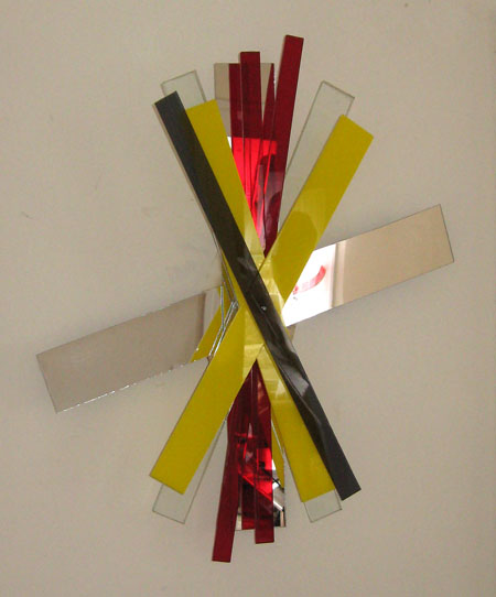
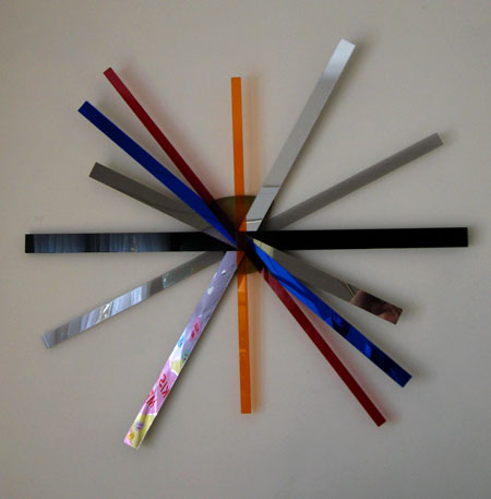
Then I discovered plastic with its siren song. Mirror finishes, clear and colored transparencies, chunky opacities – it was and is wonderful. And while the spindle in the middle remains, many dynamics are different.
The game then is one of putting strips together, building up layers, fanning things out for a best relationship among elements and in terms of the overall shape of the wall. It can be a good exercise in choice, especially since one can take it all apart and start over.
The possibilities in strip creation are boundless. At this point I’m sticking with enlongated rectangles as the pieces don’t seem to need any further elaboration.
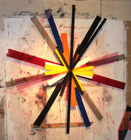
Compare the above to the below.
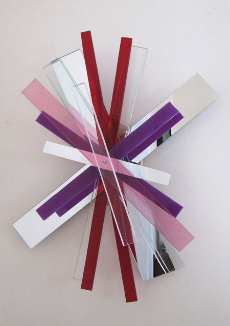
Many of the same elements and on the same spindle, but I lost the yellow and black strips and added some Victoria’s Secret pink. The overall effect feels more together.
One option is to lengthen the strips for a more spidery look.
The spindle itself can be an important part of the composition. Things are now makeshift in this department. In this example the mount is visible, but will likely be replaced with something bigger, rounder and shiny.
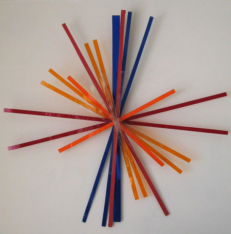
Another option is to pile on.
So, what would you put on a spindle?


The colors of a sunset – red, orange, dark violet, yellow, silvery glitter – some of the colors that you showed in 3 but leaving out the black.
Like Birgit, I’d take landscape as my source of color combinations. Your play with bright colors is fun to see, but when it comes to something for my wall, I’d prefer quieter and more harmonious hues. (Maybe it’s the wax in my ears.) For example, I can imagine working with the greens, blues, and sand color of her thistle photographs. Broad laths for the background colors, narrower for the thistle green?
Birgit and Steve:
Truth is, I’m being a material boy, seduced by all the plastic glam. And I’ve been working with what shows up. Buried in the pile of slats, that is the last image, are a few painted pieces. Better to cut the quieter colors and the clears to a larger dimension. This tends to be dictated by the fact that others, with a taste for the colorful, swoop down upon the plastic bins,
The title of this post is certainly an example of truth in advertising. I like the first one the best, but that is probably because the materials are more traditional, the colors a bit more muted.
So, what would you put on a spindle?
If I wanted to make this more bad (as in “bad” in the sense of being willing to probe the dark side and be naughty), I would put on those roast ducks they always have hanging in the windows of authentic Chinese restaurants. The horizontal ones might require some extra support.
Jay,
I think I’m most fond of the last, against that weathered fence, A nice contrast of muddled and muckled with the straight and narrow.
There’s a good book, which I’m sure I mentioned before but will do so again, that would give your “aesthetic” a proper academic perspective. It’s a catalogue of an exhibit and is Pattern and Decoration: An Ideal Vision in American Art, 1975 — 1985, ed. Anne Swartz.
Your radial moments are definitely pattern — decorative too. And speaking of moments, I meant to say about this as well as about the pie charts you showed a while ago, that they remind me of time — time passing, time recycling, circling time while trying to get a piece of it.
Karl:
Make the slats pointy and skewer the ducks on the ends. The first one also features panels of slats.
June:
Ah yes, the weathered fence. The old repository of all things muddled and muckled has been replaced by an implacable stretch that just dares me to sink a nail. What you see in the shot is my plywood painting wall.
The pie charts et al do parse. And, yes, tickings and twirlings are about the best we can do to get a piece of vaporous time. A clock face strikes me as very Hindu/Buddhist in its depiction of time as circular. And there is something profound in that old joke about a stopped clock being right two times a day. Koan? What is the time of one clock stopping?
Jay,
My daughter’s significant other, an otherwise sterling and sensible carpenter, hates our grandfather clock on the mantle. He says its quarter-hour/big-ben chimes remind him of his own mortality.
I find it comforting, a bit like having a cat in the house with a lot less litter. It also ticks, but my hearing has declined to the point where I scarcely hear it. On the other hand, I lay in bed hearing the quarter hours at 7 or 8, thinking I’ll stay there for just another quarter’s bong.
June:
The significant other might be responding to an elegiacal, tolling, Big Benishness and its attendant pall. Then again, maybe not. We have a mantel clock that is forced to bear mute witness to the hours. Not much is asked nor given.
How many bongs do you consume in a day? Smoking in bed and all that.
And have you seen anything by artist Ruslan Korostenskij?. I saw several of his works and was amazed as I have never seen anything so stunning and beautiful before. I now want to find more, but really don’t know anything about the artist. Can anyone help out? Would be very grateful.Thanks.
Yes, I know ruslan korostenskij. you can see his paintings at his website http://www.paintart.lt . i loved them!