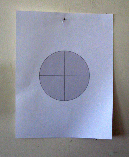
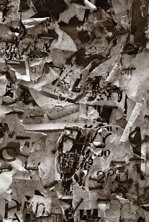
This has to have come up among the copious writings surrounding Cubism, but the facet – a unit of composition often used by Picasso and Braque – can resemble a sheet of paper hung on a wall.
Signature elements include a generally rectilinear shape, a highlight and a shadow side. One can imagine a wall full of notes and sketches begging to be arranged. Makes me think of Da Vinci and his cracks.
Some of you may be shaking your heads at my ignorance of the literature. If so, please bring me up to speed.


Jay;
A great start on a cubist image; shallow space, geometric, limited color. Now….pull some of the gray backgound up in front of the blue paper, ‘dis-arrange’ the crosshairs, make some edges transparent, perhaps a few more facets (triangular and curved)…….and a glass of absinthe…Voila!
Jay,
Paper! Now I know why I took this picture, which I’m calling “Ma blague”:

I hope to get to some reading this weekend, so more later.
My inclination would be to throw at dart at the center of the cross hairs!
Makes me wonder why I chose that sheet.
Birgit:
Your action would be key, as therein would lie ‘d art.
Jay: I am painting action.
Steve:
I hesitate to call you Ma Jolie as I would not recognize you on the street. But, hey!
Is that a photograph only, or did you apply Magasin Photo? See, I’m lying there in bed the other night thinking about cobbling images of Cubism-related text
cont.
into a pre-existing composition. I was thinking about using the stamp tool in a manner similar to those lily pads a while back. And then there it was essentially – and done better, I must say, than I was imagining. That is a fine image you came up with.
Nothing special about the bulls eye beyond it’s being handy.
Jay,
The photograph is one I made in Newfoundland last fall. You might consider it a random, public participation sculpture built up by repeated posting and tearing off of all kinds of announcements.
Steve:
That makes sense. However, given that I am seeing what the camera itself recorded, then it must have been a most unusual wall. First, the whole thing seems to be drenched in a kind of white commonality, the announcement “paper” appears as might a paper mache’ – and there is a significant paucity of copy. Furthermore, it is usual to see a certain flatness maintained as posters and notices are pasted up one upon another, and then ripped off. In this case it feels as though there is a kind of active zone of some thickness into which shapes protrude. Then the drips – makes me think of plaster- Something that might have shown up in a happening.
Jay,
There was indeed a built-up but irregular substrate of paper and staples. With the wind and rain in St. John’s, it’s not surprising that nothing hangs on too long, and what’s left has a tendency to become mush. A metaphor for memory?
Steve:
Ah, staples… that’s the ticket.
Or maybe a precise description. Myself, I’ve reached the point where I can remember the brand of toddlers’ booties I wore as a bootied toddler, but can’t recall where we went for vacation last year.
Bruce:
Somehow I missed your comment.
You bet. We can drag this thing into the promised land. However, I’m going to have to confiscate the absinthe for my personal use.
Did you say that your son designs programs? He might like to do a little app that allows one to cube up a given image using a menu of the standard characteristics.