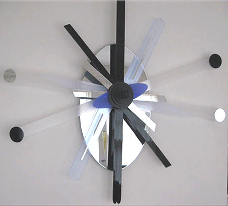
I’ve shown the likes of these previously. The going has been slow as I have had to sort through a lot of possibilities and pick up some skills. One thing remains unchanged as I am still stacking balanced elements on a common axis.
The summer a year ago I had stepped back from a somewhat futile campaign in which I had played around with wood lath. The results were fairly weak, but some directions were indicated. Then I discovered plastic with its many options. In fact, I have found that the variety of visual effects – transparencies, mirrors, colors – can resemble a candy store and I have had to restrain myself.
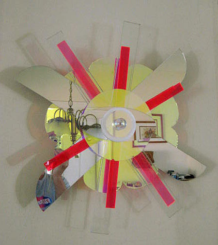
I gave in to the lollipop effect with this piece with mirrors, florescent pinks and a lot of glassiness. The dazzle notwithstanding, I find that I have to work at designing, cutting and assembling something that feels right. In this case I’m somewhere in the vicinity. Another issue is what might be called the Value City Furniture store problem in which the piece ends up looking like it belongs with a chrome and black leather room ensemble.
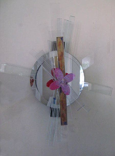
Transparent plastic bars are set among circular mirrors to create something of a grayish background rhythm. Fronting this are some more colorful and worked embellishments. Again, the whole thing can so easily go south. Fortunately, units can be replaced and rearranged on the axis and fanned out in whatever pattern seems best.
It is hard to photograph the mirrored pieces as a slight change of position can create big differences.
This stuff may be hard to critique as presented. But I would be glad to hear whatever comments come to mind.


The color scheme of the first sculpture with its ‘masculine’ black, white and blue is interesting. It gives the arrangement a bold appearance. A CEO may like it.
The second one, the Lollipop, is enchanting with its broken reflections of a framed picture, lamps, and a glimpse of the photographer. I love the round shapes. Where does the yellow come from? Is it part of the arrangement or a reflection of the room? I have always liked the combination of red/pink and yellow. (When my kids were little, every window in the house had a bright yellow, orange, red or purple curtain made from the original Marrimekko fabrique).
The last sculpture is harder to see. What is the color of the bar?
I love your new approach!
Birgit:
The yellow comes from a peculiar coated plastic that transmits different colors depending upon one’s angle of view. Straight on everything is a purplish blue but transitions to yellow at a more oblique angle. I avoided the stuff – and then I tried a little. I now own the entire lot. Again, it requires a certain restraint.
House of Plastics generates a limited variety of cutoffs, and availability depends upon what contract is in play. Overall black, white, mirrored and blue plastics are most dependably had.
Speaking of reflections, there’s another in the works in which mirrored bars work on each other. Not happy about it yet.
The bar in the last piece was sprayed in a gold luster on the back. This was partially sanded away and a layer of black applied. I like the look.
jay,
This looks to be a set of themes and variations that could last a lifetime.
I really like the classical symmetry and mandela-ishness, attached to your usual playfulness. It combines a formality undercut (or renovated with) a kind of pop art.
What are the approximate sizes?
I like the doubled mirror effect on the last piece, although I’m not fond of pink flower-ish forms (it’s just a bit of bigotry on my part, I know). Seeing bits of the color doubled in the mirror is fun, as is seeing bits of the room behind the photographer in all three, but particularly in #2. And of course, bringing in the ambience of the surrounds (your basement? your living room? MOMA?) is part of the experience — very contemporary to include the viewer as part of the art.
As you note, photographing clear plastic is an exercise in frustration. Congratulations on achieving it as well as you have. I kept wanting to see some organic elements behind the clear plastics — you know, a dry tree branch with deep black twigs, or bits of foliage caught just barely within the clear plastic. It’s possible my desire for foliage or recognizable organic forms could be achieved simply by photographing the piece in an appropriate spot. And perhaps the originals could be surrounded by photographs of them in different environments, including something even more organic — a child or dog or fish, just barely visible in the mirrored surfaces.
Keep going with these — they are a delight and thought provoking as well.
Thanks June.
I’ve taken a few preliminary swipes at bonding cloth to the clear plastic. It appears that a fabric and acrylic sheet will stick together around 400F.
Your right about the reflectivity. A piece with a lot of mirror elements becomes kind of ghostly. Frankly, as usual I would like to mount one of these things on the house. I would certainly draw an audience of official-looking types.
Maybe one might make up something that would pick up reflections from all over and take it places – but never show it as an object in itself.
Jay,
This morning, I am struck by the delicacy of the flower and its golden band calmly accentuated by the silver grey background in the third sculpture. I was musing whether the blossom is well supported by the shape/size of the mirror. Scrolling back to the two other sculptures, I feel that they are different. Rather than claiming a central focus, my eye is captured by action radiating outwards, boldly or whimsically.
Being for a while with the third sculpture now, I am at peace with its mirror. The bolder size of the mirror may increase the perception of the blossom’s delicacy. Its dark pink interacts beautifully with its silvery grey background.
Overall black, white, mirrored and blue plastics are most dependably had. Perhaps, you can insert color filters, thinner transparencies, to generate a wider color scheme?
Birgit:
The little reddish propeller is highly provisional and may go away after I have squinted at it long enough. Visual complication seems to come with the territory here and I’m interested in trying to reach some kind of destination with the least number of steps. For example, I’ve stacked a number of similar bars together to find that the overall effect is attractive. That’s a few steps, but I have to convince myself that the result is definitive in some way.
The other end of the stick is dizzying complexity. I don’t know if I’m ready for that as yet.
Ah, that pink thing is a propeller. I should have known. No flowery-bowery stuff on your art. Birgit is right about the different feel (centered inward) of #3 and the way the other two radiate outwards. You might be able to work those insights and enhance them in new pieces, playing the calm off the entropy. I like the two mirrors, myself, although the kinetic/frenetic energy of the others also works.
Was it gauche to mistake the propeller for a flower? Another guy, VVG did paint blossoms.
Birgit,
I think Jay would make some kind of pun over “gauche” — perhaps,”gosh, gee whiz, golly gee –haa, play the horses.” Some nonsense that would completely baffle me until about 2 AM.
Hopefully I have headed off (beheaded with my clippers?) his terrible punster qualities. But I doubt it.
Guys:
That little pink thing is a two-dimensional model of a mole’s nose. Better that than a mole’s tauche. And, June, I am baffled by the “play the horses”, but will suspend such bafflement at a reasonable hour, as I need my rest to then baffle anon. But I’ll have you know that the pink of the propeller is only the finest grade of red interference paint.
Where’s Steve? Anyone?
I haven’t heard from Steve. I hope he’s just taking an A&P break and not sick or something.
I’m so glad I baffled you, Jay — it made my day. And no, I’m not going to explain.
June:
Feel free to baffle me to your heart’s content.
If you are into big brushes, you may want to look up James Nares.