The depiction of waves is a cherished painterly activity. Here is one of my studies depicting double waves.
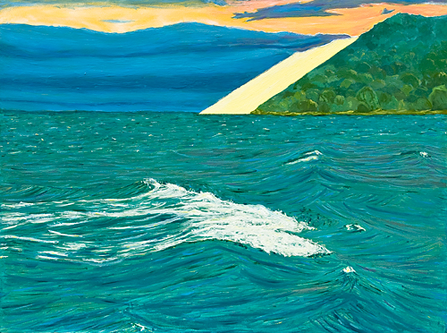
SBD080709, 16 x 12 in, 41 x 31 cm; oil on board
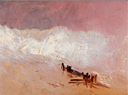
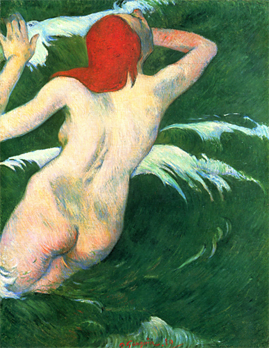
Researching the manner in which 19th century artists depicted waves, I came across these:
JMW Turner, 1835 Shore scene with waves
Paul Gauguin, 1889 Woman in the waves
Katsushika Hokusai, 1845 Feminine waves
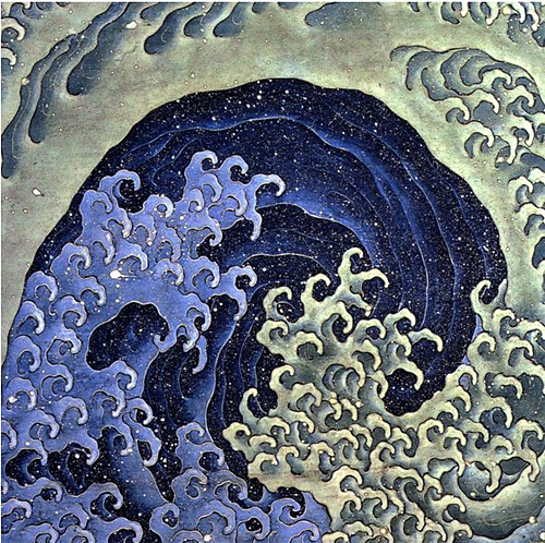
Breathtaking in their differences.

Birgit:
I’ve always been a Turner fan. There’s something in that disorderly wash of paint that brings a powerful sense of power, place and an atmosphere, without delineating a whole lot.
Allow me to congratulate you on your painting. The sky and the dune interact so well and your part drawing, part painting technique does justice to the lake. Having said that, I get the feeling that there are two paintings here: the compact upper portion with its vivid colors and contrasts, and then the lake which has a disconnected quality. What if the cresting waves were moved closer to the shore line and allowed to interact more with all that cool stuff going on?
Jay,
It is fascinating how Turner could convey a sense of power with such gentle colors.
Interesting that you picked up on a sense of disconnect in my painting. It is perhaps not quite as obvious in life view because a touch of yellow in the waves vibrates with the yellow in the dune. I will ruminate whether the apparent disconnect between the top and bottom of the picture has some meaning for me. Thanks for pointing it out.
About moving up the waves, right now, it does not seem right because my visceral memory of swimming in the waves while watching the far away Sleeping Bear Dunes is still too strong.
Birgit,
Your foreground wave is wonderful — astonishingly beautiful. Like Jay, however, I find the painting falls into two parts — the upper part is somewhat abstract, and the lower (the waves) is thoroughly representational.
There’s a kind of hinge effect that might cause the disconnect — because the shore line is so strongly horizontal and lines up across the canvas, it makes the two halves fall a bit apart. I wonder if you could smoodge (technical alert) the colors of the land and water a bit in places across that line, so the two pieces of the painting merged — not losing the line entirely but breaking the shore line a bit with paint that pulled one color from above or below into the other below or above, just here and there. — Rather than having the consistent dark line between the blue and green, smudge it a bit in places so the two bits are more alike in value and hue. And rather than the dark line and yellow line being so horizontal, break them into one another somewhat and then even perhaps into the water itself.
Maybe even having the blue hills(?) obviously reflected into and breaking up with the middle-ground waves would work.
I’m just monkeying around with ideas, not knowing if anything I’ve suggested would work, so use only such as you find useful. I would also love to see bits of broken orange sky (perhaps a bit darker) reflected in the waves — I think I see some pieces of sky hidden in all the values and hues of the waves, but a bit more might be delicious. And by the way, the colors you’ve incorporated into the water, are just right — and the way the brush strokes evoke the water’s movement — well, congrats. You’ve got it! So my comments on reflections from the sky might ruin the effect of the waves — try it in photoshop first…….
Hi June,
Your critique of my painting helped me to understand it much better – abstract versus representational.
I will photoshop using your ideas. Merci beaucoup!
You are most welcome, Birgit.
I must admit that the ideas came mostly from the group that I just finished painting the high desert with. Some members of the group had exactly the same kinds of horizons and Jef, the instructor, talked of the “hinge” (he disliked it) and ways to gently alter the line so the landscape read as an edge but not a line.
Birgit:
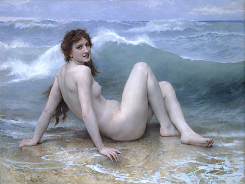
I don’t know if the term ‘iteration’ or ‘recursion’, or neither, fits the Bouguereau painting, but for me, there’s a lot of begetting there. The nude is posed artificially close to what comes across as a picture of surf, reminiscent of a museum diorama or a tableau vivant. Such tableaus were popular in the nineteenth century. In this light we might see this image as a kind of third layer starting with a painting of a nude at the beach, followed by a tableau vivant representation, followed by a painting of the tableau. Some might argue that the subsequent photograph and picture on the net represent further – but not self-referential- steps. Now, if somebody were to reproduce this as a kind of pop-up book illustration, then the merry-go-round might keep merrily going around.
Hi Jay,
From first reading your comments and then looking up tableaux vivants, I learned a little history, quoting Wikipedia
I think that the wave behind the lady and the lacy water in which she sits without getting wet are pretty good.
nice site..