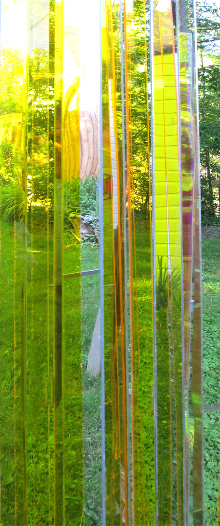
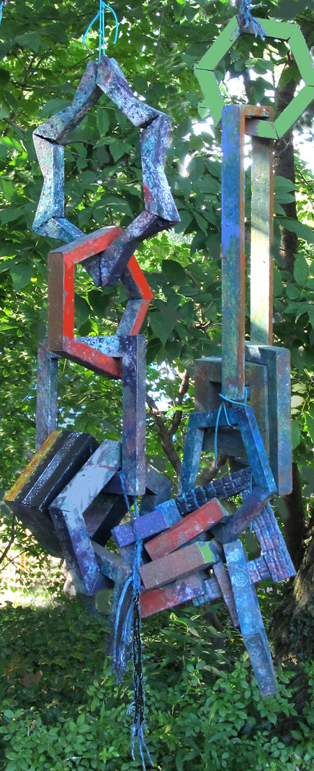
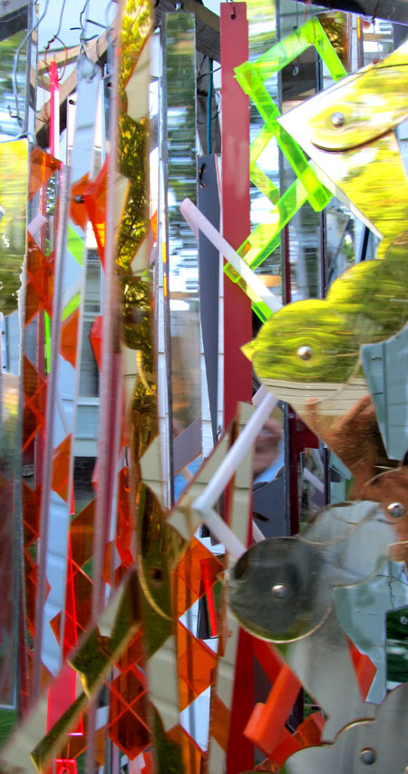
These are some pending objects.

I have been working on plastic chandeliers for the last while. This is a close up of one composed of clear yellow acrylic and mirrored rhombs.

Rearranged some bits and pieces of wooden chains. A bit of paint.

This is a closeup of a chandelier composed of a variety of components.

Tierischer Ernst is not for Jay.
The first sculpture captivates me for its transparency, translucence- something that I ruminate on all day while painting water – the second for its simple shapes, the third for its whimsicality.
Attempting to translate ‘tierischer Ernst’, translate.google produced ‘serious animal’ while some other service got closer giving ‘deadly serious’. Does ‘deadly serious’ imply ‘lack of humor’?
Birgit:
And a happy tierischer ernst to you as well.
Glad you like them. I’ll admit they are cute, as is my camera for its sensitivity to my wants and needs and Photoshop.
Jay,
I am captivated by the semi-transparency, the heavy-duty man-made (in all its senses) against the natural heavy foliage, and, in another photo you didn’t include, the shadows when you place these pieces in the right light with the right background.
Especially with the transparent ones, the viewer gets to play with an ever-changing view, like those kaleidoscopes we used to view through, where you rearranged the glass/plastic pieces by rotating them in the cardboard container. Here, the viewer can rotate herself, seeing new views as the light and background changes.
Somehow, the “chandeliers” have a whole other feel than the chains, which feel heavy to me. The chains make lovely shadows, although a bit portentious — some maybe closer to tierischer Ernst than Birgit gives them credit for.
I’m also interested in the verticality of the chandeliers — I keep thinking of the trees that Birgit wrote on a while back (I have to look again — it’s the post on Nicolaides — I fear I’ll lose this comment if I look right now). The vertical lines belie an emphasis on shape (which people tend to think of as rectangular but not elongated like this or like tree trunks) that I seem to run into in various circles of critiques and reviews. I’ve been thinking off and on about lines and about how to organize theme-based collages ala Thomas Hart Benton, who uses verticals to separate his subjects.
Ah, the coffee must have kicked in. I’m blathering. Whimsical is definitely a good term for your temperament — I might even add “silly”, knowing as I do your family’s propensity for make-believe and funny faces.
My ‘verticals‘ were a marriage between icicles and trees.
I do have a comment of my own to add here, if and when I can cut and paste out of G-mail.
Cezanne, if I have it right, was a big fan of keeping things on the H and v (akin to keeping things on the up and up, except we’re talking here about horizontal and vertical.). As much as the chain motif lends itself to random orientations, I find myself instead wanting to place things in straight lines. Sometimes I resist and other times I submit. It can seem like a lazy person’s answer to compositional problems. But then again answering the call of gravity or accepting the product of a good tug on the links can feel smart and appropriate.
Jay,
Please clarify about H and V. Googling Cezanne’s landscape, I see a lot of diagonal lines
Birgit:
He also said something about cubes, spheres etc. as being an underlying factor in his compositions – yet I rarely feel their presence in his paintings.
I think Cezanne was thinking about brush strokes performing as shapes. He was also reacting against the tendency of late 19th century realism to draw the composition and then paint inside the lines He wanted cubes and spheres to define the underlying structure rather than lines.
Contemporary artists use lines, but generally speaking, not to paint inside of (as in contours) but rather as design elements in themselves. I was surprised when I saw that Cezanne did not hesitate to outline his shapes (a ploy that seems to have become banned even in representational art these days.)
Ah, here’s the link to Birgit’s Verticals: http://artandperception.com/2011/02/edward-hopper-and-the-usage-of-incongruencies.html
It’s about five posts back and I was struck anew with the “congruencies” between the icicles/trees and Jay’s chandeliers.
He wanted cubes and spheres to define the underlying structure rather than lines.
A thought to meditate on.
Birgit:
In Cezanne’s case I wonder if an off-the-cuff statement about how he felt about the whole geometric thing hasn’t hardened, in time, into a sort of dictum about his approach.
Jay,
Maybe looking at Cezanne can help me figure out the challenges I find with the foregrounds of my paintings. I remember thinking that the foregrounds of his landscapes are odd.
Birgit:
I better go look again at his foregrounds.