Birgit asked if anyone employed a strongly contrasting treatment between the illuminated and the shadowed side of an object as seen in Morandi’s late painting. I’ve been tripping over a painting, that I did a few years ago, that might fill the bill.
Posts by Jay
More Morandi
My apologies for not being more visible in this discussion, but it’s been more fun just kibitzing.
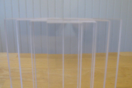
But I’ve noticed that Morandi has become front-of-mind of late; to the extent that his characteristics are influencing what gets my attention. Today I was cutting pieces of plexiglass to make into chains. I was lining them up when – behold – there was a little Morandi assembly.
Frankly, there’s little resemblance. No painterliness is in evidence, but things are arranged after a fashion and one can see an intersection of table and wall. For some reason this was enough to trigger the association.
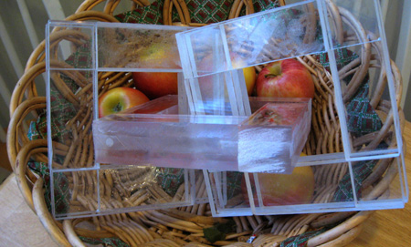
The plexiglass blocks go into the likes of this prototype seen here in a basket of apples. I’m tempted to make up some shapes similar to those used by Morandi – this as an adjunct to Steve’s experiments with the bottles.
I was going to ask rhetorically if you find your focus and sensitivities influenced by these discussions on A&P, but I know the answer already. For me, the scanner of limited attention, it’s the concentration. Any comments?
Times Plus
Winter has come early and I’ve tried to stay busy in an effort to ward off hibernation.
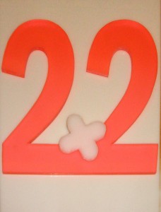
I may have already mentioned some of my hobby horse notions, such as trying to do something aesthetic with the unique circumstance of two times and plus two both equaling four. I’m not entirely sure what this may have to do with art, but I have modeled it often enough in an effort to make it fit in somehow.
The new version was inspired by some plexiglass that I came across in florescent orange/red. If I look around long enough I’m bound to find a French curve or triangle in this material in a drawer somewhere. I’ve always associated that look with things technical and graphic and the scrap led me back to the plus/times hobby horse.
The key to this project has been the notion of a plus sign that can rotate freely or that will be placed twixt addition and multiplication. I’ve tried placing the plus sign on a little motor or in a generated breeze so that it might spin. I tried adopting a shower knob/handle set into an ersatz tiled wall that included the twos. Such nonsense. Somewhere along the line the equals four part of the equation was dropped.
So now it’s an exercise in plastic with a puff ball (operator?) in high density poliethelene set askance. I might end up with nothing more than a set of twos on the wall. Any comments?
AMIEN
I have mentioned the Intermuseum Conservation Association in the past. They have a website entitled the Art Materials Information and Education Network (AMIEN.org) that contains a number of forums touching on the material side of things. I plan to drop in from time to time as I have questions of my own. Note: they are having what appear to be spam issues and are taking no new registrations for now. But That will surely change for the better.
A Relection on Reflections
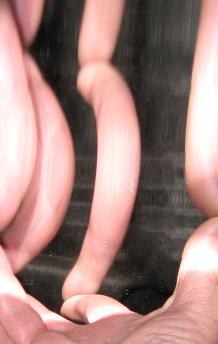
Among my recent plastic acquisitions is a substantial mirrored sheet. The grandkids like to see their fun house reflections as it is all bendy. It’s an old notion and applied to exhaustion, but I decided to see what the camera would catch reflected in it.
I’m thinking of hauling a smaller version of the sheet around with me.
Two From a Weekend
Last weekend I accompanied family members on a picnic along the waterfront and a trip to an apple orchard.
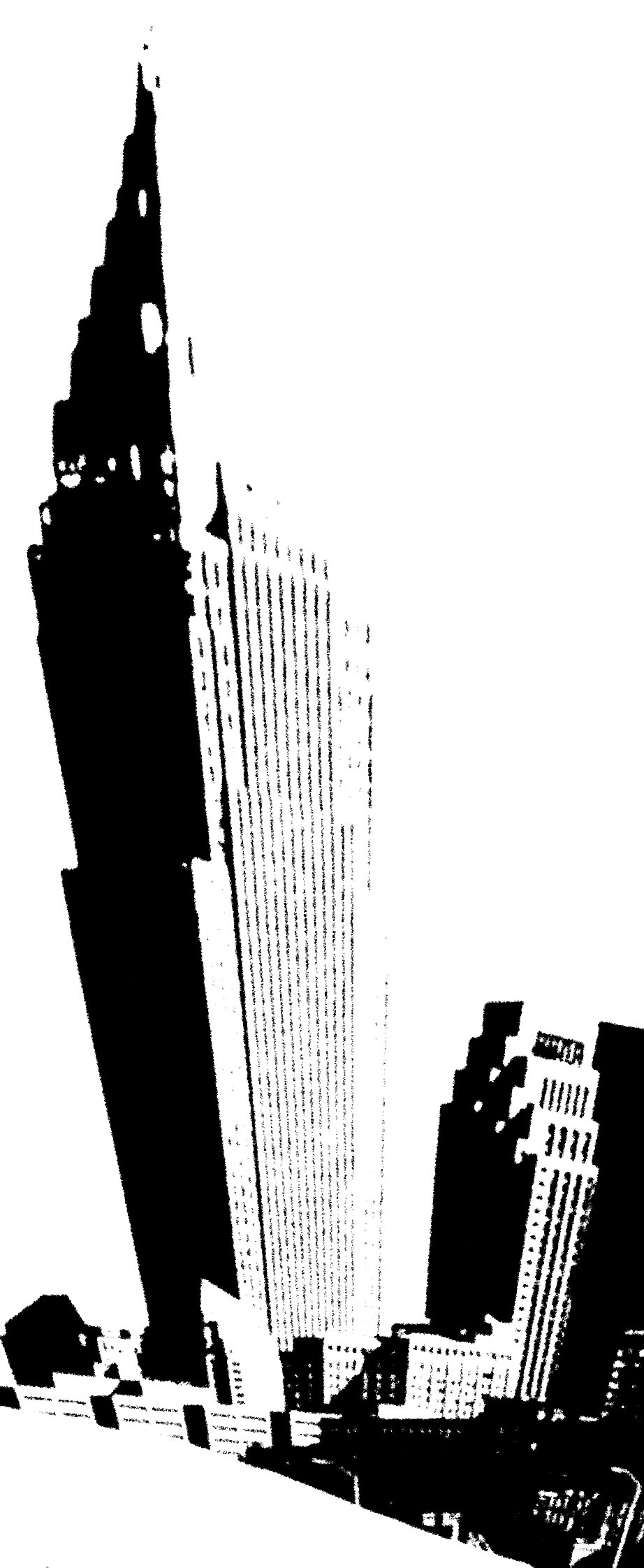
The skyline is plainly visible from the west bank of the river and I took a stock photograph of it. I then Photo Shopped this treatment. Makes me think of a mineral specimen. I’m feeling the itch to do another foam painting and this, or something similar, may serve as the source image.
Oldenburgian
I saw a dirty rear window adorned with the commonplace admonition: “WASH ME”. The glass had a general roundedness reminiscent of an old television screen. Such a screen, if dusty, would be adorned with “WATCH ME”.
I dislike this kind of thinking because it demands action. In this case not so bad as I have discovered the joys of plastic and could imagine something in that medium.
Finding an old television or crt and smearing it ala Robert Rauschenberg could maybe work, but the product would be an orphan without a context. Going Oldenburg might be better. Many of his signature works have involved a process of simplification that can catch the essential syntax of a design while allowing it to serve as a support for superimposed meanings. In this case I needed to find a way to say “TV” in an elementary way, allowing the message to be comfortably introduced.
My first impulse has been to create the outline of a tv screen in smoky lucite and to bend it into an affixed curvature, set against a background plaque, appropriately shaped and painted. Fortunately, the television screen is a deeply ingrained shape, and announces itself with no outside aid. The ‘cabinet’ might be a simple rectangle showing a little more at the bottom than the top, implying the presence of knobs and buttons. Another usable is the allowance given by the continuing depiction of older technology, like steam locomotives, in the media. Coors drives its cold refreshment choo-choo through town on steam, not diesel electric.

