Guest post by June Underwood

We often say that certain works of art “talk” to each other, that artworks can carry on dialogs with each other, or that an exhibit carries on its own “conversation.” Today I’m thinking of that interchange among works of art.
You might say I’m thinking about exhibits. However, I use “exhibits” loosely, meaning the exhibits in our minds and ones seen among blogs and websites. We are accustomed to the formal groupings of museums and galleries, and we can all easily come up with categories that curators must use to form exhibits. But I want to ponder the works themselves in a somewhat more casual mode. I’m thinking of those movable feasts that we encounter and move around in the compartments of our minds.
A specific example: such an exhibit might be arranged in the mind by allowing Steve’s rabbit to converse with his derelict houses in his series “Ghost Light.” The house photos seem full of empty space; the rabbit photo is full of texture. But putting the two into the same space, comparing and contrasting what we see as we group them in this way, some conversations seem to emerge.
Then, to add a different voice to the mix, I meandered through Colin’s photographs “of the day”. And I found another that I think might enter the conversation here.
Colin’s photo is also black & white, also “empty while full” but doesn’t have the same sense of mortality and loss as either of Steve’s. Is it the subject matter that gives it a different voice? Or the formal elements? Do Steve’s photos elegize in a kind anthropomorphism, while Colin’s stoutly refuse to romanticize? Are Steve’s photographs speaking in the voice of the grief-stricken while Colin’s have a jauntier tone? What might the dialog between them be? And what caused Colin’s photos to be, for the most part, not a very good conversational match with Steve’s? (This last is clearly subjective, based on a quick study and a tired mind – but fun to contemplate anyway).
Which brings me back to more general questions: within your own mind, is there a visual ecology among the artworks you love, where they feed one another? If so, are there ways to define and delineate that ecology which might move it from the personal pondering to more universal conceptions.
Do different art sets demand, in your mind, different kinds of ecologies and promote different viewing mindsets? Which works can be put together without canceling one another or without one bullying the other? What allows works to converse in a meaningful way — theme? style? medium? artist? chronology? period, size, or something not listed here? Or, conversely, what elements make for absolute incompatibility? If you had access to all the art in the world, what sets would you think of exhibiting?

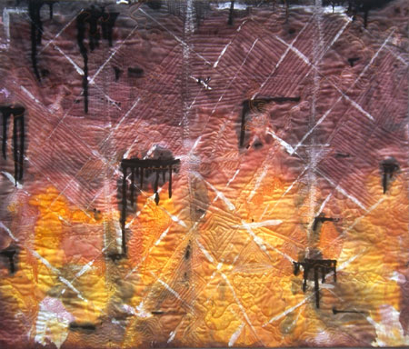
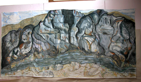
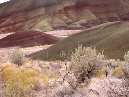
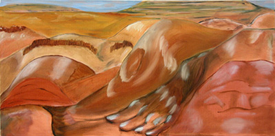
Not so incidentally, my reason for asking these questions is personal. I am engaged in a multi-year project on a single theme, the life within ancient geologies and land formations of the high desert landscape of the John Day Fossil Beds National Monument in eastern Oregon. I am processing that landscape in a multitude of media and modes. I have done and will continue to do pleine aire painting (oil and watercolor), photographs (summation and reference rather than “hey look at this), studio oils and watercolors (mostly as studies but some finished, complete-in-themselves). All these versions of the landscape will, I hope, culminate in works done with my primary media, the stitched textiles, painted, pieced, appliquéd, representational and abstract. I am in the very early stages of this rather too ambitious process, and so I am circling the questions of why/how/when/if among the pieces that I have in front of me.
As I proceed through the variations on this landscape, I hope to be more methodical about moving from memory and photograph through oil and watercolor to textiles, from representational to semi-abstract to abstract. But right now I have a mixed conglomerate of pieces, ranging from postcard sized watercolors, to an 8 x 9 foot painted textile, probably a total of 60 or 70 pieces in different media. As I work in this way, I contemplate if and in what ways, each work speaks to the others. I have multiple “exhibiting” spaces within the house and studio, and I arrange and rearrange my work on the walls and easels to see what happens.
I’m trying to get a feel for what disparate media working on a single set of imagery might have to say to one another [two examples are shown in this post.] If you would like to see more of my work in this project, you can go here.
