Posted by Steve Durbin on February 3rd, 2007
Art and Perception is being visited by more and more people, presumably looking for thought-provoking conversations about art. Many of them come back for more(!), so by that measure we’re creating interesting content. And when I say we, I’m counting commenters as well as post contributors. The comments are, in fact, the life-blood of the site, in my opinion.
So it may be time to think about ways to make more of the most interesting content more easily accessible to everyone. That would require some change to the site, so everyone’s input is needed, including any readers who haven’t posted or even commented before. We do have a category system, which could use some work to improve its visibility and usefulness. But that seems to work better for narrow topic areas, whereas people coming to the site may be more interested in some diversity and serendipity potential within broad topic areas. Think of a well-honed medium like newspapers with sections for main news, local news, sports, classifieds, etc.
more… »
Posted by Steve Durbin on January 29th, 2007

I’d like to describe a collaborative experiment that started from recent attempts to use simple image manipulation to aid in discussing visual art, such as painting (see comment 6 here) or fiber art (comment 12 here). Quite a few artists these days work partly or wholly digitally, and I wondered whether some of the advantages (like Undo!) could be carried over to an otherwise non-digital workflow.
In one of the posts mentioned above, June Underwood described her huge, inspirational, and ongoing project at John Day Fossil Beds National Monument. I proposed to cast myself as her assistant:
more… »
Posted by Steve Durbin on January 23rd, 2007
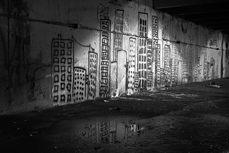
Despite recent posts here on the subject of art about art, by Leslie and by Karl, I hadn’t thought of the question in application to myself. Then I remembered that I did indeed have some photographs of art, at least if the gentle reader allows graffiti to be considered art. In any case, I was definitely interested in the personal expression represented by the graffiti. I was also interested in the setting, a half-underground concrete parking structure, and especially in the lighting, a mixture of glaring incandescent light and early morning daylight.
I made these images nearly a year ago, but still haven’t arrived at a presentation I’m happy with. I’m curious what you think of the following pairs of images. The first pair pits color against black and white. The color version shows the different tints of the two light sources, but the blacks feel richer to me in the monochrome image. Do you have a preference? For what reason?
more… »
Posted by Steve Durbin on January 16th, 2007

Probably every cat owner has encountered a scene like this on the garden path, or maybe even on the living room rug. When I came across it one morning, I immediately went for my camera and tripod. I felt slightly odd about it, but there was, after all, nothing I could do for the rabbit at that point. There is a long tradition of photographing dead subjects, and almost a genre of roadkill snapshots. Edward Weston once even photographed a dead man he happened on in the California desert. Nevertheless, presenting the result as art, for example by hanging it on a wall or in a gallery, could be considered tacky or provocative or risky. Much, of course, depends on the audience. What do you think of this picture? And is there subject matter that is unlikely to make good art?
Posted by Steve Durbin on January 9th, 2007

In a recent post, Hanneke showed us a beautiful pencil drawing of three pears. In the comments, she and Karl expressed interest in comparing this drawing with a photograph. I decided to experiment along these lines, and above I’ve posted a first result (click on the image for a larger view). I plan to vary a number of factors involved in creating the image; you can help me decide what would be interesting to try.
In this first effort, I used one of Hanneke’s tricks: a dark background. The pears were ones I happened to have in the house, and are different from Hanneke’s, not as nice in shape. I used a similar arrangement to hers, with natural illumination from a nearby window. I’m not thrilled with my composition, but I didn’t take much time, and I can do a better job when I come back to this. Please give me your thoughts on things you like or don’t like about the composition.
more… »
Posted by Steve Durbin on January 2nd, 2007
 On the last day of 2006 I made several pictures of grasses in the snow. They were in a field near the woods I’ve been frequenting for my series of Sourdough Trail photographs. Although that series is concerned with complexity, at least in part, the grasses were classic studies in simplicity.
I feel that I am as much drawn to minimal subjects as complex ones — certainly when it comes to photographs I would like to own — but few of my own images are minimalist ones. Is it possible to encompass both complex and simple images within a single, coherent style? Or do they represent ways of looking at the world that are too different? If you saw both kinds of images in the same show, would you sense that the artist did not have a “mature vision”? Do you work in different “styles” at the same time?
Posted by Steve Durbin on December 26th, 2006
I’m interested in the relationships for each of us among four categories of art. Maybe five for technical reasons having to do with the size of our bank accounts.
1. Art we make
2A. Art we own (but didn’t make)
2B. Art we would like to own but don’t because we can’t afford it. (For the purposes of this question only, you can have it. But only as much as fits in your home.)
3. Art we like to look at but don’t really want to own.
4. Art we don’t like to look at.
These categories are reasonably exhaustive and mutually exclusive, except for just a tiny wee bit of overlap between 1 and 4 in my case.
more… »

