Posted by Steve Durbin on September 2nd, 2008

You may notice a few differences in the appearance of the Art and Perception web pages. For the most part, the changes should be minor, but please comment here if there’s anything amiss or that you’d like to see altered, and especially if there are display problems. We are now running on the latest version of WordPress, version 2.6.1. This has improved features for authors (including easy adding of video and audio content), as well as better security and maintainability. But the upgrades to the core software and to the theme (Basic2Col) that the A&P theme is based on mean that some things will remain different, even as I continue to tweak towards our standard look and feel.
Feel free to ask any questions you may have about creating posts. Hopefully the new Write Post console will make sense with a little experimentation. I recommend enlarging your set of functional icons to two rows by clicking on the rightmost “Show kitchen sink,” and availing yourselves of the new Preview button. I also recommend limiting images to 450 pixels in width, though it appears larger ones will not break the display as in the past. However, depending on the browser, oversize images may look distorted in some way, as well as taking longer to load. If you save a post to come back to later, you’ll find it in the Drafts section of the Posts console.
We have collectively written nearly 600 posts and over 9,000 comments in about two years of operation. Carry on!
Posted by Steve Durbin on August 31st, 2008
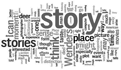
I recently came across an amusing web site called Wordle. It produces visualizations of the words making up a piece of text, with the size of a word in the picture reflecting its frequency in the text. I used it to create the representation below of what my previous post, “The Place of Story” (including comments), is about. (Clicking on the image will take you to a larger, more readable version in the Wordle gallery.)
more… »
Posted by Steve Durbin on August 26th, 2008
When we think of story we think first (at least I do) of short stories or novels. Of course, movies and theater and opera tell stories, and music and dance can also. Melanie’s Moby Dick series of fabric panels is closely tied to that story, though, as she says, not as conventional illustration. I’m beginning to think that story is a notion not at all confined to the literary arts. In fact, I suspect that stories don’t even require language–though it’s pretty hard to communicate about them without it.
more… »
Posted by Steve Durbin on August 21st, 2008
These are most of the completed panels in my Moby Dick series. They’re not exactly illustration — at least, I don’t think of them that way — but the people who’ve seen them always ask about the text that prompted the image, so I’ve included the relevant excerpts from the text.
The Pequod (Chapter 16)
All round, her unpanelled, open bulwarks were garnished like one continuous jaw, with the long sharp teeth of the sperm whale, inserted there for pins. To fasten her old hempen thews and tendons to.
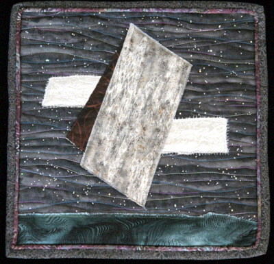
more… »
Posted by Steve Durbin on August 19th, 2008
To judge from the talks at the opening of a current group exhibit, it is a truth universally acknowledged that a landscape artist working in Montana must deal in some way with the huge volume of imagery and the stereotypical impressions people have of this state. When it comes to notions of what art should be, there may not be much difference between residents and visitors. The standard expectations seem to be of monumental mountainscapes, majestic mammals, or cowboy kitsch.
As a photographer working in black and white–already outside the norm–I am, depending on the photograph, taken to be either just like Ansel Adams or not at all like him. And after that it’s digital or film and do I manipulate the images?
Don’t get me wrong. The questions are not only valid, they’re important ones that I’ve grappled with in my work, as have many others. And I actually enjoy responding to them if I’m talking to someone interested and open-minded. Still, it’s extraordinarily refreshing to discuss with someone free of the usual preconceptions.
Montana and landscape are hardly unique in this regard. What do you have to deal with, either in creating or presenting your art? Is it generally a good or a bad experience for you?
Posted by Steve Durbin on August 12th, 2008
We’ve often discussed the effect of perceptual structures and habits on ones experiencing of art. Recently, via my favorite general blog 3quarksdaily, I came across a nice formulation of a common theme: that we are blind to the usual. In an essay on Kafka, P. D. Smith quotes the Russian Victor Shklovsky (in “Art as Technique”, 1917) on the concept translated as defamiliarization:
… art exists that one may recover the sensation of life; it exists to make one feel things, to make the stone stony. The purpose of art is to impart the sensation of things as they are perceived and not as they are known. The technique of art is to make objects ‘unfamiliar’, to make forms difficult, to increase the difficulty and length of perception because the process of perception is an aesthetic end in itself and must be prolonged.
more… »
Posted by Steve Durbin on August 3rd, 2008
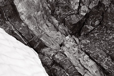
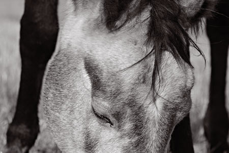
June wrote recently about the story we tell of our personal history in art. On a smaller scale, there’s the story of a particular idea or even a single piece. There may not be a coherent tale in most cases, but it happens that there is (or I think there is) in the case of several photographs I made a few days ago.

more… »

