[ Content | Sidebar ]

Archives for across the arts

Four categories of art

4766d.jpg

I’m interested in the relationships for each of us among four categories of art. Maybe five for technical reasons having to do with the size of our bank accounts.

1. Art we make
2A. Art we own (but didn’t make)
2B. Art we would like to own but don’t because we can’t afford it. (For the purposes of this question only, you can have it. But only as much as fits in your home.)
3. Art we like to look at but don’t really want to own.
4. Art we don’t like to look at.

These categories are reasonably exhaustive and mutually exclusive, except for just a tiny wee bit of overlap between 1 and 4 in my case.

more… »

Audience building – mind the gap

I’ve described Narrative gaps as one of the most powerful ideas that I’ve come across for helping to understand why people like certain artworks and not others.

The idea first surfaced in a blog by Hugh Macleod. Hugh is a marketing man so the idea was expressly connected to selling, but can be applied to finding any sort of audience for any sort of product, including art, both commercial and non-commercial.

Broadly the idea goes that people will like your work if it fits into their story. They will like it a lot (maybe enough to buy it) if it helps fill out their story and make it more complete.

This is, perhaps, best explained by example. You make pictures of wild landscapes….your audience isn’t going to be made up of people who think that a short walk on Steatham Common is the closest to nature that they ever want to get. You will have more luck with people who choose to live in and around the wild places, but probably not much. Your best market would be people who think that they want to live in such wild places. You are in the story and you help them live it a little more than they could otherwise.

Please note that the actual artwork hasn’t yet been mentioned. You can show the same work to a petrolhead, a rock climber, a farmer, and a big city commuter who wants out, and get radically different reactions according to a complex mix of whether your work is in their story or out of it, and whether it fills a gap in that story or doesn’t.

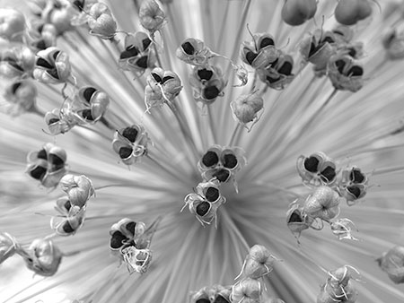
Take this picture:

studio32_web450x.jpg

It is from this short series – you can see a larger version by following the link.

I’ve chosen that particular picture to display here because I once swapped a copy of it with Steve Durbin.

During the preparation of this article I asked Steve why he chose that picture and he kindly agreed to write about it:

I wanted that Allium print for three reasons. First, I wanted to study how you handled composition with a frame-filling subject, and how in-focus and out-of-focus elements played off each other. These were things I was struggling with in my own work (Sourdough Trail series). Second, I wanted it for my wall because I enjoyed the combination of softness and precision in the image, and the overall grace and lightness. And lastly, it represented a point of contact in my search for a community of serious photographers. I don’t think this makes a great example of a typical purchase for me, but if I were to put it in terms of “narrative gaps,” I would say that the print represented several things that the narrative of my artistic life was missing at the time.

Notice that only one of the three things that Steve mentions is directly connected to the image as an image. His first point is a craft point and his third point is a social one.

At its most basic, the narrative gap idea explains why postcards of sunsets sell. They can be tedious pictures. Indeed the buyers sometimes recognise them as such, but they can hit the buttons in terms of filling a gap in their lives. They want there always to be beautiful sunsets and they want to be the sort of person who gets up and goes out to notice. Paul Butzi has written more about this recently.

It can be instructive when looking at a piece of art to work out why it appeals, or doesn’t, in terms of your own story and any unfulfilled parts thereof. But it is more instructive to realise that the fact that you like an artwork and somebody else doesn’t says more about your respective personalities than it does about the artwork.

So, if all this means anything, what are the consequences? Well, it means that if you can spot a narrative gap shared by a large group of people and then produce something to fill it, you might sell quite a lot (let’s ignore the question about whether this stops it being art). Similarly, if you produce what you happen to want to produce but want to maximise your audience, then you have to work out what sort of person is likely to be in your audience. Chasing the wrong people will be frustrating, because such a small part of your success in finding an audience is directly related to the quality of your art.

And now back to the soap powder commercials.

From the shadows

6429b-shack.jpg

Most photos don’t turn out as well as hoped for, and a rare few turn out better than expected. Some (like Colin’s hands and rock last Tuesday) can be turned to a new purpose. But the accompanying image seems to have turned on me altogether.

It was made in a mining ghost town last September, where I spent about 12 hours over two visits (once under hot sun, two weeks later in light snow). I was busy but unhurried, and the experience was entirely peaceful. I loved the light reaching into the rooms and hallways of the abandoned buildings, and I was thinking about that more than anything. It’s sometimes said that light is the only subject of photography, and it felt true then.

Developing the images later on my computer, I realized that beyond a feeling of nostalgia or mystery, many had something faintly (or not so faintly) sinister about them. I hadn’t been aiming for this effect, it just seemed to appear as I looked at the images ready for a first print. The image here, taken inside a shack built into a hill, elicited the term “violent” from a photographer friend, and I had to agree.

I’m really not sure how this came about. Am I inventing things that others don’t see? Is there inevitably a dark side to pictures about light? Was I so entranced by the light I just didn’t notice what was happening in the dark? Is it just poor preparation, led astray by my appreciation of darker tones — though the image shown is actually a bit lighter than my first version? Perhaps — an idea I rather relish — I have unsuspected psychological depths that are making themselves manifest…

I am interested in any thoughts you have on the image or the idea of light/dark in art or mind. Know of any similar pictures? If you’d like to consider a larger context, a dozen other photos from the same location are on my website. And if you want to adjust your monitor to show detail in both highlights and shadows, make sure all steps of gray are distinguishable on this test image.

I’m also wondering how often it happens to painters or other artists that one is surprised, looking back on a work, to discover something quite unintended. As a painting or quilt or whatever takes more time in the making than a typical photograph, and may entail more active decisions regarding content, is the chance of later surprise any less?

I will be checking comments intermittently, and will respond to remarks directed to me (or not!) when I can. I do work a day job…

Religious art

xian9_web450x.jpg

Larger version.

One of the big nagging questions in my mind during this year has been how we look at art from cultures that are not our own. When I did this course, for example, it was a question that the tutors shied away from.

Things which troubled me have included how we distinguish universal icons from mere local cultural references, and how we begin to look at art when we don’t understand the references.

Mostly when I’ve talked to people about this they seem to have assumed that I’m talking about non-western art – say African, or Chinese. But to me, the same issues apply within the European tradition. Our culture is diverse, and add in a time dimension – say 500 years or so – and I can be pretty well adrift on any ‘shared cultural experience’ assumption.

Religious art is an obvious example. What some Renaissance Italian was thinking as he painted the walls of a church is pretty remote from my perspective.

Nigel Warburton has written a really interesting post about whether aetheists can appreciate religious art. It is recommended reading even if, on the face of it, the subject matter doesn’t appeal to you.

Also posted on Photostream.

Exploding Technique

In my last post, I gave a definition for art as the “quality of communication.” That was the shortest conceivable statement.

The long version of the definition, without using the words “communication” or “quality” would be,”That which is imparted or transmitted by any means and is perceived to have a supreme or very great degree of excellence.”

By classing art within the broader confines of communication we have tools we can use to make the study of art quite a bit less arbitrary and a quite a bit more useful to explain, predict, and enhance. So that is a useful definition.


Michelangelo David

I’ve included here one of the inimitable Michelo Angelo’s most famous pieces. It is an interesting mix of idealism and realism. The contrast between the religious and erotic imperatives informed much of the great man’s work. The overly large head and hands of this David have always intrigued me. It was as though dear Michelo was saying, “The secret of David is his mind and his craft, not his beauty, for beauty fades, but these endure.”

There is really no faulting the technique here. At this level, any nitpicking sounds like the Fox in the old fable who when he could get the grapes he wanted, complained they “sour.”

This piece exemplifies the perfect marriage of technique and message.

But this union is not always obvious.

Someone could say, “Well God made the universe, so when I look at the sky, I am looking at His art.”

Certainly, the sky can be aesthetic. That’s why using the word “aesthetic” in a definition of art is so problematic. The definitions are circular.

Maybe God did make the universe. If so, the above statement could be true. If God did not make the universe, then we might have a hard time considering the sky art since it violates the notion of a conscious creation and hence our sense that communication requires an originator and at least some vague intention. But if we are to define art in a way that encompasses every view of the universe, then we cannot rightfully exclude such beliefs simply because we do not happen to believe there was a conscious cause and therefore not a true communication.

We can narrow our definition of communication to exclude such things; we can broaden it to include the will of God or gods; we can narrow it to exclude non conscious transmissions, or we can broaden it to include non conscious transmissions; regardless, we have a means of understanding why one person will experience something as art and another will not.

Intention need not be a complexly pre-conceived “message.”

“I will now make a picture of a cat,” or “Hmmm… I like the shape of that water line. I think I shall take a picture of that,” is intention enough, it seems, to satisfy the requirement of a creative impulse from a creator for communication to occur. Because communication can be complex does not mean that it must be complex. Often the very best art is based on simplicities so profound they cannot be easily be expressed in words and indeed were not conceived that way by the artist.

If art, while having its own ideals, is classed within the broader category of communication, it follows that art will obey the rules of communication. The success or failure of any work of art can be understood the same way communications succeed or fail.

That summarizes the key points of my previous post. Purposely, I ignored the vast subject of craft or skill to keep the scope sufficiently narrow, but I did say, that understanding that art was a subset of communication can be used to explode the relationship between art and technique.

Here, I make good on that promise.

Our entry point into that explosion is found in the word “quality.”

But I must do a little backtracking and undercutting. Forgive me if the following paragraph is too pedantic, but I cannot assume everyone knows this.

How supreme the “supreme” in quality is, is naturally a matter of opinion, but when we crack the dictionary and look up the word “art,” we see the root meanings in all the Western tongues go back to “craft” or “skill.” In Greek, we have the root, techne, from which we get “technical” and “technique.” Techne and the Latin ars were regarded by ancient peoples to be so nearly synonymous that they were considered merely different sounds for the same thing. In Sanskrit, an Indo-European language also, the word ars is even more fundamental — to make, to fashion, to form. That may be the most ancient surviving meaning. Linguists differ on this. It is possible the Sanskrit word evolved while the Latin remained true to the original Indo-European sense, but common to all the original meanings is an implicit expectation that craft, in order to be considered worthy, must be excellent in implementation.

In the arts you will find people who disagree with this. It might be two tenths of a percent; it might be as high as five percent, but most of the human race will expect that anything which is to be regarded as excellent art must have excellence of execution.

It was that pesky 0.2 to 5.0 percent that defied explanation.

I have dreaded bringing Picasso up.


Picasso Guernica

In about something less than one in twenty households in the US that actually hang art on their walls, you are likely to find a Picasso print or two. He and his consequences need to be explained. In other forums, whenever anyone points out that Picasso was really not very skilled, there seem to be several minions of the mediocre who have to rush in and carefully “explain” how that is not so.

The industrious champions of skillessness will provide links to the same old crappy work Picasso did when he was a young teenager. These are supposed to show just how talented he really was, but in fact only show that when he was fourteen he could paint like the average sixteen year old art student of the era.

We will see the same old beginner errors. We’ll see that same, ugly heavy handedness he never overcame his entire life. Picasso never did learn how light will diffract on the edges of objects and so he always tended to juxtapose his lightest lights and darkest darks in a naíve effort to separate objects from the background to the foreground. He never did overcome his inability to draw conic sections. He never really got perspective. Always his paint is over blended or under-blended.

It’s all so obvious to anyone who really can draw and paint. So obvious, that to us, protestations to the contrary are used as shibboleths.

[Short definition: A shibboleth is code used to test whether someone is really a part of a group or not. For example, anyone who says, “You know, time is the fourth dimension,” reveals that he or she is not a scientist and indeed, really does not know much about math.]

So “Picasso was an extremely skillful painter” is a shibboleth that indicates the person does not really know how to draw or paint.

But still, regarding Picasso, there will be those same old versions of quotes from writers who did not know how to paint or draw like Gore Vidal, Henry Miller, and Gertrude Stein about what a gre e e eat draftsman he was.

All that misses the whole point.

It’s not that Picasso wasn’t a great artist. He was.

He was a great artist because he could achieve powerful communications. He was not a great artist because of his technique. He was a great artist despite his crude, even disgusting, lack of skill.

Picasso accumulated a fan club of hyperbole wielding people who, like him, wanted “not to create art, but destroy it.”

Art in Picasso’s era was in need of some destroying. It had become too rule bound and pretentious. Only the very wealthiest people could afford it. (Picasso himself found his prices ironic and tried to do cheaply priced things, but collectors drove those prices up too.) The catastrophes of life and betrayals of ideals in Europe during WWI and it’s conclusion, WWII, were not addressed by the earlier aristocratic traditions. People lost their faith in the old guard, for the old guard had brought them ruin. Indeed, the birth of of popular atheism in America tracks right back to this era. Picasso correctly addressed the rage and despair felt by many. His crude technique was appropriate to his message. His was a righteous anti-pretty, anti-beauty crusade. Reality was too horrifying to be faced directly, but the horror, meanwhile, had become internalized. Picasso told the truth. It was ugly.

Unfortunately, some people people learn the wrong lesson. They think that because Picasso could be so successful with his crap technique, so too can they. But lacking his energy, originality, passion, self promotional skills, and stable of pet writers, they flop.

In music, it just drives classically trained musicians batty that bands like AC/DC could rock the house and sell so many tickets while the technically brilliant symphony groups or jazz ensembles so often have trouble making ends meet. But Picasso and bands like AC/DC spoke a message that addressed the needs of certain audiences. It was not about being “pretty” or “beautiful.” It was a primal scream of naked, unadorned emotion.

The mistake is to overly intellectualize this. The lesson is simple. Technique need only be good enough to get the job done.

What technique you use depends on the job you are trying to accomplish.

Technique is subordinate to the message.

To continue a musical analogy, I once came across a little book in the bargain bin of a music store. It was called Harmony. What caught my attention was the author’s name: Pytor Ilyich Tchaikovsky. I bought the book. At the time, I was teaching myself the keyboard. Tchaikovsky, interestingly enough, did not even play music until he was over forty. So he knew what it was to be an adult learner. His explanations of music theory were purely aesthetic. He concentrated on the types of feelings that various chords produced. Here’s a quote, “If we accept the notion that in music, as in all art, we are to express all the emotions of the human soul, then we must master dissonance, for our feelings are understood and made known not in isolation, but in contrast.”

I would say that an artist who can only deal in beauty, is not much of an artist. Life is full of ugliness. You may not want to hang it on your wall, but that does not mean it isn’t art. The purpose of technique to is carry the signal. What signal that is, is the choice of the artist.

Some artists get by on technique alone. They really have no message. They can do this because their technique is good enough to itself cause an impact. Their carrier wave is so strong, that there really need be no more signal than that. There’s nothing wrong with that, but I wonder what they could accomplish if they did have a passionate message however, those highly skilled artists.

I wonder what they would do, those passionate but naíve artists, if they actually knew how to draw and paint.

I can’t help but think that both would make better art.

This post also appears on rexotica.
One art, or two?

Brooks Jensen’s podcast of November 16th makes an interesting point about the way that different artists work.

The tenor of his thought is that photographers tend to be less likely to be artists in other fields as well – in comparison with painters or sculptors etc. He is not claiming an absolute line here (please listen to the podcast), but a tendency.

I think he probably has something.

The question is ‘why?’.

What I’m about to say is riddled with exceptions and iffs and buts. I’ll try to deal with the major ones as I go.

Photography is a dramatically different art process from any artform where you start off with a blank canvas, a white sheet, or an empty space.

As a photographer I don’t build an artwork piece by piece. I don’t need an idea. I can’t dramatically alter a work once it has begun.

No, as a photographer, I put myself in positions where there is something to see. I subtract the things that I don’t want to include and then I press the shutter. Once I have pressed the shutter, 95% of the work is done.

This doesn’t mean that I can’t have a project in mind, or that I can’t have some thoughts about what I am doing in advance. But I can’t influence what there is; I can’t control to any great degree what will pass in front of my camera. I decide where to stand and when to press the button. This may explain our collective fascination with street photography. Is this the form of photography where the photographer has least control over what is in front of the camera?

There are photographers who work out in advance a picture and then work to create it. I’ve recently seen an interview with a photographer who can take months of preparation before getting to the camera work, and, even when shooting, will go days without making an exposure. I think such photographers are the exception.

I think that photography is most like the additive arts when still life photographs are involved. There is no great difference, I think, between the thought processes behind creating a still life painting and creating a still life photograph. I also think that the ‘clean sheet’ art closest to photography is drawing from life (or possibly watercolour painting). The production time is short enough, and the possibilities of reworking are limited enough, that the same ‘see and react’ process could be happening. Photography has been called ‘instant drawing’.

Brooks Jensen also noted, as an exception to his general view, that a considerable number of photographers have been musicians. I think that this makes sense. Musicianship is also an art where the important bit is in the doing. Not the thinking beforehand, nor the artefact afterwards.

The idea that such a large part of the art of photography has happened when the shutter is pressed makes sense of the observation that photographers don’t often show unfinished work for comment. Showing an unfinished work makes much more sense for an additive artform because somebody can say something that may significantly, rather than marginally, influence the final piece.

It also begins to explain some of the miscommunication about communication. If to begin an artwork you have to have an idea, then you are probably likely to bind that idea, in your mind, into the finished product.

So, photographers aimlessly wander around and randomly press the shutter button not having any idea in advance what they are trying to achieve……

Lots of people before me have said that ‘photography is about deciding where to stand and when to release the shutter’, so there is no credit to me in inventing that phrase. But it is a powerful one. Deciding where to stand doesn’t just mean ‘up a bit, down a bit, left a bit, fire’. It also means deciding where in the world to go and when to do it. But once you have done that you have to accept what there is. You can’t invent snow that has melted, or bring out a sun that doesn’t shine. You don’t create by adding. You don’t use your imagination, you use your eyes.

Whereas, if you start with a blank sheet, you can examine your idea and ask ‘is this an oil on canvas idea, or a linocut idea’ (or any combination you care to mention).

This is a very good description of what photographers do, whilst this is an incomplete, but nonetheless interesting, take on the f8-and-be-there serendipity mindset. By the by, the ‘f8 and be there’ idea is another take on the whole craft question – but that is for another time.

There are artists who are signficant photographers but who also are known in other art fields. Wright Morris was a novelist (I can’t explain that combination); David Hockney was a painter who did photography for a while (that is a much more likely way around for it to happen); Henri Cartier Bresson was a photographer who also drew (I think the phrase ‘instant drawing’ was his). Any more?

This entry also posted in Photostream.

Art and Communication

It was a comment in one of Paul Butzi’s elegant posts The Four Seductions that I said “Art is about communication.”

That phrasing was a writer’s device. Paul, quoting or perhaps paraphrasing Stephen Dietz said “Art is about craft.” I held up a contrary mirror to that statement and used the word “about” again. That was an artistic phrasing of a larger idea.

Art is a certain kind of specialized communication. Communication is not necessarily art. Art does not equal communication, but all art is communication. In mathematical terms, art is a member of the set of communication. What makes art different and special is that a communication that has value.

People consider a communication art when it has merit, worth or excellence. Perhaps a better word than value would be quality.

This is how people, ordinary everyday people use the word art. Nothing has been invented here. So this is not really a “theory.” It’s an observation of observed phenomena. The word “art” is used to describe any communication that can be valued as to excellence.

That’s really a definition for art. The quality of communication.

What is interesting about this way of understanding and analyzing art is the magnitude of predictions and explanations that result. By considering art as an instance in the class of communication, we have an organizing principle that can be used to predict, measure, enhance or create art. We have a way of helping our own art, and we have a way of helping other artists.

For example, if art is communication, it follows the rules of communication. If it’s too original, it is difficult for people to understand. If it is too unoriginal, it is a bore. Too loud and it is irritating. Too quiet and it has no impact. If the subject bears no relationship with the experiences of the perceiver, it is not likely to be grasped. If it deals with a subject in a way that is not stimulating, it is not likely to be valued.

Second, we see that we can dismiss binary or two valued logic as applied to art. It is never therefore “art or not art;” rather, it is degree of art. Someone might attempt to make the case, “If that’s true, well then everything is art. And that can’t be true.”

(That’s so easy to refute I won’t even bother; rather, I will leave that as an exercise for the reader. Assuming of course that you actually read this.)

However, considering that art is communication and that the term is used to describe a the quality of communication, we do open the field to many expressions that have not always been considered art but craft. Craft becomes art when it breaks away from mechanical functionality and begins to “emanate.” One’s personal appearance becomes art when it transcends the purely functional. One’s life itself becomes an art form when it becomes something more than mere survival. So it is true that art as the quality of communication expands the definition.

Therefore this is not a trivial idea.

As artists, we have heard many debates in our lives about whether this is art or that is art. Is a sunset art? Is graffiti art? Can animals make art?

But the answers to these questions can be found by applying the above criterion. Are you experiencing it as a communication — conveyed information? Do you value it?

Then yes. It is art. For you.

Sure, we have heard “Beauty is in the eye of the beholder.”

But why?

This is not something new. Artists have “always known” this. They have an intuitive grasp of this even when they deny they are trying to communicate, and it shows in their work.

As an an organizing principle, art as a communication of quality predicts that art is not a universal. Sure. We know that. But why? What will be art for one will not necessarily be art for another. Why? Because art, as a subset of communication. It succeeds or fails the same ways that communications succeed or fail.

The “artiness” is a matter of opinion because value is a matter of opinion. How much would you pay? Why does a painting appear more valuable in one environment than another? Why does promotion work? (Clue: there is a relationship between degree of attention and degree of communication) Elitism itself in art is explained by this principle. Because one group can see it is art (or pretends to) they are therefore more capable of perception than the crowd, and therefore superior. What are they doing? They saying “This new practice/thing is valuable communication.”

That’s all.

Because I have narrowed the scope of this essay, I do not here treat the relationship between art and technique. But the understanding here can be used to explode that topic.

It could be said, that communication must have intention in order to regarded as “true” communication, but there are several ways to refute that. One, in law, intention is an ineffable quality that is difficult or impossible to prove or disprove. Second, intention can be the intention to not have an intention. Third, nowhere in any usual dictionary definition is intention required for the word communication to apply. Fourth, the requirement that only sentient beings can communicate is a peculiarly Northern European tradition. It is not shared by most of the world, as in Africa or Asia where it is very strongly believed that “inanimate” objects can give and receive communication. It is nothing unusual for a Latin to talk to his sword or his pistol. In Japan, there is a tradition of “seeing stones.” They are “emanative” rocks. When discovered, usually in rivers, they are highly prized and will receive special places in gardens. Visitors will be taken near them without being told about them as a test of the visitor’s sensitivity.

It could also be said that if art is actually defined, then what are we going to talk about?

Art.

Giorgione, The Tempest

To show the possibilities for discourse, I have selected one of my favorite paintings. It was named “The Tempest,” but that came later. No one knows what Giorgione called it. He never explained it.

Let’s look at it. People have debated this painting for centuries. Whole books have been written about it. It’s “meaning” has always been a huge mystery.

Who is that guy with the walling stick? Is it a walking stick? Maybe it’s a spear shaft. A phallic object the goes with his exaggerated codpiece as was the style then. Is he the painter? Giorgione resembled this man. He is not looking at the woman. He’s looking off… somewhere, and he seems to be thinking. Perhaps he is looking back in time. Is he a wanderer? A soldier? There’s a bangage on his leg. Is that significant? And the woman with the child. She looks so vulnerable in her nudity, and yet the way she looks out at the viewer is anything but vulnerable. It’s like she’s saying, “You see? This is life.” Or is she? Her look can be construed as accusative. Then there is that divide, that watery gulch between the two figures, and the two figures are so differently painted. There is considerable texture to the man, but the woman is more smoothly painted. Is that significant? Did he paint these in two different periods? It’s like Giorgione put them together in the picture, but they are really in separate countries. Is that symbolic?

Was this autobiographical? Did Giorgione get a girl pregnant then leave her to her fate? That seems to be going on here, but maybe the guy died, and this allegorical. Maybe the woman is a friend of the painter and he felt compassion for her difficulty.

Then there is the storm in the background. We know this is Torino, but it’s a fantasy, Romantic Torino. There is a sense of something imminent. Doom? Danger? Change? And notice that tippy building behind the man. A world gone askew.

We will never know. Giorgione’s intentions, if he even had any, are not clear. We can only speculate.

What do you think? (There are no wrong answers.)

This painting demonstrates several things. It shows that the artists intentions need not be known for a communication to occur; therefore, artist’s statements of intentions are not significant. Indeed, it suggests that an artist would do well to dispense with any vanity on the subject. It suggests that the art that will be considered truly great will be the kind of art that is actually completed by the viewer. This is the singularly remarkable characteristic of art that comes down through history as truly great. Ambiguity of communication in art is a highly valued characteristic, evidently.

I have completely ignored technique here. That was intentional, but the opportunity for viewer participation (two way communication), when combined with dazzling virtuoso skill is a one two knock-out punch combination.

But the reason I picked this painting in particular is that it has historically demonstrates an amazing capacity to stimulate dialog. It shows that what makes art the most valuable in the eyes of people throughout the ages is something that generates communication far beyond it’s own time. That is one thing you can say for sure about any really famous piece of art.

If ever there was a proof positive that art is about communication, there it is.

Twenty thousand years of art history scream it from the mountain tops. It is writ in letters of fire across the sky.

But I’m afraid I won’t be able to participate in any dialog resulting from this post. I’m taking a long train trip tomorrow, starting before dawn, and as soon as I post this, I shall have to pack. Please do not think me rude if I do not respond. I will have a look at again Monday, but until then, I shall be offline.

css.php