[ Content | Sidebar ]

Archives for across the arts

Artist’s statements

I’ve never needed an artist’s statement professionally. Probably I never will – I have no ambition to do the sorts of things that require them. However, if I did need one, I know I would have great difficulty in getting away with my working statement: This is what I saw. Even if I stretch that out into longhand – these photographs are representations, to the best of my ability, of what I saw – I only get to fourteen words.

I’ve updated my photo home page.

I’m writing about this again now, because I was recently asked by Lisa Call to explain what I meant when I said “art isn’t about communication. I am trying to communicate nothing. This is just what I saw.” Specifically she said “Colin could you expand on these comments? It is what you saw – but you put it here for us to see and to react to. Isn’t that a form of communication?”.

Now, I’ve had enough debates about the communication thing to know that, er, some of you disagree with me (one part of the debate is archived here, and I wrote an article which is here). I’ve no particular desire to go over that ground again, because it seemed to me that it was a matter of belief, and beliefs are not challenged by arguments. What I want to try to do here is to answer Lisa’s question in practical terms.

It is a fair question. If I’m not communicating when I put one of my pictures on display, then what am I doing?

I need to invoke a level one cut-off. I am saying here is a photograph. I think that that is about as uninteresting as communication can get, and even if I didn’t say it, the photograph would sort of say it for me. Please ignore this level.

What am I doing?

My photo home page has contained the following statement for some time: “I’m showing them to help create a dialogue, and with the hope that they may raise a smile, create an understanding or just generally do some good, some how, some where.” There are two parts to this, which I’ll deal with in reverse order:

a) smiles, understandings, and good: this is the altruism motive. I go to places like this every day for enjoyment. You post. I post. We both smile. I don’t think that this needs further explanation.

b) creating a dialogue: this is the potentially confusing area. I want to hear what you think about my photos. Not whether you think that they are sharp enough or whether the sky is blue enough – there is a place for that, but web reproductions aren’t usually worth the effort. No, I want to hear about what they make you think. I do this for purely selfish reasons, because some of you, some times, think something that adds to my thoughts and allows me to see better in the future. This is actually at its most interesting when your reaction is very different from mine. When there is no obvious flow between me seeing and creating, and you reacting. You have my attention the most when you have seen something that I didn’t.

If Winogrand is right and photos are new facts then they are interesting special cases to practise seeing on. If I can’t see what you can see in the photograph then I have to ask myself why? And is it interesting? It is much more difficult to have the same conversation about the real world. It is too big and we might not be looking at the same thing. Observation changes reality’s cat. Time creates difficulty. Things change whilst they are being described. On the other hand, photos are dimensionally limited. They don’t react to being observed. They do not change signficantly during a viewing period. And my photos are something that I think that I’ve looked at. That I think that I understand. Show me a new way of looking at them and boy, am I interested. I’m learning.

There are a couple of subsidiary things going on. I’m one of those human being thingies, so like everybody else I get high on random praise. Getting a few ‘the best photo ever’ comments never did anybody any harm.

I also use my photos as gateways to communication. Here I am on Photostream and Art & Perception (dual posting) talking about stuff – both through the comments and by email – with dozens of people that I’ve never met (it is sometimes slightly spooky that the conversations are overheard by quite so many thousands of you, which is why my email address is so freely available). The communication is about art. Not the other way around.
Sketchbooks and Journals

journals 

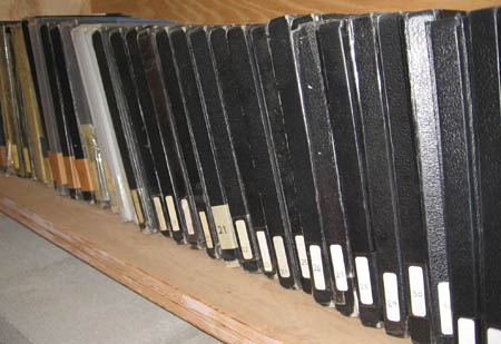
On the first day of class my freshman drawing teacher had us all go out and buy 9″ x 11″ hardbound sketchbooks. We were expected to carry them around with us over the course of the semester, and draw constantly. Now, thirty years later, I find that I have an encyclopedia set of these books filling a shelf in my studio. Keeping journals/sketchbooks has become an integral part of my art practice and my everyday life.  But the way I use them has changed.

               I think of a sketchbook as something you draw in, and a journal as something you write in. And though I’ve always used the same book for both, I see that mine have evolved over the years, from more sketchbook to more journal. In the early ones I did very involved drawings, sitting for hours doing studies from nature, or drawing people. These days the drawings in my journals tend to be notational, and if I do anything more finished it’s on single sheets of paper. 

              My journals function as sketchbooks, idea books, diaries and scrapbooks. I always have the current one with me, in the bookbag that I carry around, along with whatever I’m reading at the time. And over the years I’ve developed certain conventions for them. For example, I’ve gotten in the habit of starting each entry with the date, time and location, so it’s very easy for me now to look back through them and see when certain ideas initially occurred, or where I was when I was writing about something. I also, early on, started keeping a list on the back page of the journal of the books I read. I list the title, author, and the date I finished reading it, and if the book made a particularly strong impression on me I put a star next to it. So at this point I have a running list of pretty much every book I’ve read during my adult life, including re-reads, and a simple rating system that is useful when I want to go back and retrieve information, or recommend books to friends. When the journal is full I put a number on the spine and add it to the shelf, and I start a new one.

               These journals serve several functions for me. The most obvious is that they’re a place to store ideas so I don’t forget them. Putting them down on paper also forces me to clarify the ideas somewhat, at least enough to put them into words or a sketch, and it also relieves me of the burden of carrying them around in my head. Often seeing the idea on paper helps to spur variations. Sometimes these ideas are visual, sometimes verbal. Sometimes I’ll start with a quick drawing, spin out a verbal list of associations or connections, and then do more drawings. So the journal becomes a place to not only record ideas but also to develop them.

               The journals are not just for my art practice, but are part of my everyday life. I use them as diaries; to record my thoughts, concerns and activities. They are scrapbooks that contain newspaper clippings, postcards and concert tickets. I’ve been writing songs almost as long as I’ve been painting, and the journals contain endless lists of possible titles. It’s pretty obvious how a title can be a starting point for writing a song, but I’ve also had titles launch whole series of paintings. The old cliche about a picture being worth a thousand words also works in reverse –a word can evoke a thousand pictures. Sometimes the same title will result in both a song and a painting. I keep all of these possibilities pretty open-ended, and don’t try to figure them out right away.

               Keeping the journals has taught me a lot about my creative process. I see ideas appear, and then reappear months or even years later, but changed in some way. Like they’ve been percolating under the surface, accumulating resonance and layers of meaning without my awareness. I can read diary entries from years ago, see the things I was excited or worried about, and gain perspective on how they’ve played out in my life. And most of all, the journals are a library of ideas, some terrible and some pretty good, more ideas than I could ever execute in several lifetimes.  I’ve learned not to edit or judge the ideas when I get them, everything goes in, and later when I look back through I pick the ones that are most promising to pursue.

               When people visit my studio and see the journals lined up on my shelf, they say “Oh, you must be very disciplined. I’ve tried to keep journals before, but I always stop.” But the truth is that I’m not disciplined about it at all. Here’s the big secret, the way I’ve been able to keep these journals going all these years – I don’t write or draw in them every day. When you try to do something as a discipline, like a diet or a New Years resolution, it’s easy to start out very gung ho, then miss a day or two, and decide that you’ve failed and you might as well give up. In my case, sometimes I’m working in the journal several times a day, and other times weeks will go by without an entry. But I’ve always got it with me, so it’s there when I need it.

I’m sure many of you keep sketchbooks or journals of some kind. In what ways is your process similar to mine? How is yours different?

The Four Seductions

Stephen Dietz is a playwright I admire greatly, not only for his wonderful, beautifully crafted and deeply insightful plays, but also for his incredible attention to process and craft.  Once, after watching Stephen listening intently to an actor reciting lines that Stephen has just revised during a workshop of one of his plays, I asked him why it was so important to him to hear the words read aloud.  He told me he had learned, long ago, that when he was confronted with a choice in his writing between meaning and sound, to go with sound every time.

A few years ago, I had the extraordinary good fortune to hear one of Stephen’s lectures, in which Stephen proposed what he called “The Four Seductions” – pitfalls that ensnare us and seduce us away from the real business of creating art and instead lead us down blind alleys and stymie our growth as artists. 

Stephen’s list of the Four Seductions is:

  • Distrust of Beauty 
  • Disparagement of Craft 
  • Criticism 
  • Blaming the Audience 

Distrust of Beauty – In the current art world, it’s fashionable to advance our work by making it ‘edgy’.  There’s a sort of consensus that ‘beauty’ has been done to death, and that if a work is beautiful, then it  must be passé.   There’s a sense that since beauty is a quality that’s awfully hard to pin down, that it  must therefore be unimportant, and that striving for beauty is a fool’s errand.  It’s a whole heck of a lot easier to provoke an emotional response by doing art that’s gratuitously offensive than it is to make art that arouses a passionate response by making something beautiful.  Because of these pressures, it’s often the case that we’re not attentive enough the place of beauty in our art.  And, before we get caught up in the “I don’t want to just make pretty things”, I’d like to quote Eolake Stobblehouse, who wrote that “Note that beautiful does not necessarily mean pretty. Pretty is Beautiful’s popular sister.”

Disparagement of Craft – Likewise, there’s a sense that craft is not what art is about, and therefore it’s unimportant.  Thus we get plays that are poorly structured, with poorly written dialogue and hopeless plotting, offered up with the excuse that because the subject matter of the play is socially relevant and ‘edgy’ (note the implicit disparagement of beauty) we should excuse the poor craft.  Stephen told an anecdote about going to Europe with his family and some friends, and seeing all the glorious sculptures done by Michangelo, Donatello, et al.  He asked his friend (a sculptor, apparently) why no one did representational sculpture any more.  His friend replied “Because, Stephen, it’s Very Hard to Do.”  Craft is sometimes hard, and the temptation to slip one past can be overwhelming. 

Criticism – It’s far easier to criticize than to create.  There are lots of artists in the world who look at work and say “Hey, I could do that, and do it better”.  But somehow, they never seem to get around to doing the work – they’ve been distracted by the flush they get when they elevate themselves above the productive artist by picking apart work that’s actually been done.  Stephen suggested that when you catch yourself engaging in some criticism, that you should look at what you’re thinking/saying.  Are you trying to figure out what went wrong, and what might be done to put it right?  Or are you looking at the work and trying to find ways to run it down so that you feel superior to the artist? 

Blaming the Audience – Finally, when one of our works of art fails, the temptation is to blame the audience.  They aren’t perceptive enough, they aren’t smart enough, they don’t have the right education, or perhaps they simply aren’t sensitive enough to respond correctly to your work (which you feel is absolutely superlative in every respect).  If only we had the RIGHT audience, we assure ourselves, our work would get the recognition and acclaim it (and we) deserves. 

I’m sure I’ve done an inadequate job of trying to capture Stephen’s ideas accurately – for one thing, he advanced all of this in a far more articulate way than I ever could.  But I heard the lecture a couple of years ago, now, and I find that I’m still turning all these ideas over in my head. If you can look past my meager presentation and try to get to Stephen’s ideas, I think there’s a lot there for consideration. 

Mixing paintings and photographs

A friend recently put it to me that it was very hard to show paintings and photographs in close proximity to each other without it being to the detriment of both. I hadn’t really considered this before, but I could see the problem. Further, it seems to be a problem with those two specific media. Photos and sculpture, for example, don’t fight in the same way.

I’m not sure that I’ve got to the bottom of this yet, but my working hypothesis is that they are too alike, yet not so similar that they complement each other. By which I mean that you are very unlikely to walk up to a statue and think that you are looking at a photograph, but it is possible to confuse photos and paintings.

If I have been looking at paintings and turn to look at a photo, then the surface of the object seems dull and lifeless. I’m looking for texture that isn’t there. And in the other direction, if I look at a painting expecting it to be be a photo, then I can be disappointed by the lack of detail.

There is also a problem of scale. There are large photos and there are small paintings, but generally photos want to be smaller than paintings do. This means walking up to them more closely, and in a mixed display I’m not sure where to stand. Obviously, I resolve the problem picture by picture, but it is unsettling.

I don’t think the same confusions apply to drawings and photos. These are alike enough that the texture and scale differences are reduced and don’t grate.

I don’t think we were making this up.

Also posted in photostream.

What’s up with Sargent’s “Tent in the Rockies”?

A Tent in the Rockies by John Singer Sargent

I recently asked how John Singer Sargent managed to capture the incredible sense of luminosity of the tent in A Tent in the Rockies. I’ve seen the painting in person; trust me, the interior of the tent looks even more luminous in the painting than it does in the web reproduction above.

Karl made two excellent comments about what’s going on, one dealing with contrast of chromaticity and one based on the viewer’s inferences about the tent material. I think those two comments are on the right track, but I also think there’s something else going on – I think Sargent is taking advantage of some quirky properties of the human visual system.

Check out this web page: http://web.mit.edu/persci/gaz/; if you don’t get the pop-up window (I didn’t) click on the ‘click here’ link as directed. Run the little animated demos, which are all about the sort of effect I thinking Sargent is using to good advantage. These demos (and the embedded explanations) are a fascinating exploration of some of the properties of our visual system.

It looks to me like Sargent has cleverly chosen the composition of this work to be similar to the ‘simultaneous contrast’ illusion – the bright, translucent area of the tent is cunningly surrounded by a region of darker ‘shaded’ canvas, so that the central portion seems even brighter.

I’ve found my minimal understanding of some of these effects to be useful when I’m adjusting a photo to be printed. I’d imagine they’d be similarly useful to any visual artist who has to contend with trying to eke out an expanded sense of brightness or darkness from a medium with fairly limited brightness range. Does the painting world know about this stuff and use it on an everyday basis?

Artists talking

Posted by Colin

I’ve been invited to become a contributor here at Art and Perception. I’m intrigued by the possibilities that this opens up. For you see, I’m not a painter, or a sculptor. I can’t draw, and I’m not particularly experienced as an art critic. I’m a photographer.

One of the things that I’ve come to understand over the last year is how little dialogue there is between the different branches of the visual arts. We might differ in our crafts, but our arts are often so similar. We share the same fascinations with seeing and depicting. With exploring light, texture and colour. Yet we don’t talk to each other.

Worse than that, we hold opinions about the other arts that are often bizarre. There are plenty of photographers around who would dearly love to paint, because that is “real art”, and Karl tells me that there are painters who still feel threatened by photography. This is a divide that never made much sense; has gone on too long; and stops us learning from each other and using that learning to grow our own art.

I’d like to take two examples drawn from recent postings on this blog.

This portrait by Jon Conkey deals with exactly the same issues that I deal with in making a portrait – I don’t mean the technical stuff, but the artistic issues like how to blend depiction with abstraction, what colour palette to use, and where to place the framing. Thinking through the decisions that Jon made has been a valuable exercise for me.

As a second example, these figs could so easily be one of my photos. I don’t mean that they look like they are a photo, but that (I’m guessing) the motivation was the same, the style is very similar, and the thoughts about lighting and background must have worked in a way with which I am familiar.

So, to end this first post, I’m looking forward to the dialogue. If you dip into my blog, or my wider site, there will be lots of stuff that won’t interest you. But I hope that there will also be stuff that does.

Interaction of sculptor and painter

Painting and making sculpture are today considered as separate pursuits with little interaction between the two. Historically, sculpture and painting had important influences on each other. Below Lorenzo Ghiberti (in his Commentaries) describes some of his contribution to this process:

Also by making sketches in wax and clay for painters, sculptors, and stone carvers and by making designs of many things for painters, I have helped many of them to achieve the greatest honors for their works.

These “sketches” in wax and clay were presumably small figure models. For the painter, they would provide life-like models with the patience of a still-life.
For my current painting projects I have been making figure “sketches” in both clay and wax, and I have been amazed at how helpful these are. Lately I have been using wax more than clay, because wax is more stable than unfired clay. Firing the clay produces a strong model, of course, but it then cannot be changed easily.

[This topic thread moved to The Homunculus]

css.php