Archives for being an artist
Comparing Media: Intaglio, Quilting, and Language
In a recent critique session of quilted art, conducted by two “fine” artists, I found myself having a “eureka” moment. Then, a few days ago, Jay and Melanie’s discussion of Jay’s intaglio technique on board and foamcore (published prior to this post) pushed some of my insights a bit further. All this was added into a melange of thinking I’ve been doing about where I am in relation to quilted art and painted art.
The eureka moment came through the phrase used by one of the fine art critics: the phrase was “working the surface.” “Working the surface” in the traditional fine arts means adding, deleting, scraping, underpainting and overpainting, sanding, gouging — all the kinds of things one can do that either uncover and/or add to a planar surface. It seems clear to me that Jay’s process of working his boards and foamcore are fine examples of “working the surface.”
With quilted art, “working the surface” seems to show up in two ways. One is what is called “surface design,” which basically alters the flat plane, by dyeing it, laying rust on it, discharging (bleaching) it, monoprinting on it, and even digging into it, tearing and unraveling the threadwork. This work sometimes adds texture (especially with elements applied to the surface (applique) or taken away from it (“cutwork” or just plain gouging holes). These kinds of working of the plane are singular, patterned for the effect in a particular work, not meant to be turned into a commercial design for fabric (the original use of “surface design” had a strong commercial element.) The other part of working the surface with textiles is the work of embroidery and quilted lines that make for a frieze effect; when stitches are pushed through the two layers of fabric and the in-between batting or wadding, the stitched line makes an indentation, beside which the surface becomes raised by the pushed-aside materials.
I have never heard the phrase, “working the surface” applied to quilted art before, but when I heard that and then saw the intricacies of Jay’s working of his surfaces, I realized that the language may give me new insights into what can be done with quilted art.
At the critique, the guest “critics” (very kind observant folks) looked at two pieces I had brought, comparing them.
The first was one you’ve seen before: Mrs. Willard Waltzes with the Wisteria, 76 x 61″, 2003, hand dyed and painted cotton, embroiderie perse with computer-generated prints, and dyed overlays.
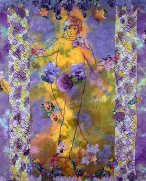
 detail
Critiques: Some Thoughts
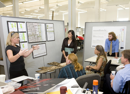 Architecture Students Present their designs at the Savannah College of Art and Design
On the Ragged Cloth Cafe blog, I wrote about the nature of critiques, mostly summarizing James Elkins’ Why Art Cannot Be Taught; I won’t go into his ideas — you can read a summary on Ragged Cloth if you are interested — but I have been evolving my own thoughts on the subject.
Last Tuesday, in a painting class, the instructor failed to show. We were scheduled for a long critique session, and, being self-sufficient and interested in each other’s art, we continued with the critique ourselves. The critiques in this class had always been group affairs, ones in which the instructor led but did not direct the conversation. So we could easily emulate his processes.
Elkins’ speaks of critiques as fraught with dangers, having multiple ways to can go awry, and he loves the fascinating explications of human nature and thought in action which critiques provide (which is also why they are fraught with dangers).
Some of the danger, as I see it, lies in the fact that while the artist wants information that will help improve her work (and also is hoping to impress the viewers with her artistic abilities and insights), the “panelists” — students or professionals in the field — are almost always struggling to explain what they are seeing. If the panelists (in our case, the other students) are to be successful, they must have insights into the work they are looking at, and then find ways to articulate those insights so that the artist will benefit. It’s a struggle on both sides, since the artist has to be totally alert to the thoughts of the panelists — sorting out, when comments seem confused, whether the speaker are struggling to find her idea, struggling with expressing the idea, or struggling with explaining the idea in terms that will benefit the artist.
And when comments are not confused and the panelist clearly states an opinion or question or makes a comment, the artist has to sort out whether the comment comes out of a concern which the panelist has with his own work or obsession or whether it is truly applicable to the art that is being presented. Other kinds of interface problems can occur — the panelists may get off course and meander into digressions; they may find themselves hostile or overly sympathetic, and so forth.
All this is outside the sometimes awful experience of attack critiques, those legendary events that leave the artist a quivering heap of jelly. I think they arise not out of art or articulation or ideas, but an entirely different culture and one that I haven’t encountered.
Nevertheless, critiques, as I know them, are a substantial and important part of my art education.
In this critique, I limited myself to three works, a “straight” naive/realistic painting of a nearby street scene, a more complex and abstracted view of a warehouse area from above, and a semi-abstract “forest” scene.
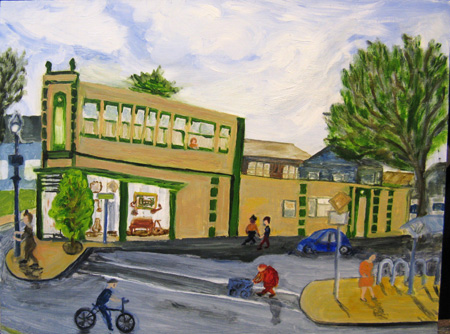
Hawthorne & SE 20th, Mid April, 12 x 16,” oil on board
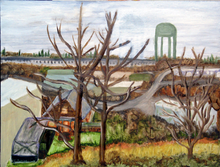
McLoughlin Warehouse District, Mid April. 12 x 16,” oil on board
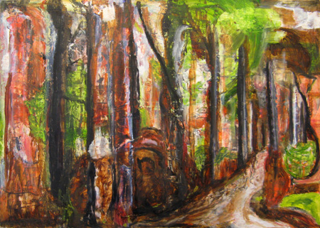
Forest Scene, mid-April, 12 x 16,” oil on board
I was interested in people’s responses to three very different kinds of paintings, all done within a couple weeks of one another. I was particularly interested in this group’s comments, because they are very articulate about what they see. I am somewhat intimidated by their ability to explain what they see, what they like, and how they read a canvas. So I am learning as I listen to them, not just about my art, but about talking about art in understandable ways.
The responses to the three pieces were that they enjoyed the corny street scene, that the colors in the warehouse piece were good (the reproduction here doesn’t do them justice) and that the composition in that one was excellent (they liked the water tower, just as they liked the old lady crossing 2oth Street), and finally that the last was puzzling, interesting, weird, Hansel-and-Gretel-ish,or maybe smelt of Hieronymous Bosch. At any rate, the last, for them, seemed to be coming out of some inner state, whereas the other two were evidences of external scenes. There were other comments but these are the ones that I remember most clearly.
But what the group really wanted to know was where I was going in terms of this last piece. Was this a direction I intended to pursue? What would I be painting next?
I talked for a while, and then realized that the the group consists primarily of abstracting landscape painters — people who take their references from landscape and then work those references into abstractions. Here’s David Trowbridge’s work. David is an accomplished artist, currently exhibiting in downtown Portland, whose work I admire. It is fairly representative of the working process and product of most of the group members.
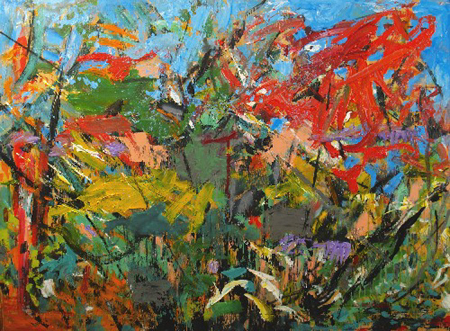
David Trowbridge, Sheffield XI, acrylic and spray paint on plywood, 35.5 x 48″
So when I debriefed myself about the nature of the critique, I had to consider that the abstract attracted the panelist’s attention most because they themselves did art like that. And the questions about where I was going from there were both out of thinking this might be a new path for me, but also a function of knowing that the class was coming close to its conclusion. We were all going to have to decide “where we were going.” I did ask directly and firmly, at least twice at the conclusion of the session, what suggestions they would have for me. They had none.
So my question is, what kinds of critiques have you had that left you with interesting debriefings? Why were the critiques useful? What unanswered questions were there? Do you believe in critiques — if so, what are their limitations?
Pleine Aire: Advantages and Otherwise
I continue to get out and about in my Portland neighborhood, painting whatever resonates with my quirky instincts. I plant my easel on the sidewalk, set up my palette, and proceed to put color on board.
This activity invites community action: sideways glances, deliberate not-lookings, polite “may I see-s?” and full-fledged engagement in conversations.
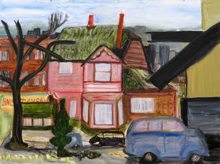
A City Drift — Painting without Purpose
At the request (advice/direction) of my oil painting instructor, Jef Gunn, I have gone out on the streets of Portland to paint. Luckily the weather has been relatively decent, although cold if one is catching morning shadows. But the experience has put me in the midst of the community, and a grand experience it has been.
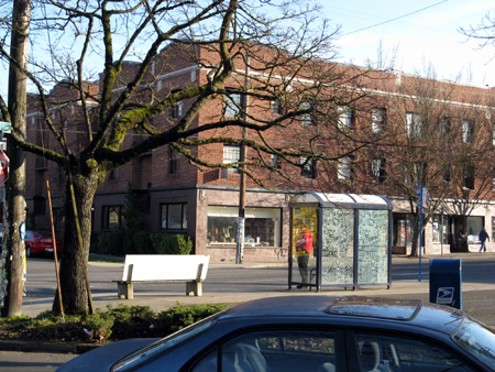
I am discovering that one of the most fulfilling aspects of painting is having the casual onlooker weigh in, discuss the weather, make silly comments or just say “hi.” I didn’t realize until the Basin experience how much having a bit of interaction with the community could mean to me. The Portland pleine aire work that I’ve been doing verifies that social contact enhances the pleasures for me of slapping color on board, smooshing substances around until they come to mean something, and personal ruminations about the view.
The Refuge
The back wall of the Hewitt Downstairs studio at the Montana Artists Refuge is about 15 feet by 20 feet. It was that wall that became the repository for a series of oil-painted panels called The Refuge. The Artists Refuge is in Basin, Montana; The Refuge is oil on canvas, a product of my two-month residency in Basin.
The Refuge is a visual rendition of a psychogeography of Basin, Montana — paintings that recall scenes and feelings arising from that particular place in that particular time and space of my life.
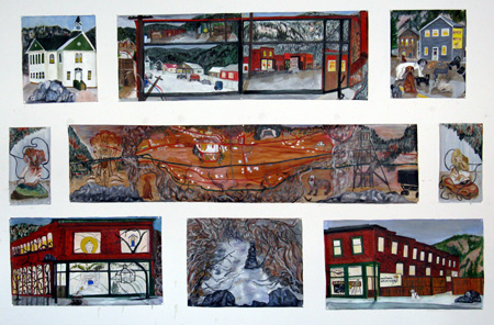
The Refuge, oil on canvas, Approximately 6′ x 10′.
The Weight of Perfected Craft — a Visit to the Archie Bray Foundation
On a windy frigid Wednesday this week, Jer and I visited the Archie Bray Foundation in Helena, Montana. The visit was frigid, fascinating, and raised some internal questions for me.
The Archie Bray is a ceramics workshop, foundation, and clay business, started by a brick manufacturer who was fascinated by art ceramics. According the website, the Archie Bray was founded “in 1951 by brickmaker Archie Bray, who intended it to be ‘a place to make available, for all who are seriously and sincerely interested in any of the branches of the ceramic arts, a fine place to work.’ Its primary mission is to provide an environment that stimulates creative work in ceramics.”