Posted by Steve Durbin on October 16th, 2007
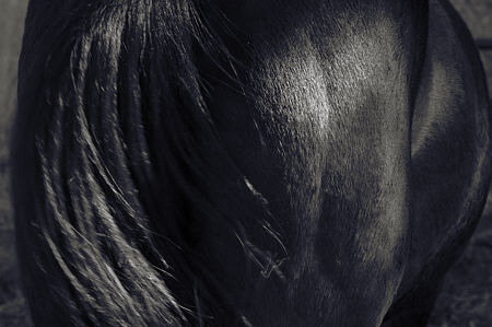
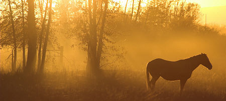
I’ve been continuing with my new project on horses, which has predictably wandered into a thicket of possibilities. I’m confident it will emerge at some point — though I daren’t say when — and when it does, it will necessarily be in some direction or other. Hopefully trailing a series with some coherence.

But at the moment, I’m taking many different kinds of pictures. The very few I’ve put on my web site are a motley and incomplete assortment, determined more by (lack of) time available than anything else. The experience has me thinking about the nature of projects.
more… »
Posted by Richard Rothstein on October 14th, 2007
Since I last checked in with Art & Perception, I’ve been exploring the synthesis of two of my most persistent obsessions: Manhattan and beatuiful men. I was partly motivated by comments on this blog questioning my lack of people in my city views and details. As a result of that, I have of late gone in a completely opposite direction.
Truth be told, I rarely enoy nude male photography, it leaves me cold. Too obvious. On the other hand the naked city in all of its hardness, rigid angles and cubist statements is to my eye powerfully masculine and quite arousing. So I wondered if I could use my camera to create some kind of visual and emotional communication between the stone, steel and glass architecture, textures and colors of my adored metropolis and the architecture, textures and colors of beautiful men.
I’m not sure I’ve succeeded quite yet, but I do feel I am on the right path. And I must confess–not surprisingly–the exploration has been great fun.
Perhaps the strangest part of this experience has been that the sexual and visual pleasure that I’ve been experiencing during this process of of exploration has been unique and extraordinarily intense in ways I had not imagined. Furthermore, the experience has given rise to intense personal feelings that I’ve not experienced during the actual act of sex. Partly, this is because–with one exception–I have not indulged in sex with my models despite the fact that one of the criteria I’ve used to select my models has been powerful sexual attraction. Limiting myself to the visual experience has opened the door on new sensations and much more powerful visual experience than I’ve ever had before.
more… »
Posted by Karl Zipser on October 13th, 2007

Painting From Life vs. From Photos
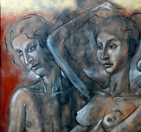
This is a painting resulting from searching. Outlines of different figures are visible behind the man and woman whom I ‘found’ in the process. The sketching use of paint is not the way I usually work. That’s part of what makes this picture interesting to me. It bridges drawing and painting which, for me, are usually sequential and distinct processes.
I made this back in April. Now I am returning to this limited palette and exploratory form of painting.
The Dutch have an expression, “fine painter.” I loath this expression, because it tends to force an artist into a position where “fine” (as in detailed, not loaded with spontaneous dabs of paint) becomes the goal of painting. “Fine” or “coarse” are of no interest to me as goals, only as means.
Do you sometimes switch between very different modes of expression, whether in painting, drawing, or photography? Do you think in doing so you are trying to find difference approaches to the same expressive goal? My feeling is that I am doing that, that there is an unity. This is part of what makes its so exciting.
Also by Karl:
How to Store Oil Paints

- Tube Trouble?
- The Greatest Invention Since the Paint Tube
How to Care for Brushes

- Turpentine Trouble?
- Storing Brushes
- Cleaning Brushes
- Shaping Brushes
- Transporting Brushes
Things to Ponder

- What is Art?
- How to Make Art Last?
- Is Art School Worthless?
- Why is it Difficult to be an Artist?
Frames and Framing

- To Frame or not to Frame?
- Internet as Frame
- In real life, the frame matters
Painting from Life vs. from Photos

- From Life by Zipser
- From Photos by Bodner
- From Life by Bartman
How to Blog

- How to Write the Perfect Blog Post?
- “Bloggers have to Earn the Right to be Read”
- How Should Artists Blog?
- Can You Create in Public?
Posted by Steve Durbin on October 9th, 2007

In a recent post, Hanneke looked again at a year-old painting she had felt dissatisfied with. I’m not sure how common this is for painters, but for me and, I suspect, most photographers, it’s the normal way of things. Whether blessing or curse, we have lots of older images that were not immediately pursued. Capturing an image takes much less time than bringing it to the standard of a fine print.
There is one advantage to this state of affairs, namely the enforced editing that prunes the large fraction of images that are, at best, less good than those we spend our limited time on. There might even be psychological benefit: if it’s good to learn to let go, I sure have a lot of learning opportunities. On the other hand, if regret is bad, I’m in trouble.
more… »
Posted by Hanneke van Oosterhout on October 7th, 2007
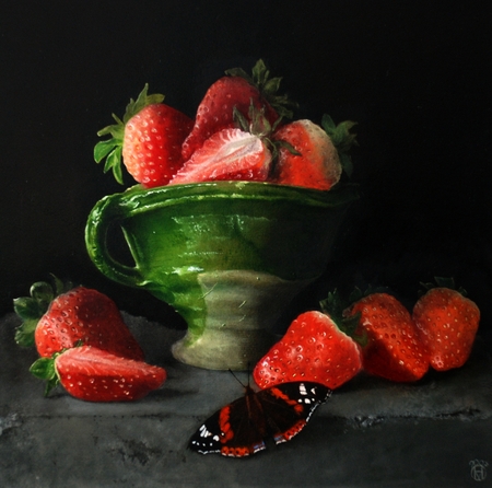
This is a new painting. Karl was against the idea that I should paint a butterfly in a still life, he thought it would be the essence of kitsch. When he saw the result, though, he thought it was good. What do you think, does the butterfly work here?
Are there some topics in art that are going to be kitsch no matter what, or is it really more a question of how the artist handles the topic?
Posted by Hanneke van Oosterhout on October 1st, 2007
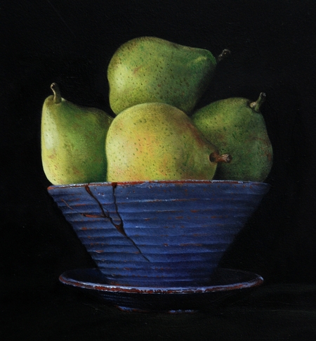
Here is a still life that I started over a year ago. It was originally not so good, but I made some changes and now I like it a lot. What do you think, did I improve it?
For me the lesson is that paintings that seem to not work so well may be a few strokes away from something good.
Posted by June Underwood on September 28th, 2007
As an oil painter who tends toward “moosh” rather than clean graphic edges, I have found myself pondering the stitched line intrinsic to my quilted paintings. They change the moosh that I so often fall into, adding a different set of visual ideas.
So, if you’ll forgive me, I want to explore notions of line — line mostly as it is generally described and discussed in design classes, but more particularly as it works in quilted art. [ed. note: This turned out to be more of an essay than I had intended. If you wish, you can just look at the pretty pictures.]

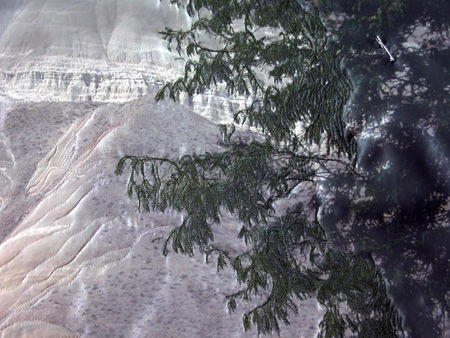
Painted Hills Bluff, detail (Work in Progress)
Line is important in design, particularly, of course, in drawing. It moves the eye, evokes feelings, defines or suggests shape, can make value and depth, and can be varied to vary its expressive quality. In quilted art, line functions in all these ways, but can have a weight and value different from that found in drawing and is far more inportant than line is in painting. In conventional photography, line seems to have minor function, but art photography often makes extensive use of line.
more… »
