Posted by Steve Durbin on October 2nd, 2007

A blog like Art & Perception is, in some ways, a substitute for the local café. The ability to discuss art with people around the world compensates, at least in part, for the loss of the immediacy of face-to-face contact. But it’s not a complete substitute. Direct interaction is still important for many reasons, and consequently there is a need for ways to facilitate it by letting people know about opportunities to meet each other, to learn, and to see art.
Few of us are so plugged in to our local art scene that we are aware of everything that’s going on in terms of shows, openings, talks, social events, etc. The newspaper may list major events, typically those for which an ardent volunteer or a motivated gallery has written a press release. In the case of my hometown of Bozeman, Montana, there are several places on the web that have listings, but judging from what is there, I suspect they are little known or used. Most of what is happening is invisible to the public. Sometimes that’s desired, though certainly not always.
But more important than the events themselves is the community that could potentially form around them. The past quickly slips into oblivion, and there is no convenient forum for the remembering, discussing, reviewing, proposing that might be engendered.
more… »
Posted by Karl Zipser on August 6th, 2007

Painting From Life vs. From Photos
The design of web-pages for displaying art is a matter of great practical as well as aesthetic importance. One design that I find striking, because of its boldness, is Jannie Regnerus’ web-page. This page (detail below) is minimal to the extreme. It is so unlike what one is used to in a web-page that at first it seems confusing. But it is precisely this unusual quality that makes the layout a successful frame for Regnerus’ photography. One has the feeling of having left the noisy bustle of the internet and having arrived in a quiet place.

I say the design is bold is because, by departing from expectations, Regnerus takes a risk that visitors may be confused and leave the site before they see anything. For those visitors who do look more closely, the simplicity of the layout serves the intended role of providing a quiet context for the artwork.
Is minimalism inherently good for the internet?
Is Regnerus’ site a model for other internet sites?
First posted April ’06 [note some interesting comments there by Arthur].
The minimal approach, Regnerus’ model in particular, has influenced my thinking about website design; the Art & Perception layout reflects this. Could we use more eye-candy? My thinking is that the minimal layout allows the latest post define the site visually — ideal for an art site, as I see it.
Posted by Steve Durbin on April 10th, 2007
 Here’s a curious tale for you: A week ago I was approached by someone interested in art collecting and in art blogging, and particularly in the interaction of the two. The C, as I shall call this beginning collector, put forward the interesting speculation that blogged artworks acquire “an aura of fame” that potentially makes them more salable. Whether that’s true or not, it probably doesn’t hurt the value of an artwork for it to be blogged.
 It happens that A&P had come to the C’s attention, and as a way of getting hirs feet wet, the C is considering buying perhaps half a dozen prints of images that have appeared in my posts. My prints are cheap; I’m sure I wouldn’t be writing this post if your paintings, linoleums, quilts, etc. were the same! (But maybe they’ll be next.) The C had good timing, in that just a few days ago I met with a local gallery owner who was enthusiastic about showing my work in her gallery. If that works out, my prices will have to go up, at least for work being sold by the gallery. (Also, the C didn’t know it, but I currently give an unadvertised 20% discount on purchases after the first.)
more… »
Posted by Steve Durbin on February 3rd, 2007
Art and Perception is being visited by more and more people, presumably looking for thought-provoking conversations about art. Many of them come back for more(!), so by that measure we’re creating interesting content. And when I say we, I’m counting commenters as well as post contributors. The comments are, in fact, the life-blood of the site, in my opinion.
So it may be time to think about ways to make more of the most interesting content more easily accessible to everyone. That would require some change to the site, so everyone’s input is needed, including any readers who haven’t posted or even commented before. We do have a category system, which could use some work to improve its visibility and usefulness. But that seems to work better for narrow topic areas, whereas people coming to the site may be more interested in some diversity and serendipity potential within broad topic areas. Think of a well-honed medium like newspapers with sections for main news, local news, sports, classifieds, etc.
more… »
Posted by Karl Zipser on January 31st, 2007

Painting From Life vs. From Photos
The only thing worse than being talked about is not being talked about.
—Oscar Wilde, The Importance of Being Ernest
Has art dealer Edward Winkleman become a cultural icon? If so, it seems we should pay attention to what he is saying . . .
more… »
Posted by Karl Zipser on January 23rd, 2007
[update: Here I use Art & Perception’s Theme files, but with the basic Sans-Serif font. You can compare the two sites to see which is easier to read. On many systems, both should be easily readable.]
[update 2:. . . more… »
Posted by Karl Zipser on January 22nd, 2007

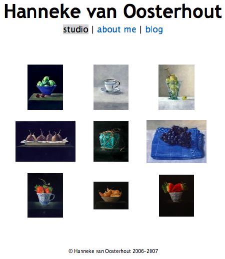
Inspired by our previous discussion, I prepared an art studio/blog layout.
more… »


