Steve received an e-mailed picture taken by me during a recent trip and suggested that we do a collaboration around the theme of waterfalls, and do so in the form of two posts. In the first, I hereby display some images and describe my path to them. We then discuss a reworking of one of the images by Steve. This will be followed by another post where he displays and I perform a makeover.
My Images
Ohio is the home of the gentle cataract. The peculiarities of geology and topography promote a stepwise progression of falling water. We stand in awe of any fall that we look up to. In the White Mountains of New Hampshire the water responds differently, the result of a hard geology that wears with effort. This results in smooth transitions, punctuated with boulders of various sizes.
These two environments present themselves very differently. Here one looks across the water for the most part, the included image notwithstanding, while the perspective is more vertical in the mountains.
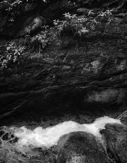
This post features images taken at Buttermilk Falls, outside of Cleveland, and the Flume in the White Mountains. The Flume is essentially a slot canyon formed by the selective erosion of a basalt dike. Water falls vigorously through a steep succession of boulders and slopes.
A word about my approach: the camera captures a multiplicity of detail that the eye would tend to weed out on the spot. Photo Shop is a quick and dry sort of dark room and it allows for a further shaping of an image away from the contingencies of the moment. I can dwell on a given shot and try to articulate more fully whatever prompted me to take it in the first place. Sometimes this process clarifies and condenses as when I am working on a portfolio image. It can also lead me away from specificity toward something more personal. Then I often find the image assuming a novel identity. At times it can seem that I am changing it to match an internal template, as though I am looking at my own mind.
Buttermilk
The photograph below is an example of this process. It was taken from a small bridge just upstream of the falls themselves, and is typical of the flattened stream beds in these parts. I was attracted to a kind of role reversal: a few feet further and the water is white and foamy as it falls over darker rock. Here the water makes it’s way in dark pools and rivulets and the rock itself reflects brightly. Furthermore, it is a welter of suggestive features and subtle details.
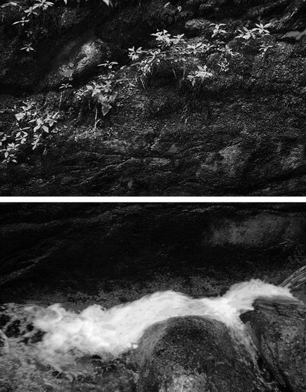
The first image is as taken, and the second as processed.
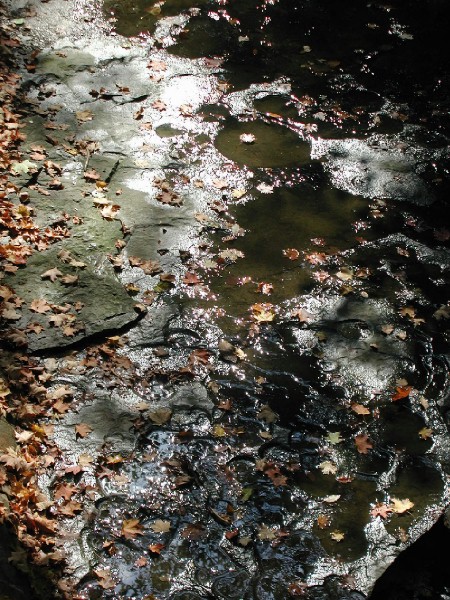
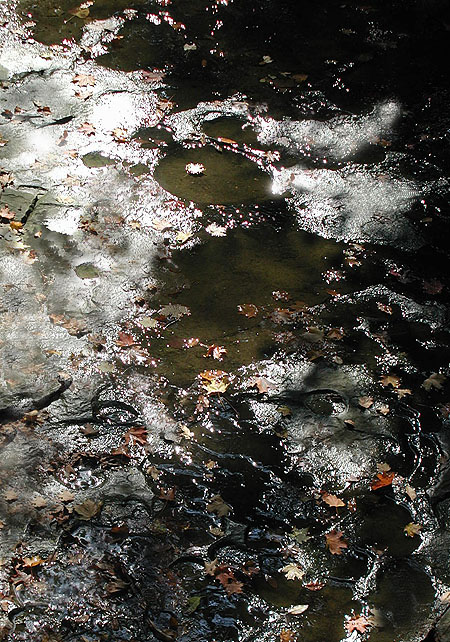
The scene did not satisfy me as taken. There was something there that needed to be shaped. I began the process by cropping the image. Then I erased small artifacts, like glints and leaves, that detracted from the overall quality. The magic wand and the stamp functions were used to isolate areas for more attention and to transfer colors and textures from one spot to another. somewhere along the line I began to sink into my work and the quality of mind matching appeared.
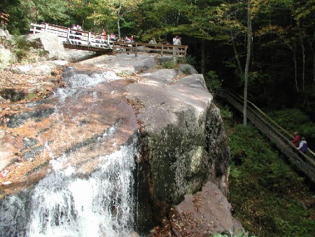
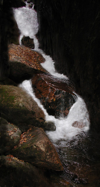
Flume
The waters of the Flume fan out over a ledge before assuming a quieter course down hill. The view had a lovely kind of breadth to it, but consisted of a patchwork of more and less interesting areas. I essentially transfered some of the better areas elsewhere in the image, creating what was for me a kind of dream scape effect: the view overall has a logical progression to it, but one which dissolves in places. The people on the bridges are insubstantial and perhaps wondering what just happened. Overall I feel a Westernized Orientalism in this piece.
The first image is the scene as shot; the second as modified.

The next example is heavily modified. I spent time moving water highlights around, darkening walls, removing leaves and generally trying to simplify. I feel that it might be wearing too much lipstick.
The Discussion
Steve’s thoughts
One thing Jay and I seem to have in common is an approach that involves continuing to learn from the image as we work with it. I found the “mental self-portrait” he uncovered fascinating. It’s a great example of what some might see as mere inanimate landscape coming to express something quite deep and personal.
One of Jay’s photographs that especially appealed to me was one of the Flume. Here is how I first saw it:

This image is probably most meaningful to Jay as shown here, not only an appealing picture but one recalling a place he enjoyed. But the memory aspect has little impact on me, since I’ve never been there, and in fact I am little interested in memory aids even of places I have been. But it did appeal to me very much in a more “abstract” sense, and I really wanted to see it in black and white, which often has the effect of decreasing the specificity and opening the door to further associations.
I like the result for its play of tones, especially on the wet boulders (note that because of the high contrast, these depend quite sensitively on your monitor settings). I like the top half and the bottom half separately, which set me to musing on the juxtaposition of low (earthly) rough turbulence and high (spiritual?) delicate stasis, separated by intervening darkness. The plants and ground cover in the upper half are reminiscent of brighter stars against the Milky Way.
Jay Replies
There’s an economy of coloration in the Flume. It’s as though every hue is hard won. I decided to accept what was presented, color and form. With the exception of some gardening in the upper portion and coiffing the rapid, I left the image pretty much alone. Steve’s version compresses the scene into a gray scale. At first his version bothered me until I re-read his explanation. While it is far more than a memento, the image for me has little symbolic value. Steve altered it to achieve a new synthesis to match his response. The water below and the string of foliage above are indeed in an evocative relationship. I would like to see Steve darken the intervening rock face to make it more of a void and give the foliage a more spectral and star-like quality. Also I think that the image would need to be re-shot on location in a larger format so as to allow for a much bigger print to be made. And the image seems to demand a sharper focus than I was able to achieve with my elderly Olympus.
We have been discussing appropriation on A&P, both in a practical and ethical sense. I accept appropriation in its many forms as being part of the overall compilation that we are here on Earth to perform. But this exercise did not go that smoothly for me. Everything in this collaboration was done with mutual consent, yet some instinct inside of me was growling at the intruder, come to snatch a child away. I believe that one best confronts an emotion like that. An effective therapy might be to have people modify my stuff in abundance, until my mental adhesions are Rolfed away.
Steve’s new versions
Since it is Jay’s image, I can’t do less than see what his suggestion looks like. Below, I’ve made adjustments that are not too dramatic — I’m not straying too far from naturalism — but have the effect of implying greater separation of lower and upper spheres.

That concept could be carried even further by separating the two halves while keeping them juxtaposed, along the lines discussed in a previous post.
 Volkswagen and Horse Chestnut tree, 12 x 16, Pleine aire