Posted by Angela Ferreira on October 18th, 2009
It wasn’t until mid Renaissance times that anyone other than the church was wealthy enough to afford decorative commissioned paintings. People wanted to show their wealth by asking painters and sculptors to do this.
Roman Art was almost as wallpaper, it covered most of the interior walls, outdoors murals, shop walls and ceilings.
Art form then, was a service to others, a technical skill brought into your establishment with limited individual freedom. Nevertheless, many artists while working for the church and patrons would also benefit from food and bedding as guests while executing their assignments.
In contemporary times, artists are given an assignment and we often pre-negotiate payment, theme, color scheme, size, etc…
Has the artist possess limited freedom in their work? What are the personal benefits besides the payment that an artist accomplishes from a commission that moves away from the individual style?
The challenge is that an artist has to re-think their work outside their ‘safe-comfort zone’ and create pieces that satisfy the commissioner as much as themselves.
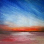
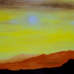
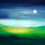
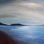
I personally found this a very enjoyable journey for a professional artist. These five paintings shown here are an allocated comission to Novotel Hotel in my local zone.
After given a brief, I have walked to my studio thinking, researched and re-invent some artform that would still fall in to the client’s expectation and of course carry on my style signature. A challenge that I have truly enjoyed with the added bonus of discovering a new facet to my developing art skills.
Is a traditional artist an ego seeker? What is an artist true goal when producing art, is it their own fulfillment, or is it the rewarding enjoyment of public/patrons approval?
-

-
Sunrise – Oil on painting paper
-

-
Sunset – Oil on painting paper
-

-
Sunshine – Oil on painting paper
-

-
Moonrise – Oil on painting paper
-

-
Misty – Oil on painting paper
Posted by June Underwood on October 6th, 2009

Rackstraw Downes Mixed Use Field on Texas Coast, 1987, oil on canvas on board, 11 x 58 inches
As someone soon to be facing how to paint a large desert sky spread across a large desert panorama, I’m circling the question of the possibilities available.* The Goldwell Foundation, where I’ll be painting,locates itself physically near Beatty, Nevada, on the northwest region of the Basin and Range country, 8 miles and one mountain range from Death Valley. I’ve done lots of small studies there. Now I’m contemplating the Big One. Desultorily contemplating…..
I have no theories, only pictures.
more… »
Posted by June Underwood on September 19th, 2009
On August 23 I finished the seven-panel plein air oils of The Diamond Grade. On September 10, I’m still working on putting together a small card with a fold-out version of the panorama. This is a project I thought to complete in a couple of hours. Instead, it’s taken weeks.
There was the question of the size of the images. And the paper onto which they would be printed. And which printer. And then it was clear that without some kind of cover, the images, folded into rectangles, looked a bit like the notes I passed to friends as a sixth-grader. So I had to find a cover. And then the images sprang open inside the cover, so I had to find a way to fasten the cover, a way which could be undone and redone, without too much damage. I had a bunch of Moo cards that I am currently enamored of that I wanted to include somehow.
Here’s the photo essay of the process:
The original strip of images:

After trying out samples of 3″ and 4″ sizes on my HP ink jet printer and 2″ sizes on my Epson pigment printer, which actually could handle up to 24-inch wide strips, I decided to go with Kinko’s laser printing service.
more… »
Posted by Birgit Zipser on September 12th, 2009
Art supply companies sell pre-stretched canvases, wood and hardboard panels with only a limited number of dimensions. Standard width/length ratios are 1 x 1, 1 x 2, 2 x 3, 3 x 4 and 4 x 5. If I want to use a photograph of my camera as a motif, a 2 x 3 panel would be the most suitable to represent the full picture. Musing on dimensions, the golden ratio came to mind – 1 x 1.618 – easy to remember because 1.6 km equal a mile.
Here is a photograph cropped to fit the golden ratio with respect to width and length:

more… »
Posted by June Underwood on September 4th, 2009

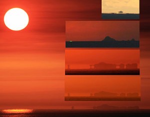
The upper frame is an inferior mirage of the Farallon Islands. The second frame is the Farallon Islands with a green flash on the left-hand side. The two lower frames and the main frame are superior mirages of the Farallon Islands. The superior mirage went from a 3-image mirage (inverted image between erect ones) to a 5-image mirage to 2-image mirage. Such a display is consistent with a Fata Morgana. All frames but the upper one were photographed from about 50–70 feet above sea level. The upper frame was photographed from sea level. The interval between the first and last frames of the superior mirage was six minutes.
And, on a not unrelated subject (albeit obscure, perhaps) I have finished my southeast Oregon painting extravaganza. It resulted in seven panels, each 16″ wide and 12 ” high, a total of 112″ in width (with no spacing) and 12″ in height: 9.25 feet x 1 foot.

[You can see individual panels as well as closer combos by checking southeastmain, a blog I maintain with husband Jer: From the Diamond Grade, panels 1 & 2, and the following four posts are the pertinent material. I’m not bothering to reproduce the results here because many of you already saw them, ad infinitum, on southeastmain.]
more… »
Posted by June Underwood on August 17th, 2009
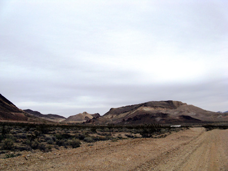
In a few months, I’ll be back in Nevada, tackling the Amargosa Playa again. This time I want to do a set of painted panels, five 5×5 foot ones (25 horizontal feet). I have various notions of how this might work out in paint, but will have to wait until I get there to see what actually happens. I also want to do something similar in textiles, perhaps only some preliminary image making, saving stitching for when I return to Portland. But I am mulling over both projects in my mind, trying to think how I might work them.
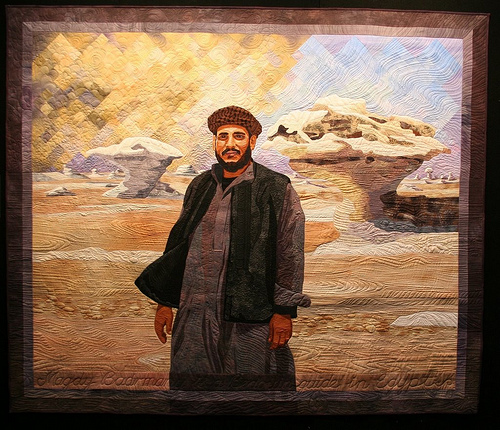
I just read a blog entry (dated August 17) by Jenny Bowker, who is an art colleague who works in quilted textiles. She tackled the same kind of landscape and had the same kind of hopes about what she might evoke, with some additions that the Amargosa doesn’t have: the presence of a handsome driver and some marvelous land forms. Her blog entry, which finishes with the photo of her textile work, is worth reading for sheer pleasure. But it makes me somewhat nervous about my ambitions.
Here’s the photo of Jenny’s artwork, which won a prize at the Canberra quilt exhibit and, I’m sure, will be seen often at other places around the globe.

Jenny Bowker, Sandstorm over the White Desert, about life size (see her blog entry for scale)
And here is an photo or two of what I will be facing, again

more… »
Posted by June Underwood on August 10th, 2009
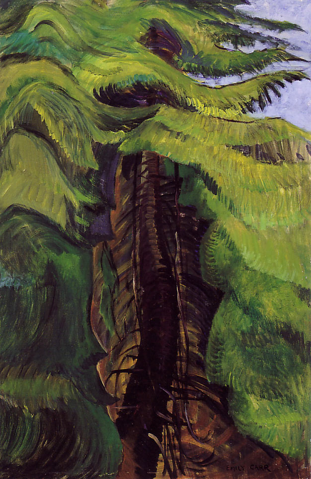
Some of you already know that I’ve been copying Emily Carr paintings for the last week or so, attempting to understand more fully how she does forests and trees.

Emily Carr, Cedar Sanctuary, 38 x 26″, Oil on paper, 1942
I’ve learned a lot through this exercise [ including the rule that I must paint-over or otherwise destroy the copies I’ve made before someone comes into the studio and exclaims with pleasure over them. Such an exclamation forces me to admit that what the complimenter is seeing is a copy, causing embarassment all round.] Carr’s finding of shapes in the complexity, of making color within the shapes, and of “draping” her branches are all valuable for my own art-making thoughts.
However, during this process, I had other kinds of questions occur.
more… »

