Posted by Sunil Gangadharan on October 11th, 2007
At my solo show (here), I happened to notice something about the way people react to the baggage that comes with art. I decided that contrary to popular practice, I was going to add a little blurb to each of the 10 paintings displayed at the gallery in addition to details like size, medium and title. The blurb ran from about 50 words for some paintings to about 150 words for some others. In most cases, the blurb tended to explain the social situation that compelled me to attribute that particular face to a particular facet of social reality. Gallery purists might shake and shudder at the fact that I had sunk to lowbrow levels by condescending to add blurbs next to paintings when it was supposed to be the other way; just view the painting and let the opinions garnered by the visual experience play out in the viewers mind rather than distort/subvert the whole process by an artist supplied opinion.
Surprisingly most of the gallery viewers reacted in a very positive way and were very happy to actually note that I had taken the trouble to write the context behind the painting.
As an example, I had the following blurb next to ‘Stomach Clock‘.
It is estimated that 33 million Americans continue to live in households without an adequate supply of food. According to statistics from the Bread for the World Institute, 3.5 percent of U.S. households experience hunger (9.6 million people, including 3 million children.) Children are a disproportionate share of the poor in the U.S. Although they are 26 percent of the total population, they constitute 39 percent of the poor.
My question to you is as follows: When would you consider putting a blurb next to your works? Never, sometimes or all the time. Why?
Posted by David on October 6th, 2007

…just a Santa Monica seagull for Birgit,
more… »
Posted by Jay on October 4th, 2007
We visited an institution called MASS MoCA this last weekend in North Adams, Mass. Unbeknown to us , a legal saga was in the process of being resolved, as a court in Springfield found in favor of MASS MoCA . The institution and Christoph Buchel had been locked in a dispute over the disposition of an unfinished project whose budget had ballooned out of control.
What did catch our attention was a show featuring the work of Spencer Finch. I was unable to take shots of his work as there was a general photographic lock down, a likely consequence of the Buchel matter. However, his site: Spencer Finch, includes a number of pieces in the show. One can also look in on the MASS MoCA site.
Why Mr. Finch? The more that I saw of his work, the more I was reminded of A&P and the things that we tend to discuss here. Finch is an artist who can, on one hand, be seen as an earnest soul bemusedly pursuing his muse (A&P), or, on the other, a clever exploiter of the system (not A&P).
We understand that Mr. Finch began by looking into subjective color. A number of his earlier pieces consisted of creating color samples, in watercolor, of objects that he was observing under differing conditions. Three sheets give us such samples taken from objects in a room in the vicinity of the Rouen Cathedral, Monet’s subject in a famous series of paintings. Another grouping displays his attempts to remember and paint various degrees of darkness that he encountered in his studio. This concern with color memory forms a thread in the show which, for me, has a certain continuity and economy, complicated a little by his story about Monet.
Beyond that, the show devolves into a panoply of equipment and effects that ends up far away from what seems the original premise. Indeed, I thought I was looking at a quotidian survey of art from the seventies and eighties until I discovered that it was all Spencer Finch.
My intention is merely to bring Mr. Finch to our attention. I can see at least two areas of discussion: his work with color and memory – or otherwise the nexus between language and perception – and his success as an impresario. What do you think of his approach to the color memory issue? Is there something fresh here? How about his employment of off-the-shelf ways to fill a gallery? Is that fair of me? Honestly, I got the strongest feeling that he is using a lot of sure-fire stuff to give his ideas a greater sense of consequence. But it’s clever. He makes me think of Warhol. But instead of soup cans, he draws from the given M.O. and paraphernalia of art itself. One gallery contains a hundred framed pink-painted discs. These are said to be his attempts on subsequent days to remember the color of Jackie Kennedy’s pillbox hat – all in the purported context of the Warren Report. Warhol spoken here, but in a very interesting dialect.


This installation is programmed to replicate a wind pattern that S.F. recorded at Walden Pond.
So what do you think?
Posted by Sunil Gangadharan on October 4th, 2007
Cartier-Bresson once said on his turning from painting from photography “the adventurer in me felt obliged to testify with a quicker instrument than a brush to the scars of the world”. These are timeless words pregnant with effect and meaning. Of course, not that I am harboring plans of turning from painting to photography, but the simpler act of pointing at a scene and shooting at will to create an instant kaleidoscope of colors that pleasures your mind is a very enticing prospect. It is precisely this intention that I pander to when I point the trusty little Canon digital on my way to work at a certain Brooklyn shoreline early morning at about seven or so before the Staten Island Ferry makes its sojourn across the New York harbor to deposit bleary eyed automatons to their regular day jobs. I have been trying to capture the essence the shifting patterns of light by aiming the camera at the same spot every day. Day after day and the results are very enlightening and never replicated – so much so that I am almost compelled to paint from this fount of changing color combinations. The beauty of the ever changing cloudscapes playing subtle games on the ripples below is timeless. Sometimes the stern of an appearing boat only adds to the excitement. I hope to continue this side project of mine and report back in about six month’s time to see if the morning presentations duplicates themselves on this Brooklyn shoreline at least once.
I have samples from the last four days… more… »
Posted by Birgit Zipser on October 3rd, 2007
Continuing the tradition started by Steve,
I invite further comments to Mary Scriver’s comment #9.3 to yesterday’s post Local Art Blog
It is in the interests of the art galleries, museums, and other institutions to keep artists separated from patrons. Don’t ask them to be the go-betweens. Also, their goal is status, “society,” class, fashion, etc. all things that can corrupt and possibly destroy artists.
Posted by June Underwood on September 28th, 2007
As an oil painter who tends toward “moosh” rather than clean graphic edges, I have found myself pondering the stitched line intrinsic to my quilted paintings. They change the moosh that I so often fall into, adding a different set of visual ideas.
So, if you’ll forgive me, I want to explore notions of line — line mostly as it is generally described and discussed in design classes, but more particularly as it works in quilted art. [ed. note: This turned out to be more of an essay than I had intended. If you wish, you can just look at the pretty pictures.]

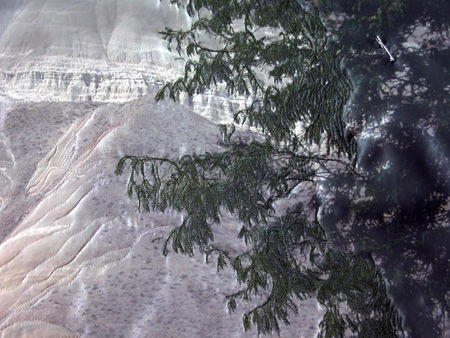
Painted Hills Bluff, detail (Work in Progress)
Line is important in design, particularly, of course, in drawing. It moves the eye, evokes feelings, defines or suggests shape, can make value and depth, and can be varied to vary its expressive quality. In quilted art, line functions in all these ways, but can have a weight and value different from that found in drawing and is far more inportant than line is in painting. In conventional photography, line seems to have minor function, but art photography often makes extensive use of line.
more… »


