Many people think of underpainting as a working in monochrome — either in grays, or browns. Artists of the past like Jan van Eyck used very colorful underpaintings. The usefulness of this I see in my painting of grapes.
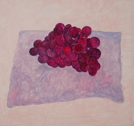
I was painting these grapes from some dark purple-blue grapes in my studio. I made the underpainting much more bright, and warm, than real grapes, as you can see in the picture above.
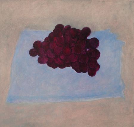
When the first layer of oil paint was dry, I began overpainting, putting darker shadows over the grapes to make the colors more realistic, darker and cooler, as you can see above.
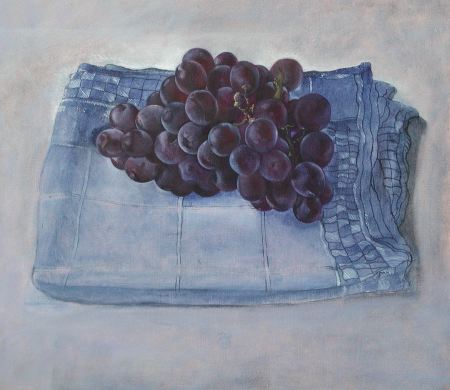
Here I have gone further with overpainting in another session. Now the grapes have a realistic color, but the brightness of the underpainting color shows through and gives life to the colors. If I had started with dark gray grapes, instead of a colorful underpainting, the colors would be dead when I did the overpainting. This this picture is not quite finished in the cloth. Here is where I left it yesterday afternoon.
Any suggestions?
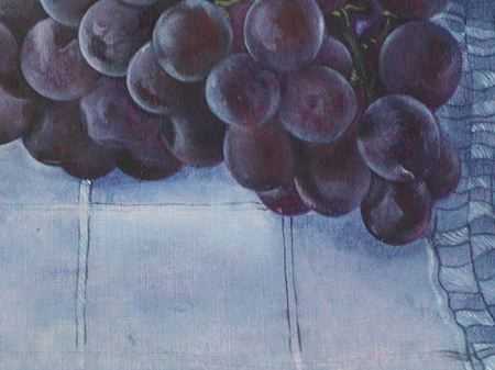
(detail requested by Steve)

Hanneke,
This is too tantalizing, I want a larger or detail image to admire the grapes better! I am sure that in this very cool painting, the warm undercoat has a great impact. I’ve always loved that translucent quality of grape skins, and I’m sure your technique will work especially well for them.
My one problem with this painting is that my first impression was that the cloth was somehow mounted on a wall. The bunch of grapes and the way they rest on it make this interpretation virtually impossible, of course, but I still don’t feel the correct perspective as strongly as I would like to. In most of your other paintings you show the edge of the table, and this immediately clarifies the viewpoint, so in fact a wrong interpretation never occurs (consciously at least).
Steve,
Thanks for commenting on my picture.
I also see the friction between the grapes and the cloth , and the cloth under it . I am working on it . After new year you can see the result!
Hi Hanneke, My first remark is similar to something that I hear once in awhile and while it’s not my favorite thing to hear, it can be a useful observation. I think each stage of the painting that you have shown here can function as a finished painting. Just something for you to keep in mind if you ever feel as if you want to change your style a bit. In fact that is pretty much what I did-I used to paint in a photo realistic manner, then I decided the in between steps were much more interesting to me. Anyway, just an observation, NOT a suggestion:-)You have a beautiful painting style.
I think in the final piece, while all of the elements are beautifully painted, I don’t get the feeling they are relating to each other. The grapes seem to be pasted onto the cloth in some places. Perhaps more shadow or some color shifts would help them “talk to each other”. The cloth doesn’t quite look as if it were ON a surface. And I agree with Steve that the perspective of the cloth seems to be off. Actually, I think that both of these things are not an issue in the first image. The relationship between all of the elements is working and the cloth’s perspective works with the simplicity of the drawing.
All in all, though, it is a lovely piece. I love the colors, the light and now I am off to see if we have any grapes cause I am hungry.
Hanneke,
I am mesmerized by the differences shown in each individual grape. And the delicacy of the ordinary piece of linen. I think you need a small plate or saucer sitting just in front of the grapes which might complete the thought or idea in the painting. But with or without changes, it is once again an exquisitely detailed painting.
Robin
The combination of colors in the grapes and the blue cloth is stunning. Both the grapes and cloth are luminous.
Showing a table edge would be an easy way to provide perspective. Could it done in a novel way?
Would it be possible to modify the blue cloth itself to affect a greater sense of stability?
Could the grayish table cloth be shaded in such a way as to provide more perspective without putting any additional real objects on it?
Remember Walter Bartman saying Three dimension as an illusion in painting has been it’s “Holy Grail… in comment #22.
Thanks for the detail image, Karl. The grapes are lovely, and that pale frosting is nicely done. I’m wondering about the lightening of the cloth immediately bordering the grapes on the left. That seems a bit unnatural; could it be part of Tracy’s sense of cloth and grapes not quite talking to each other (great phrase)?
The loving detail in the small squares in the cloth is fabulous.
Perhaps, Hanneke’s intention was to evoke a sense of instability (motion) within all that beauty?
Perhaps, our comments are steering her into the conventional direction that is wrong for her artistic development?
Perhaps, the sense that the grapes are not talking to the blue cloth is supposed to provide a sense of alienation. Remember,the rotten grape in one of her previous pictures.
Yes, I thought the left side of the grapes was the area that wasn’t quite connecting with the cloth. I realize they are bunched up and off the surface of the cloth so there is probably no cast shadow there. Perhaps if there was a bit more emphasis on those particular grapes, they would look as if they were coming forward and up instead of looking as if they should have their own shadow.
I think the changes to make this work would be so subtle. Just deciding what those changes should be is the challenge!
And again, I agree with Steve, the squares in the cloth are wonderful.
Birgit,
My comments are based on seeing the image on a computer screen, certainly not an ideal situation, so clearly whatever I say should be taken with a grain of salt. Spatial issues can be tricky as viewed in a reproduction so I sure could be wrong there, However, I am still feeling a disconnect between the elements. If Hanneke’s intent is to create instability or motion, I don’t really see that either, so if that is her intent, some shifts in that direction would be helpful as well.
Surely Hanneke will follow her own feelings about the direction to take, no matter what our suggestions are. She already has a very distinct sense and style of painting. While input from others can be helpful, I think she is the one who guides her work as she sees fit. As most of us do in our own work.
Overall, though, I may be splitting hairs. The piece isn’t finished and perhaps as the cloth is completed it will all tie together. As I said, all of the elements are really beautifully painted.
Birgit,
You’re right, the artist’s intention is all-important. I try to make my comments about what I see and think about, what I like or not, so that she’ll know at least one person’s reaction. Then she can decide to do something about it or not, in whatever direction she likes. I have no doubt she can resist any influence from me on her artistic development!
Steve, we crossed comments and said nearly the same thing! Of course you summed it up far more economically that I did:-) I do tend to chat too much.
Hanneke,
Thank you for the interesting insight on how you create the colour and light effects that you do.
Like some of the other commenters above, I feel that there is a ‘disconnect’ between the elements. In fact, I feel like I’m seeing different parts of the picture from different places.
However, as Steve has so elegantly put it already, your intent is what is important. My viewer reaction is that light and colour fight perspective.
As I’ve come to this conversation late, I can just copy:
I am mesmerized by the differences shown in each individual grape. And the delicacy of the ordinary piece of linen.
Lovely.
Colin and Steve, please help me in my ignorance.
Colin said above My viewer reaction is that light and colour fight perspective.
Steve told me yesterday you could bring the foreground farther forward by emphasizing its warm colors vs. the blue background.
Is that what is going on?
Birgit,
You’ll have to get Steve to explain more about what he meant. I simply meant that my enjoyment of one aspect of the unfinished painting was being altered by another aspect.
Hanneke
thank you for showing this process. It’s both delightful for itself and for its educational value to me.
As a tiny aside, I thought the cloth in the most finished piece was very important. I think that if the grapes sunk just a bit more into it, or if the cloth curled around the edges (as if it were holding the grapes), the two elements would pull together. You know better than I how to accomplish that, if it’s what you want.
I’m eager to see what the next stages look like.
It’s interesting to see your work in progress. I will try this method myself with the colorful underpainting. I’m not sure I would have thought to be so bold with the red color if I had not seen you do it. But the red does indeed glow through even with the darker color on top. Thanks for the lesson.
Birgit,
My comment yesterday was an idea for the large landscape setting; I don’t know if it would work here, because you don’t expect atmospheric perspective in a small scene. Red coming forward relative to blue tends to hold anywhere, but in your photo it could have been used to enhance the other perspective cues, such as diminishing size of features in the distance, and obscuring of far things by near ones. Your photo already had bluer colors in the distance, and the near hillside could plausibly be redder. There are other “tricks” you could use if you want a greater depth effect, such as sharpening the foreground a bit while leaving the background unsharpened. If you want to learn more along these lines, plus other photography tips, check out the daily critiques at http://theradiantvista.com
In today’s painting, I feel the perspective problem (separate from the interaction problem) is more geometrical. Taking the cloth as rectangular, the parallel lines of its sides don’t seem to be converging too fast toward a distant vanishing point, so we conclude we’re seeing it nearly straight on. But the grapes are placed in the middle of it, yet block its far edge, so we “deduce” we’re seeing it from roughly a 45-degree angle, looking down. There’s a conflict and it looks “off.”
Now actually, there is some convergence, and my guess is Hanneke drew quite accurately from a consistent viewpoint. But since, as it happens, the left front corner of the cloth comes back in, and the right edge has some underfolds slipping out, the first impression (at least for me) is the one I said above. I agree with Tracy that some subtle changes could “fix” this “problem” if Hanneke wants to. But it’s also true that if something is indefinably peculiar, then we might spend more time exploring the picture, and decide we love the color play and detailing so much we don’t care about the rest!
Sorry if this got too long-winded. I enjoyed spending time with the painting.
stunning!
the grapes are so alive!
Bright pink peeps through the perfect purple… and with such elegance only matched by nature.
I bought some grapes from the market and snapped a photo!
but this is still better.
visual treat!
I was thinking… part of the reason the coloured underpainting works is because the grapes are Translucent… so some of the light is passing throught the grape. a small part of this (now redish) light will fall onto the cloth beneath. so where there is shadow, you should also be getting a small amount of light from “THrOUGH” the grape. this might help to unify the two objects as part of the same scene.
Beth,
Your comment is inspirational.
Wine is really very nice painted. I have experience that first time is fruit very difficult, but other time it is more easy and takes not so much time to paint it. I made one pic which I do not have on internet of fruit, one of my first oil paintings I made very long time and was very excellent. I love white cover on the wines you painted.
I am looking pastels and children wax crayons what writes on web to make some pics also wtih this not only with oil chalks and dry chalks, carbon or red chalks, but also with crayons. I loved technics that is vax crayon covered with school chalks on table and on it black ink and then by needle or some subjects cut into it pictures. I think about such technics and found that sometimes is good make not only classical picture, but also some modern styles that art is art.
Eva Bartosova
Eva,
What you describe sounds like the first method I remember from childhood as a “technique” (not just plain old drawing). We made an underlayer in different colors of crayons, then colored over it all with black crayon, and then used something sharp (I recall the end of a paper clip) to remove the top layer, revealing lines of bright color. I haven’t thought of that in a long time, but it’s actually akin to some ideas I’m currently experimenting with.
P.S. My office partner is also from Bratislava. Thanks for writing.
Hanneke,
The grapes are wonderfully done. To my minds eye, I think you need some shadows to anchor the grapes resting on the cloth.
I think its a great idea to start with underpainting, more than one layer even, building on the first, before the final values. IMO, this gives a painting some “weight.” I am going to exercise patience and develop this practice.
Did I tell you I love your grapes!!!
Hanneke, and all…I just realize that this is an old thread..however, I am glad I found it because I learnt from all the comments.
Linnette,
In case you didn’t notice, there’s a follow-up post on this painting, Purple grapes (continued). The nice thing about these discussions on the web is that they can remain useful long afterwards.
Thank you! A great explanation!