As mentioned last week, I’ve been re-examining my photography in terms of some ideas from Japanese aesthetics. In practical terms, that means I’ve been going out and looking differently at subjects. For example, I’ve tried to be more aware of views involving negative space along Sourdough Trail, my main project of the moment.

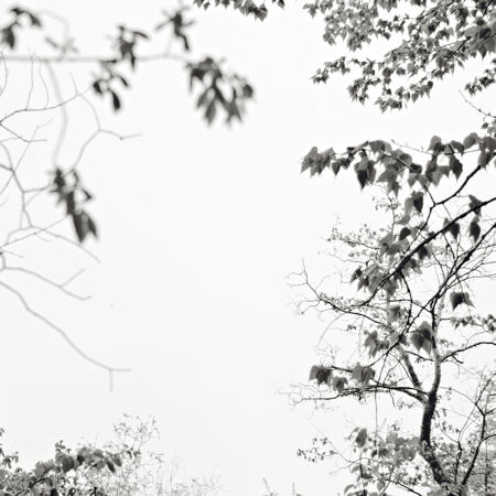
One might assume it would be easy to capture huge numbers of images with, say, plenty of sky as negative space. To my surprise, I’ve found it rather difficult to come up with such views, if they’re to be more than forced snapshots. On the other hand, I have no objection to playing with images on a computer. So it occurred to me that I could accelerate building new intuitions about negative space by making my own. Whether or not nature can be improved upon, the ability to compare related images with certain differences is nicely complementary to seeking out diverse examples.

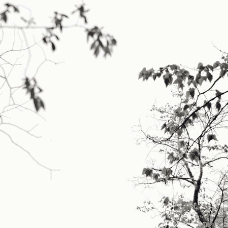
The above image is derived from the first one by removing two groups of foliage. I like the spare lightness of it and the suggestion of a conversation when there are two main elements.
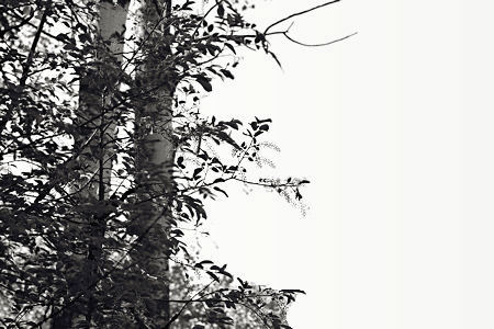
In the next case, I lighten out almost half of the image to get a very asymmetrical composition.


I feel that I’ve gained some insight into the compositional possibilities and into my own predilections through just a quick bit of image play. Does it seem like cheating? I think of it as similar to the useful composition exercise McFawn suggested recently. At any rate, it’s no matter, that wasn’t the real test. Next is to go back out there, hopefully with eyes to find expressive pictures in their native surroundings, framing them to enhance their liveliness.

Steve:
Intriguing post.
Makes me think about how negative space is such a given in the context of a site like this and in much of internet fare.
It might be fair to say that much effort has been given to making a screen, such as mine, as featureless as possible. It is composed of a fine subdivision if one peers in, and whatever is being reflected upon a more relaxed viewing. This is in contrast to the relationships between many mediums and whatever negative space is found thereupon. Canvas, for example, even when smoothly gessoed, still announces itself. Watercolor paper, in its various textures and tonalities, plays an active role in defining whatever negative spaces that it is asked to portray. In the case of my computer screen I feel that your negative spaces are more or less another piece of the general ambiance. I’m not going to suggest anything, like giving the image a tone that may set it off a little, or a framing device, as that might not really help.
Jay,
That’s a terrific point about how featureless is the negative space. Very apropos, as I’ve just been processing another picture where a main thing I thought about was how much information to leave in the dark shadows, which are the negative space there. Pure blankness can be too boring; I think the eye needs something to see when it wanders out from the main subject. In the rather lame examples here, it would be better to have more sky texture. I think burnt out but faintly discernable clouds would work well.
In fact, I just looked back and found there are a few bits of cloud in the sky at the time. But I happened to select the exposure where they were least evident (to get best detail in the darker leaves and trees), and then let them essentially disappear in the processing. Hopefully, your reminder will help me to not neglect the negative in future. I’m also not sure how it will work, but here I didn’t even try.
Something less uniform than a screen as physical support would also be effective. I sometimes do print on watercolor paper, and cloth might provide a nice echo of silk paintings.
It must be tricky to decide what to omit.
In the first image, I am drawn to the diagonal correspondence between the upper right and lower left arbors – perhaps because they are in focus?
In the next photo, I enjoy the difference in texture between left and right arbors – perhaps due to the difference in focus?
Negative space and the importance of focus?
Birgit,
Yes, focus plays a big role here, so it’s not a simple comparison. Difference in focus, as you highlight for the second picture, is something I’ve clearly been experimenting with a lot lately, and I think that difference makes the “dialog” more interesting than if both parts were either in or out of focus.
In Shiatsu, there is the idea that a couple of the meridians are what holds the body in, what supports the boundaries that give the body dimension and integrity as a form something like the cell walls in plants, but in the form of invisible streams of ch’i.
I wonder if that’s the function of the so-called negative space — to supply a field within which (or upon which) form can manifest?
Melanie,
That’s an intriguing analogy. It bothered me at first that there’s a tension implied in the holding-in function. But the way I’m thinking about negative space is not just in the graphic art/decorative sense, but as a space that suggests a contribution from the viewer (assuming they bother to contemplate the picture at any length). I don’t necessarily mean a filling-in of the imagery, but some train of thought by the viewer confronted with that near blank. So that might be your manifestation or generation of form.
Steve,
I’m loving your play here and in the last post. I think Jay has captured something of the difference with your on-screen work and what I’ve seen of eastern negative space work — and that’s the texture out of which the not-space comes. As well as the frame that Melanie refers to. But I haven’t resolved these issues in my own mind.
And I must run off for a bit, but I’m leaving this half written post so I will remember something of what I was ruminating over.
Back again —
I’m thinking of something I read about “shared” space — not individuated elements, but elements that are incomplete without the others in the scene.
With that in mind, I started to blank out more of the tree trunks (with a finger). The change was startling, because the two elements then related, even with the lines between them were invisible. That’s what I’ve always thought Notan was about — and to some extent, the emphasis on negative space. So I guess I would say that the second photo has more conversation going between the lines of foliage.
Now I don’t know how this fits with your question about the viewer filling in the blank. I myself prefer some suggestion of something in that blank — a bit of gilt, a fading line, a lost edge. But then, that could just be an internet habit — wanting the blanks filled in.
The famous screen that Elatia Harris speaks of does have the big blank in the center, but it is bounded by tree groupings and the edges of the screen itself.
I wonder if you could collage some of your trees/foliage, layering them and fading them almost to nothing to give space a shape and a mystery.
Just pondering — I am enjoying your working through of the questions.
I’m glad I stumbled upon your post. I am very intrigued about the idea of adding negative space to an image–or even moving it around to make the picture better.
I have a number of images that do not translate well to 2 dimensions that could benefit from adding some negative space. There may be an interesting curve to a branch that just doesn’t stand out enough without it.
I think that once I get used to the idea of it being okay to re-arrange a photo, it is just one more step to begin to arrange an image from scratch with segments from other photos.
Mike,
It’s interesting that it does require “getting used to.” Though some photographers have taken liberties from the beginning, such image manipulation can still feel like a violation. Everyone chooses where along the spectrum they feel comfortable. My idea was simply to use this image play to build my intuition, train my eye, regarding negative space. At this point, I don’t think I’d want to present an altered photograph as a normal photograph. I’d be much more willing in a more decorative context, like a lampshade or screen. But I certainly have no problem with anyone else doing whatever they want in an art setting (not in journalism!) Have fun!