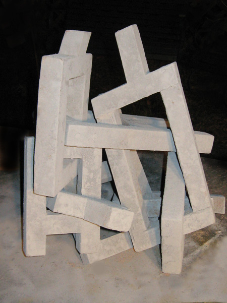
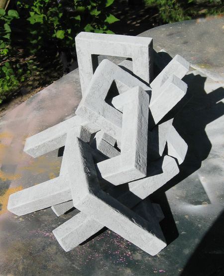
Allow me to report on my progress, or lack of it, with the question and answer theme.
The idea has been to create a chain form, corresponding to a sequence of events; in this case questions and answers.
Scattered about my workplace are various takes on the letters “a” and “q”, done up in a number of fonts, sizes and materials. These have been strung together in attempts to find the right combination of variety, legibility and sparkle.
Early attempts emphasized strong interactions of color and form. They were entertaining, but the underlying call and response theme that I was after tended to get lost in the visual noise.
In this iteration I’m trying to standardize somewhat by choosing block letter forms and a monochrome finish. Last I counted there were three of each letter, which when tied together creates a tight mass.

The letters are all composed from the same size of stick, but some freedom was taken with scale and proportion, with one letter canted somewhat.
But now the questions: are there too few units? Is there too little variety? Is it too subtle or not subtle enough? Is the fact that it can be reconfigured a plus or a minus?
One thing I have noticed with this exercise is its sensitivity to lighting. Two images were photographed at night and have a certain deer-in-the-headlights effect. The other was taken in morning light for the sake of contrast. There’s a metaphor afoot here in the “media spotlight” that we encounter this presidential season. Pundits like to shine a beam on the backs and forths of this campaign – getting into the crannies, illuminating. I’m led to believe that the best lighting for a “q” and “a” chain might be a single harsh spot coming straight down.

This whole business is so darned programmatic in it’s Constructivist plan-your-work-and-work-your-plan manner, that it makes me want to mystify matters a little, like putting the whole thing in a shrink wrap bag. I can imagine viewers saying: “Look Henry, there’s a “q”!” and other words to that effect. Is this a dish that should announce its ingredients?

I’m not unhappy about the finish which is a mixture of varnish and sawdust that is then ironed flat, and in this case, hit with automotive primer. It points to the possible use of aluminum castings that would preserve the look of the sand molds with the option for portions ground flat and polished.
How many links do you think should be in the chain?


Jay, your Q&A call/response concept is truly a brilliant way to break the regularity of chains (as in your earlier chain work) and turn them into powerful narratives. But I feel much of the story telling potential is lost when the letters are all similar to each other in form and color. And their relative bulkiness makes it difficult to put them together in a suggestive linear (or self-crossing or circular) structure that has some development. On the other hand, I’ve definitely been in conversations that would be well represented by a clumsy and contorted concatenation!
My answer to the title question would be “not too simple,” and for the final one would be “at least three pairs, better more.” Have you considered forming your sculptural links of some thinner and perhaps flexible material?
Steve:
What’s a poor Art Linkletter to do?
You mean like the brief chat I had last night with the waiter over the fine print on the chopsticks wrapper?
This was an effort to touch base at an elementary level. Forgone is the fancy for now as I have discovered that there’s more to be resolved than I first imagined. The square cross sections create a kind of absolute but they chunk things up. (I’m not talking about the chopsticks any more.) Thinner and more wafer-like might be kind of Oldenburgian, but worth another try. The holes that pierce and define the Q and the A must be sized to allow inter penetration, but is it better to have an interlocked or a loosely interlinked quality? There is the open question and the closed question with the closed being what one might commonly encounter in the courtroom. And the closed might be better suited to a dynamic sculptural presence.
Furthermore, I’m trying to avoid the fonts. It’s so easy to shop through the choices in search of nice things to appropriate. Better, perhaps, to custom create letters that work with the premise. That’s why the blocky-look you see: not a final answer by any means, but just what I did.
and color can be critical. I tried the primer as a coat of such indicates a work in progress – pending whatever finish coats are forthcoming.
Jay,
In your present assemblies, the meaning of the letters got lost. I only see one Q in the first image. I don’t see any ‘A’s. Perhaps, the sticks are too thick?
With respect to the lighting, a black background is often used by painters of still lifes. Hanneke van Oosterhout often chooses a black background, perhaps, because it makes the objects more mysterious? Personally, I stay away from black even though it appears to be in high fashion. I see young mothers, clothed in black, carrying their babies or toddlers – a weird funereal look.
Birgit:
Maybe the entire schtick is too thick. That is a point to ponder in this exercise, that the letters are helter and skelter, and such a quality does not contribute to the object. I think that I may forgo the self linkage next time around.
Sounds like you’ve been watching the Addams Family on tv.
Jay,
At home, I access virtual world solely on the internet. Black-clad young moms were seen in real life.
Jay,
Your assemblage of blocks makes me a little nervous — I’m claustrophobic and if this is where Q&As get us, let me out! If that is your intent, then you’ve achieved it — that is, that Q & A as currently practiced in contemporary culture goes nowhere and makes nothing but a pile of indecipherabilities that seem to have meaning.
I too like the color, but if you were working toward clarity, then thinner might help. The question of how the light shines to photograph the piece makes me smile a bit, since it too fits with the strange ways that comments (Q&A) get interpreted and reinterpreted in contemporary media.
I always like your sculptures; they make me question and seldom provide answers. As enigmas, they work. I suspect the question is, what do you want to work on your viewer — enigma or some clarity.
Jay,
Jer and I were talking over dinner and we decided that you needed to do 27 of these sculptures. We even had Notions: Q’s in one corner of the ring; A’s in the other. Q’s lined up before prostrate A’s (or the other way around). Thin Q’s, fat A’s and vice-versa. Red q’s, black A, ranging in circles and ovals and squares and rectangles. Q’s climbing one of your ladders while the A’s cling to the sides, being knocked off. Q’s as the trunk of the tree, A’s being the spindly branches.
I started to riff on the shapes and meanings therein, but then our pudding came and we abandoned Q&A for food.
June:
A spot of Q and A does sound a little like some kind of Yorkshire pudding. The dessert that terminated your ruminations was likely far more digestible than the topic under consideration.
I like your ideas and would likely appropriate them shamelessly were they not here so in view. Red and black are indeed two colors that seem right for these.
And I agree that the concepts around Q and A , and attendant physicalities can remind one a little of the relationships found between geometry and the phenomena of music.
Birgit:
I myself have a problem telling Q from A in this piece. And here again some kind of story can be woven from such – the denouement depending upon the call of clarity or mystery.
Jay,
Much of my recent life has been a striving for clarity. Perhaps, in my case, it is time for a little mystery.
gorgeous