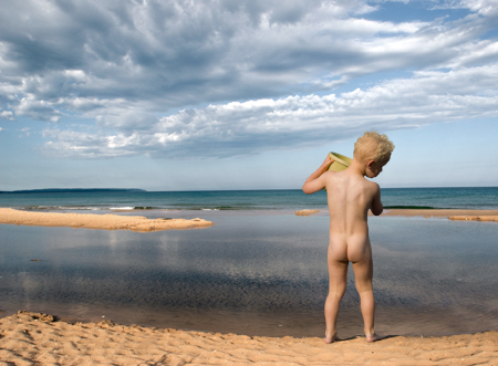
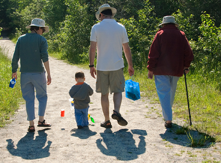
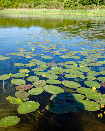
Pursuing my two favorite motifs, water and the anatomy of movement, I started making composites, extracting from one image and pasting onto another.

Showing the first version of this composite to a mentor, he questioned me about shadows.
Now, shadows are something that I had a blind spot for. In contrast, I have always been partial to reflections. At one time, I bought beaten up mirrors that I put into many corner of the house. I then photographed my small children, reflecting back and forth across the rooms and up the staircase. A few years later, I enjoyed the reflections in Richard Estes’ photorealism – objects reflecting in windows, mirrors, and shiny rims of steel stools in lunchonettes.
Inspecting the original picture with the boy, I realized that it needed to be rotated horizontally in my montage so that the shadows (copied now as well) point in the right direction. But there still is problem. The shadows extending from the feet are too short because in the original picture, the feet were standing on a pier. In my picture, the water is pretty close to the surface of the sand and therefore, I have to learn to paint extensions of the existing shadows.

To learn about shadows, I am now busy snapping them.

Experimenting with different properties of water – reflection and transparency – and adding shadow (the photographer). Tomorrow, I promised myself to remember bringing my polaroid filter.
I am puzzled why I liked reflections but rejected shadows.
Do prefer one over the other or are they equally interesting to you?

Birgit the first picture its so good just like a professional photographer.
The emptiness of the background its very surreal and the atmosphere is very dreamy… poster style. I like it a lot!
Birgit, first of all I like the image just the way it is. Good work! It’s surreal anyway, and the shadow cutting off creates an impression that the boy is on a ridge and the water down below him.
But if you DO want to extend the shadow, start by making a selection of the boy’s shape, copying it to another layer, and then filling it with black. Label the layer “shadow”, and set it to “multiply” mode and a low transparency %. Then use the “Free Transform tool” (I don’t remember the keyboard commands, but you can hold down certain keys and move the corners of the bounding box independently) to distort the shadow down into perspective.
You’ll also need to make another copy of the boy and put him on a layer above the shadow, so it’s under his feet and not over them.
If you want to get really fancy, you can create a layer mask for the shadow layer, and within that use the gradient tool to make the shadow more transparent as it gets farther away from his feet.
Have fun!
I think the shadow is fine. Like David, I just assumed there was a slope to the water that we don’t see. The emphasis in this picture is the color, with skin and sand tones nearly matching, and both contrasting beautifully with the blue sky, water, and far shore.
In the second image, however, I think the shadows are really important, making interesting pairings with each character.
Whether or not you use a polarizer, an image like the third will have a gradient of transparency of the water surface: it will always be reflective farther away. Many fun possibilities to play with!
Angela, David and Steve,
Thank you for you encouragement.
David, I really appreciate your AP instructions. Right here on my desk are two pages with your tips on Free Transform tools that I printed out a while ago.
I always had difficulty understanding what surreal meant. Perhaps, my picture will help me with that.
The family scene would be boring without the shadows. The third picture was an afterthought. Physics was never my strong point. Time to learn about optics.
Birgit:
Your first image has a marvelous atmospheric about it. I agree that the shadow is not an issue.
I do have a problem with the lily pads as it seems that you are casting a shadow in the foreground. For me it breaks the image into a duality with the larger portion evoking the pleasures of a natural scene and the smaller setting up an essay on human presence. That duality has considerable potential as a statement, but in this case I see an “Oops!”.
Following the idea of surreal — in the second image, there’s a squarish shadow between the two figures on the left and an orange object that seems to be casting the square shadow whilst floating. (my disorientation may be due to the modest quality of my home computer, though)
The first image evokes (for me) baby gods at the dawn of time at work making… something. That dramatic sky seems Olympian.
Is your interest in reflections (moreso than shadows) due to reflections having more image/content/narrative than shadows typically do?
Jay,
Today, I imaged lily pads without the interfering shadow. I have not yet figured out what to do with them.
Melanie,
You are right. The orange toy was caught floating in the air. One frame later, it lay on the ground and two frames later, it was restored by mom to the child’s plastic container.
I am sure that you are also right with respect to the image content of reflection and shade. Thanks for pointing it out to me. It probably also explain why I like Richard Estes’ cityscapes and why I have to restrain myself from over sharpening photos.
Now, I will attempt to discover about the narrative content of shadow.
Birgit:
This conversation takes me back to last September and a post of mine called “The Duck Pond’. There we talked about the issue of shadows, water and lily pads.
I might suggest introduce a shadow of something quite extraneous like the Eiffel Tower or an elephant in profile. Seriously.
Jay,
from duck pond. In your second to last picture, the juxtapostion of orthogonal shadows from the wooden planks with the curvy shapes of leaves is striking.
In your last image, the interplay of simple shadows with the intricate reflections of the lilies leaves is gorgeous.
Birgit,
I am a little late, but can’t resist….
One observation that was drilled into our heads last week was that shadows are transparent; shapes are opaque. This boggled me a bit, but the further insistence that we paint the shadows first, not laying them on top of an underpainting, is one I still struggle with.
My instructor also had the keenest eyes I’ve ever encountered, so he could see shapes and colors within the shadows that I completely miss. I guess that’s why he’s getting paid to teach.
You might start looking at shadows for the shapes and colors that reside inside them — looking at them, for at least a little while, as independent of the form that creates them.
I know what you mean about reflections — and I sense that, with practice, one could come to love shadows in the same way. Richard Estes always grabs me.
June,
I am glad that you are inspiring me to continue learning about the ‘narrative of shadows’.
Thinking about Jeff’s advice …shadows are transparent…paint the shadows first, not laying them on top of an underpainting.. does strange things to my mind.