Old musings on recent photography have led to the resurrection of a completely different series I thought I’d given up on. Just last week I deleted a draft from March that I had started in excitement, but never finished because I couldn’t make the pictures work.

The thoughts were on Japanese aesthetics, and the abandoned series was a rather minimalistic one, captured in all of 15 minutes near the start of a Yellowstone outing during which I later busted my aging ski gear, cutting the trip short (I managed to limp out with frequent falls, discovering in the process that it’s not easy getting up from soft, deep snow when your skis are higher than you are).
I’ve long been attracted to Japanese aesthetic concepts, and I think I even grew up with the same book mentioned by Elatia Harris in her delightful essay (the cover looks very familiar and at least resembles one that was in the house). I think my own work is influenced by these concepts, in ways I’m slowly working out. What struck me most in the Harris essay was the idea of empty places in a composition, and I wanted to see if I could apply that in my current project Along Sourdough Trail.

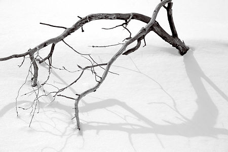
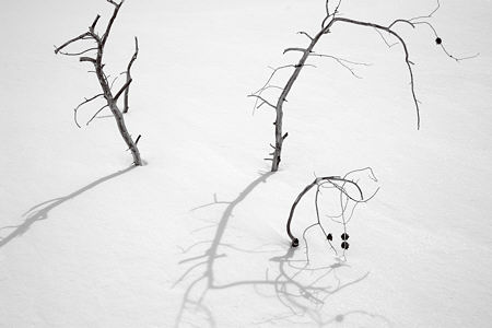
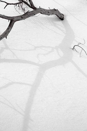
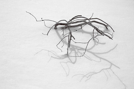
But more on that in a future post. The images in the branch and shadow series shown here do not, in my mind, exemplify that compositional device, despite the large areas of nearly textureless snow. Rather, the train of thought was as follows: Starting from the thought of composition and considering some Japanese ink drawings in a book, I realized that empty space is much easier to achieve in that medium, where one can simply choose to put in only the desired elements. That’s much harder in photography (if one eschews image manipulation of that sort). I couldn’t find much blank space in my Sourdough Trail images, so I started scanning my entire photographic production, such as it is. I happened on the series here, and it immediately reminded me of the gnarled pines that often figure in Oriental pictures.

So I looked and fussed a bit, and realized I’d been doing it wrong before. I believe I was trying for darker shadows, which had the effect of giving too strong a texture to the sunlit snow, and was also hard to reconcile with branches that were more than black silhouettes. I decided to accept the lighter shadows, and found, this time, that I liked them like that. That was the key that opened the way.

At the end, I return to my hopes of explicitly trying out the compositional device of empty spaces. Have you ever been so taken with an idea or technique you just had to try it for yourself? Did it work out well? Did it evolve to become part of your personal style?

What struck me most in the Harris essay was the idea of empty places in a composition.
Itzak Perlman, after having played a short piece by Berg once said something like: I am sure that you did not understand the piece. I will play it a second time. Now, listen to the intervals between the notes.
These certainly fit in with the idea of “pairs.”
I’ve been enjoying working in monochrome. I’m starting feel a slight pull toward color, but have nothing to report on that (as on so many) front(s).
Steve:
Often, if not daily.
Perhaps it’s just my screen, but your shadowed photos gradually darken toward the edges. I have to go back and reacquaint myself with things Japanese, but it seems that the empty spaces in Japanese work don’t just wander off, but are bounded by edges that usually correspond to the natural boundaries of the surface in question. In a somewhat related manner, and in the absence of a functional boundary, the gradual darkening acts as a kind of visual uphill slope that rolls the eyeball back to the subjects in question.
Shadows form the foreground in Your images. It makes me want to reverse the given relationships so that the branch or twig feels more the product of the shadow.
And in response to Melanie, Are these images monochrome? I took some snowy shots this last winter that could easily be mistaken for monochrome, so subdued are the colors.
Jay,
You’re right about the darkening toward the edges, it’s a natural optical effect not usually noticeable, except where thdere are large expanses of even tone. Some deliberately enhance the effect (classic vignetting); I simply don’t correct for it normally, but possibly I should here. It does, as you say, tend to keep the eye within the frame. Also, these are monochrome, though the original color would look almost the same.
Though some features are shaded somewhat in typical ink brush paintings, distinct shadows would be extremely unusual. A very interesting point worth expansion when I have more time later…
The second picture looks like they are dancing… the austere simplicity gives me shivers but the lighter shadows reassure me.
Steve,
As I thumb through some of my own Japanese references, I note that shadows seldom appear in Japanese art. Your stick figures are like calligraphy, and the echoes of the shadows feel like the repetition of the the rhythm. Playing it a second time?
Angela,
You’re right, the lighter shadows are also much lighter emotionally, I also find them reassuring–good word!
June,
I’ve always had an interest in the calligraphic, and that’s even the name of an ongoing, amorphous project that has very little in it so far.
Japanese aesthetics, the use of apparently empty space as an active element of composition, and keen observation of shadows — all are present in this very interesting post, which I found by searching ‘In Praise of Shadows’..
Perhaps surviving in the wilderness with broken ski gear prompted a focus on the elemental essentials of composition.
The ink paintings of Sesshu and Sesson might offer additional inspiration.
Fascinating site, glad to have discovered it.
The negative intervals that surround the object and its shadow is embodied in the spatial expression called the concept of ‘Ma’. It is empty or formless beauty linked to ‘Mu’ absence, and ‘Wa’ harmony and balance.
Japanese aesthetic is very much like an onion with the many layers all nested within each other.
As a professional Japanese Garden builder, I continually work with these aesthetic elements as a matter of course. There is an entire glossary of aesthetic terms linked to concepts of great subtlety. The more one studies this area the more the different layers are revealed. Its an endless life process.