[Note: This post also appears on my personal blog, southeast main. Jay has persuaded me to cross-post as an efficiency matter. I find it changes my thinking to do it this way, which is a different, but also interesting, topic. Hi all — I’m glad to be back.]
I’m thinking about edges. I have a theory — or rather a “notion,” (which is a theory that is so diffuse it has no edges) — but anyway…..
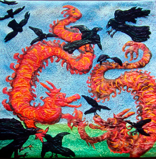
My theory is that a lot of textile art maintains its textilishness via its edges. And this is in spite of the hand-dyed fabrics, surface design with fuzzy results, sheer fabrics, and other fuzzying techniques of contemporary textile artists. The edges of quilted art are often delineated by the quilting ; sometimes they are even more clearly portrayed with zigzag applique. Applique by itself lends itself to clean edges, as do commercial fabrics. Piecing fabric together gives a seam line, which makes an edge, even when the fabrics are close in color and value.
The clarity of edges in textiles tends to pull the textile toward something I think of as “good design” such as can be seen in magazine ads and hard-edged abstract art. This clarity has a certain appeal –it’s clean, not mushy, not sentimental. Clarity has a sureness of feel about it (which is probably why it’s so popular in advertisements). It’s also good for a certain kind of whimsicality, of child-like sensibility. The “faux representational” look in textile art often derives from its clear, often hard, edges.
Arabesque, 40″ x 40″, hand-dyed cottons and silk hanks, appliqued and machine quilted
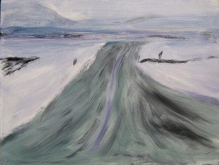
However, contemporary painters, particularly representational painters, fuzz up their edges, even when to the eye it doesn’t appear like an obvious tactic. In the Guide to Landscape painting (one of those books I return to repeatedly) John Carlson speaks of masses reaching into the sky — say, buildings or trees.
“A dark mass seen at some distance, through this [dust and moisture-laden] air is more or less lightened according to the day and time of day. Especially is this noticeable when looking toward the light (as in the case of the window). Especially, too, is such a mass lighted at the edges touching the sky or light… It seems darker to the eye of the beginner, but if he paints it that way (darker), the light mass (sky) touching it, while being itself a light value will not seem to give off light rays.
This lack of light light is easily noticed if you try to paint a dark tree too dark against a brilliantly lighted sky. Your sky may be brilliant yellow or very light blue… but with your too-dark tree painted against it, it will not appear to radiate light. It becomes just black paint again light paint, but not light. The light not only lightens and simplifies such a tree, but seems to wrap itself around the edges in relief against it so that these, more than ever, lose their local color and much of their local value.”
Snow on the Palouse Plateau, Oil on board, 12 x 16″
My recent oil painting instructor, Jef, after he got tired of saying “more paint” to me, started saying, “Soften up those edges.” That’s when I went back to Carlson. And now I’m reading a whole chapter on edges in Richard Schmid’s Alla Prima: Everything I Know About Painting .
Schmid is more analytic than Carlson, so he says the same thing but explains it more fully. Schmid says that edges appear the way they do for a variety of reasons. One reason is the inherent shape of things, like the differences between a sheet of paper or a fold of fabric — the fold will have a softer edge than the hard-edged paper. Another is the intrinsic (“local”) value and color of things — shapes that are similar in value or color will appear to have a softer transition between them than elements which contrast, even though the real (physical) edge is the same. A dark blue against a dark green will look softer than a dark blue against a bright orange.
Other reasons for differences in edges exist. For example, the nature of things– what they are made of — changes their edges. Clouds (and the rear ends of ducks) are softer than bricks, and their edges will be softer. Also the light — how strong, or weak, or diffused it is and the angle it is hitting the subject changes the nature of edges. [This is why painting books always tell you to set up your subjects with a stong light coming from a high angle; it makes the writing of the instructions much easier (I said that, not Schmid).]
Finally Schmid gives two other reasons for edges appearing different at different times — one is the atmosphere, which is most familiar in distant landscapes, fog, etc.; and the other is motion, which calls for soft edges (and patterns within the motion which have to be caught).
Of course, there’s rarely a single cause for the appearance of an edge. And edges, Schmid reminds us, are comparative creatures — they appear differently because of relationships one to the other.
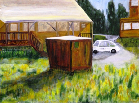
Early Morning Trash Container, oil on board, 12 x 16″
I did the painting above about two years ago. Then I took Jef’s class, read Carlson and Schmid, and redid the painting. I’m still not sure I’ve caught the edges (and other things) but it is a lot better for the notions I’m accruing.
I can play around with photography and edges in terms of painting and textiles, but not in terms of photography-as-art. I wonder how the camera deals with edges. And I think of Jay’s foam-carved paintings and sculptures — he relies on that most sophisticated of instruments, our own eyes, to make the edges do whatever they will do. Or at least that’s my notion at the moment.
And a note about the Schmid book — it’s pricy, even in soft cover, but getting it from the author is less expensive than any I found elsewhere. Don’t trust Amazon on this one.


June,
I only recently began to think about edges explicitly. Among other things, I realized I really liked contrasting hard and soft edges, which is something I’m experimenting with in leaf pictures and elsewhere. You’ve given me lots to think about, but it’s already tomorrow, so I’m going to sleep now.
June:
Welcome back. A&P now feels more complete. This is a major post and I too must chew on it some. In the meanwhile let me say that it’s good to have you among us again.
June,
For 4 days, I had my first lessons in oil painting with Karl. As my first motif, I selected the second pitcher thistle image in http://artandperception.com/2008/07/family.html.
My mindset was to paint lots of detail with sharp edges, inspired by Auspicious Dragon once stating his preference for photographs over painting because of their richer detail; my love for Richard Estes’ cityscapes with their edges (my memory from 2 decades ago when I studied them); and finally, my day job where detail is everything.
Next week, I will post my first try, looking forward to critiquing. In the meantime, flying back to the US, I will muse about your post. Welcome back!
Birgit,
I hadn’t looked at Estes for a while, although I’ve always loved his reflections. It’s hard to tell from reproductions, but when I look closely I see Estes playing tricks with the edges of the edges, just as Carlson suggests.
Have a grand time with the thistles– what a great place to begin your painterly processes. I’m ambivalent about details — I’d like to be more cavalier about them, but often find myself grinding them out, particularly with the representative work. And I end up feeling like they are the result of grinding of teeth, perhaps.
But I’m working on that lively paint theory along with big shapes — these in some abstract work I’ve been doing — and playing with the edges as well. I just sat with the art of Lucinda Parker, a local artist who has a big exhibit down at the art school. I could sit at a table in the deserted commons and really look at what she does. It’s impressive and may have given me some impetus in my own abstracts.
http://www.laurarusso.com/artists/parker_l.html
You and Auspicious Dragon are definitely right when you think of photos as having the kind of detail that contemporary painters tend to eschew. It’s the one irritating thing I find in books about doing contemporary representative work, particularly plein air. There’s a veritable adoration of the tossed-off look, which can mean lots of paint and color but not detail.
Steve,
Indeed, you are making an art of contrasting the textures and edges, hard and soft — your example is perfect.
I’m wondering (and I should do my homework, but am hoping someone else might find it intriguing) if you put your hard edges into Photoshop and ratcheted up the resolution until you could see the pixels clearly, whether the number of intermediate pixels would be one or ten or 100. I became convinced that edges were a lot softer than I was “seeing” them when I did this to a color photograph and found an astonishing variety of colors in that area between definitive foreground and definitive background.
Maybe tomorrow I’ll take myself up on my challenge — if no one else has, that is.
Is there a difference between an art in which the point is hard/soft (as with your leaves) and one in which the nature of the edges becomes simply a subtle part of the whole, without being its focus?
I was just out photographing this afternoon, some of the time picturing–without remembering your mention of it–just the situation quoted from Carlson, namely dark tree against bright sky. There are some fascinating things that can happen with edges then. The transition for a sharply focused subject can be only about one pixel (i.e. one pixel is intermediate), but when edges are out of focus the light wraps around the subject in a delicious way, very like Carlson’s description. I’ll highlight some of these aspects when I write about it in a couple days.
June, is your interest in softer edges an important reason you’re recently favoring painting over fabric art?
Guys:
I would draw our attention back to Angela’s painting in her recent post. I find the distinctions between the tower-like figure and the enveloping background/atmosphere to be very well rendered. There’s a strong psychological element there for me.