
Birgit’s post and subsequent discussion on Giorgio Morandi has inspired me to try my hand at the same subject using photography. Not with the goal of trying to create an imitation Morandi, but more as an exploration for myself of some of the same ideas I see and enjoy in his paintings. I don’t claim these are necessarily Morandi’s ideas, but I think the process will certainly help me understand his work better. Essentially, I am taking up again the concept of studio as laboratory.
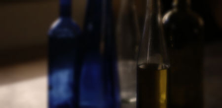
Here I present my first attempt, having had so far just a half-hour stolen from Thanksgiving activities yesterday. I grabbed a few bottles lying about and cleared off a table, though I didn’t manage to set up a simple background (hence the crop to remove distracting elements). I was primarily interested in playing with elusive boundaries. In the arrangement I photographed, the two blue bottles on the left merge (can you tell which is in front?), and the green bottle on the right merges with both the olive oil-filled bottle and the dark part of the background. (The degree to which these remain slightly distinguishable will depend on your monitor settings; on my laptop, it depends quite noticeably on angle of view.)
One of the fun aspects of this micro-project was working with the color in relatively large patches. In this set-up, the colors were relatively dark compared with Morandi’s. Like his, they are partially de-saturated. This is a combination I happen to like, but I definitely want to try lighter colors also. Another aspect I enjoyed was the highlights and refracted lights, the simultaneous reflectivity and transparency. This is absent from Morandi’s work; he painted his bottles before painting the pictures, I presume to avoid these higher contrasts, as well as to provide the colors he wanted.
I photographed from a similar viewpoint as Morandi’s, well above the level of the table. The physical optics then dictated that the edges of the bottles were not parallel to the edges of the image, appearing to lean outward. I corrected this digitally to get the same distortion that Morandi preferred, whether intuitively or deliberately. I hadn’t been consciously aware of this earlier when looking at Morandi’s paintings, but I think it may contribute to the sense of “naive” simplicity that I get from his work.
As the title implies, I’m hoping to continue with this series. I’ve removed labels from a few more bottles, and am looking around for boxes or similar objects to add. Do you have any suggestions, or experiments to propose for this laboratory?

Steve,
How elusive are the boundaries of the bottles? How well do they separate from the background?
I think that I can either see the edges of the bottles or, at least, construe them from the nearby reflections. They don’t quite feel as elusive as Morandi’s dissolving boundaries yet.
My snapshots of children’s movements this weekend made me think of other dissolving boundaries like those seen in Doug Plummer’s photos of dancing people.
Hmm, how elusive should they be? I think Morandi’s edges can also be more or less located. As a trial comparison, I can make edges less defined by a post-facto blurring:
To some extent, the same result could also be achieved via focus and depth-of-field adjustments. I think I am resisting giving up too much of photography’s characteristic ability to sharply depict at least part of a scene. Not that there’s anything at all wrong with making a photograph that doesn’t look so much like a photograph. I just have a default preference for having the blur arise naturally through depth-of-field or, as you mention, motion effects. I suspect that what I ultimately learn from these experiments will influence more the non-central (though not less important) parts of my images.
Steve.
Hmm, I just lost my original comment. I’ll try again.
I took your bottles, saved them to my computer, and rotated them through a whole circle, just as I did with Jay’s “Twos.” Doing that made me acutely aware of the light patch that lays on the table top and runs through a couple of the bottles, particularly around a 90 degree rotation in either direction. I wondered what would happen if that light source were twice as strong (or appeared to be twice as strong). How strong can it get before it wipes out the bottle qua bottle and turns it to non-sense? What happens (besides glare) if you do a wash on the whole scene without the side light? Do the bottle blend them?
Then I took the Morandi line of bottles from Birgit’s post and rotated them, and realized that he has no light source (unless he’s using a fluorescent wash!). But rotating the images 90 degrees makes the semi-circle of his tabletop/wall pop out of the image.
Morandi’s edges are far clearer than yours except perhaps in two cases in the images Birgit shows. Even though they are soft, they are clarified by a slash of edge paint or a patch of shadow. This surprised me, since I would have, off the top of my head, said that photos would show more clearly delineated spaces — but that, of course, is nonsense — in fact, the opposite might be true in that the painter can decide whether to lose the edges, whereas the photographer is to a larger degree at the mercy of what the light and chemicals present him with.
Morandi’s flatness — his abstractness — is a function of that wash of light with the edge delineation that isn’t blended — your photos have a far more “painterly” blend at the edge.
I also took some of my abstracts and subtracted saturation and made some fun discoveries. One of these days, I may have to present you with them — either as virtually subtracted or, if I get disgusted with the way they look now — as really de-saturated.
June,
I’m not sure exactly what you mean by “wash,” but above is a considerably lightened version of the picture. They seem to have a stronger rather than weaker identity as bottles. By the way, I neglected to warp this version, so you can see how off-parallel the bottle verticals were originally.
I was thinking at the time about the bright light on the table, which is actually just diffuse window light. I enjoyed having the whiter patch (though I carefully didn’t let it go full white) and I also wanted light to transilluminate the bottles (which are otherwise dark except for reflections). Like the rest of my predilection for light, it didn’t seem to fit too well with a Morandi style, but it’s what I had handy for my first attempt. I do want to try with flatter light in future, and probably with opaque objects.
Another “distortion” of Morandi’s that becomes clear is that despite the sometimes moderately strong and well-defined shadows, the actual value range in his pictures is far less than real objects would exhibit.
In Morandi’ s last three still lifes in my post, it is largely one edge that dissolves – beige item dissolves into beige background, grey item dissolves into grey background. Interesting, because in photography, of the top of my head, I would think that the loss of edges occur mostly in the white or dark.
Steve,
A “wash” (in terms of lighting) is an all-over light, such as you get with fluorescent ceiling lights. I suspect the use of a scrim over photographers lights also give that kind of light. In a wash, the shadows are dim or non-existent — a flash in a camera, from the front, will often “wash” the items with light.
That said, the window light is beautiful in the photo; I was only playing with “what ifs…” The window light is, of course, the most traditional kind of light painters had to work with and used to great effect to create forms.
Because the light comes from the side and hits the glass, the lightening of the objects makes the lit edges far more definitive. I suspect you are right — that unless you paint the bottles, the nature of transparent glass will always involve particular elements that, like the rumtumtugger, will do as they do do.
Birgit — an interesting idea about photography — that it’s the extreme values that merge or dissolve. I’ll have to check it out. Maybe photography subtly sorts out the inbetween edges, pushing them one way or another.
After another look at Morandi’s paintings (not their pictures on the web), the way that the boundaries dissolves between the rightmost bottle and the background in your first photo looks very ‘morandish’ except that Morandi achieved such dissolving boundaries with lighter colors.