 1
1
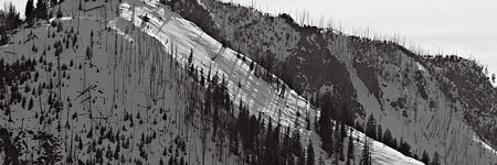
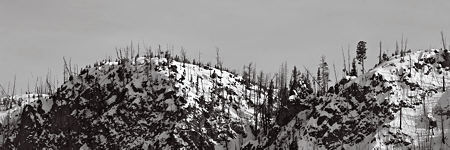
My day in Yellowstone last month was a long and varied one (see previous posts one, two, three). As I was leaving the park along the Madison river (almost the longest in the U.S.), I stopped occasionally to photograph the line of mountains on the opposite side of the valley.
 2
2
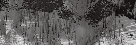
As I was doing this, I had in mind the images from the month before of the landscape by Tepee Creek (post here). I was hoping to catch some of the rhythm, perhaps even musicality, that I found in both places. I’ve nurtured such a poetic and mostly unrealized hope since I read about photographer Michael Smith’s epiphany with sonograms, like the one below of a hermit thrush. Smith was inspired by the beauty of such sonograms in creating some of his wide landscapes. (Though it’s worth pointing out that Smith’s wife, Paula Chamlee, in her own way, succeeded as well or better.)
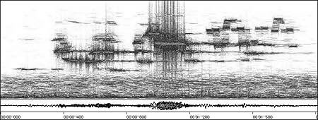
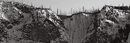
That wide panoramic format is not only reminiscent of a musical score or narrative progression, but also fit well with the actual manner in which the line of mountains scrolled past me as I travelled. So I tried cropping a few of my images to half their original height, which makes them three times wider than they are tall. It was fun trying to decide what slice to take; sometimes more than one seemed to work.
 3
3
 4
4
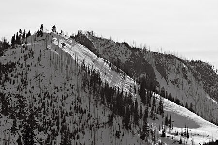
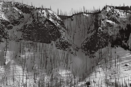
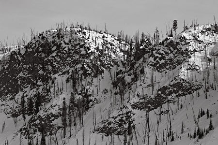
For comparison, below are the non-panoramic versions. I’m not sure I like these less, but there is a different feeling with them. The viewer wanders around more in the landscape, rather than taking a journey along a designated path.
 5
5
 6
6
 7
7
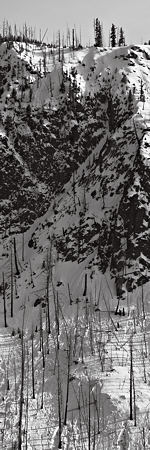
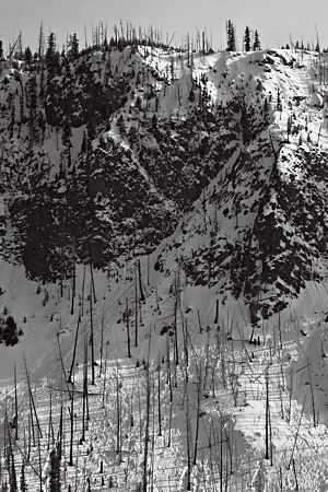
The same approach seems to work as well for a vertical orientation.
 8
8
 9
9
As usual, I like to see how other artists have dealt with similar issues or used similar approaches. Lately, l’ve been looking at Bruce Marsh‘s landscape paintings, which are frequently in a panoramic format. Here are just a few from his Recent and Utah galleries (click to see larger versions):
The experience of viewing a panoramic depends on size and viewing distance. If it’s large enough that you need to physically walk along it, that tends to enforce a linear trajectory, like reading a Chinese scroll. On the other hand, at that size there is also plenty to see via local roving about of the eye. Wandering with a drift.
One thing I noticed is that my panoramics here seem to be more about repeated patterns and major division lines, like the skyline. Especially images 2-4. Bruce’s paintings have more of a shape, a development or story to them, which I find very satisfying. Waterpocket Fold I and Mira Bay Hill even have evident chapters. My vertical does have more of a storyline, though I can’t decide whether it runs up or down.
Which direction seems more natural to you? In the case of the horizontal panoramics, do you read left-to-right, right-to-left, or start at some eye-catching point in the middle and work both ways? How about the vertical?
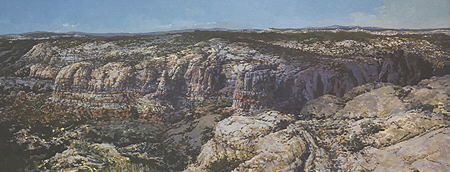


I’m very flattered that you included these paintings of mine in the discussion. There’s also a remarkable coincidence in your comment regarding a story line and chapters in the work. I have long thought about the problem of making the onsite work somehow relate to the experience of being there.I’ve known that I’m not interested in making it seem that I’m recording a moment..a photo like record of light and weather. I don’t want to convince you that I’ve magically recorded a image of 10:17 AM, June 1, 2009. So it dawned on me to think about the problem in terms of a written journal; how would I record the passage of a morning, or a day, at a place? So I’m beginning to very consciously take that tack, and to look for the means to make that evident. When this dawned on me, in March, I titled the next painting “Dudley Journal”…(we were at the Dudley Farm). This opens a range of possibilities…referencing the changing light, shifts in view, etc. So far I’ve been just putting a toe or two in the water.
I also am way overdue in updating my website…much of the work of the past 6 months is not posted.
Thanks again, Steve.
Bruce,
I hadn’t originally been thinking about the element of time, but it was strongly suggested to me by the panoramic format. That’s might be a narrative time, rather than a chronological time. It was often both with Chinese scrolls, such as the Kangxi Emperor’s Southern Inspection Tour. Click on View Entire Scroll to unroll it, just as I watched the mountain ranges passing by on returning from a trip yesterday.
I’ve also been thinking about a way to incorporate experience over time. Hopefully I’ll be able to gather examples soon for a future post.
Steve;
The scroll is very beautiful, and also looks to be quite accurate in terms of the topography. villages, rivers, etc. The misty atmosphere glues everything together, both near and far spaces and what seem to be jumps in time. It’s done with such care, and plays the multitudes of tiny dark figures against the subtle gradations of color in a fashion which brings music to mind.
I’ll be interested in the ways you find to deal with time. I certainly am thinking about it, but as I get out and paint I go through a lot of resistance to change. My interest in maintaining some measure of objective description is a hindrance. I’ve thought of trying some major change in materials and process…like jumping into some journal like things, perhaps with drawing, using image and text.
Steve and Bruce.
It is interesting for me to study the presentation of slopes shown here, first using light and dark and then, additionally, using color.
I appreciate that I could magnify the paintings to see the details.
I am trying to illustrate a sand dune, sloping towards water. What you showed here will help me.
Steve and Bruce:
The element of time – I look forward to your posts and comments.